X
share


X
share
view
next

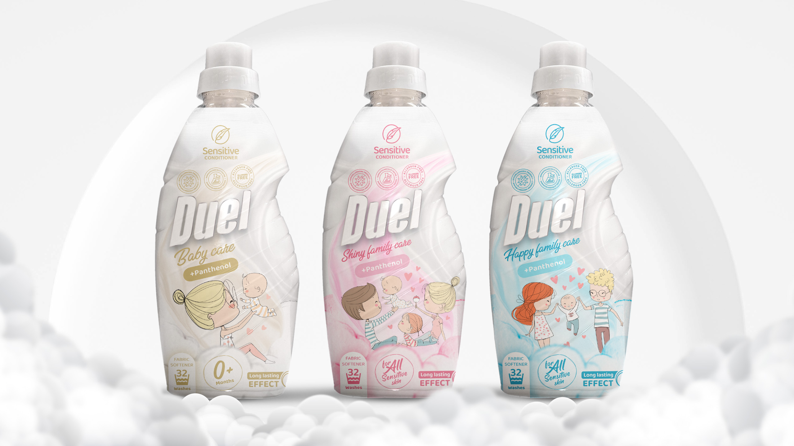
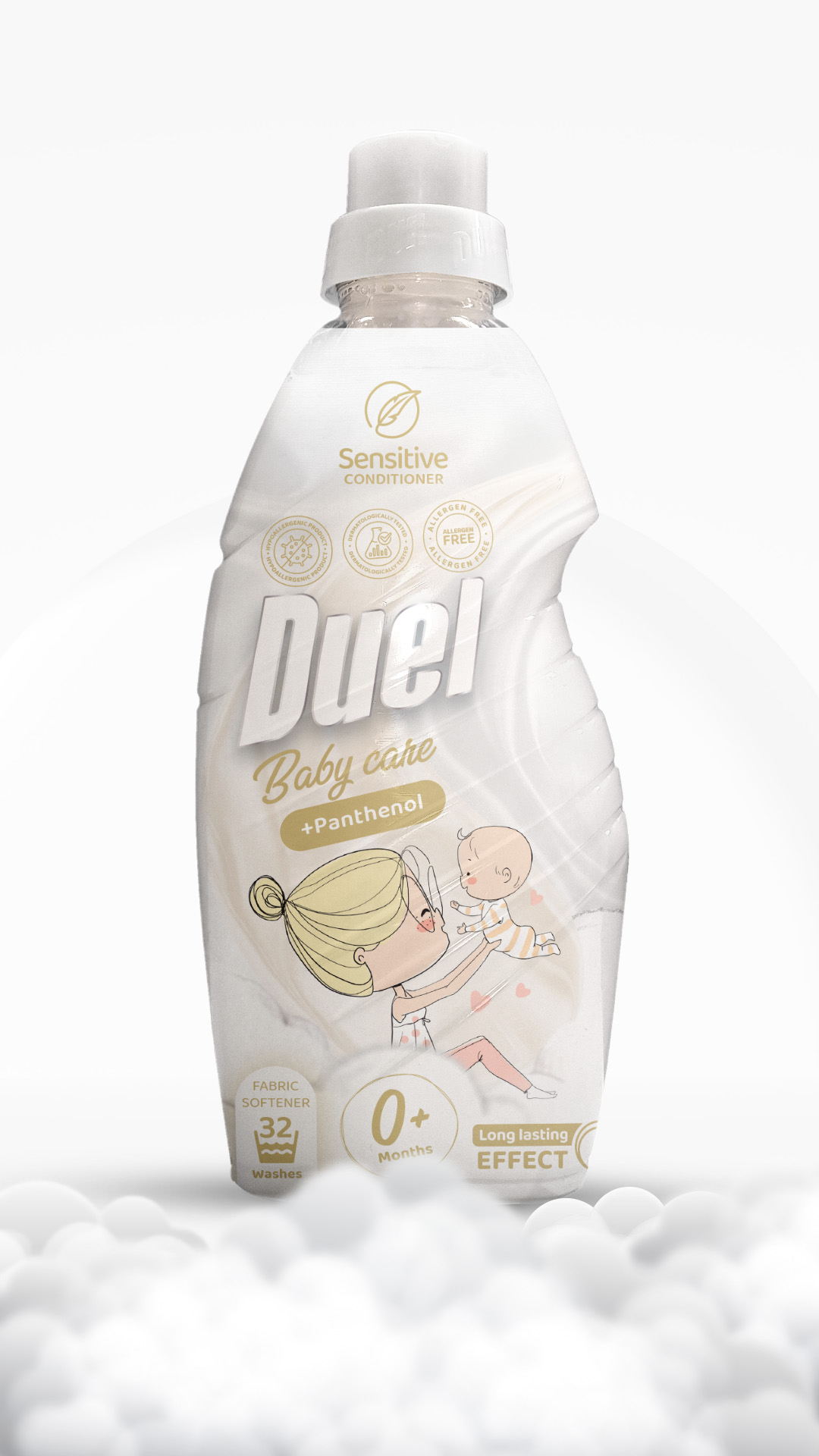
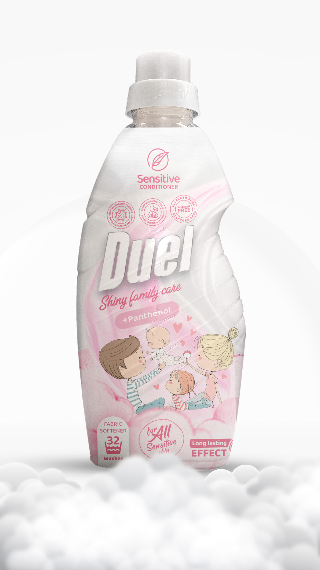
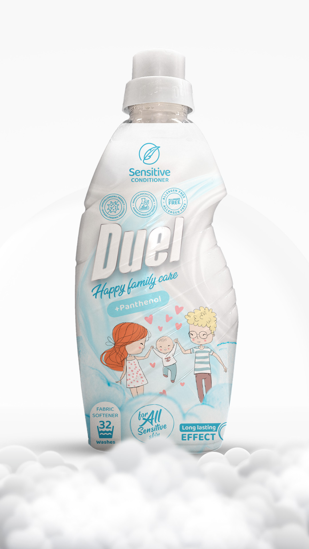


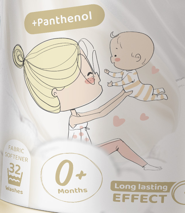
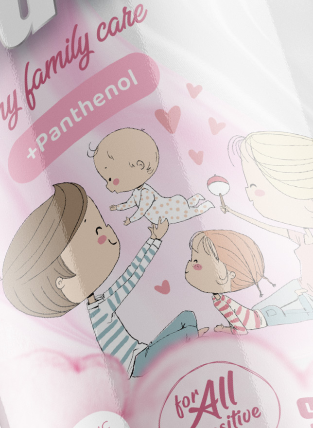
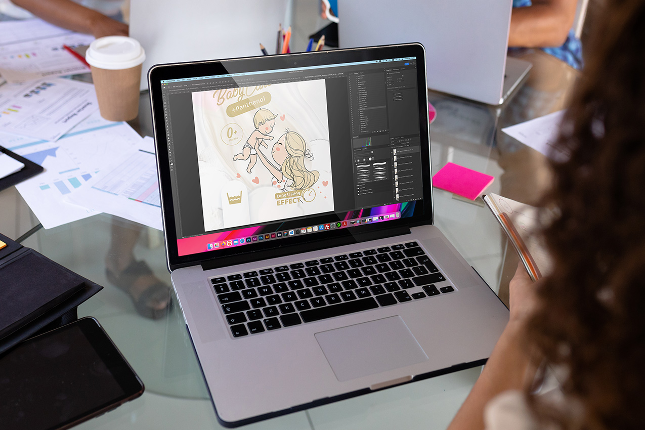
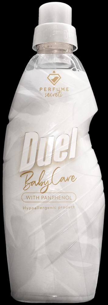
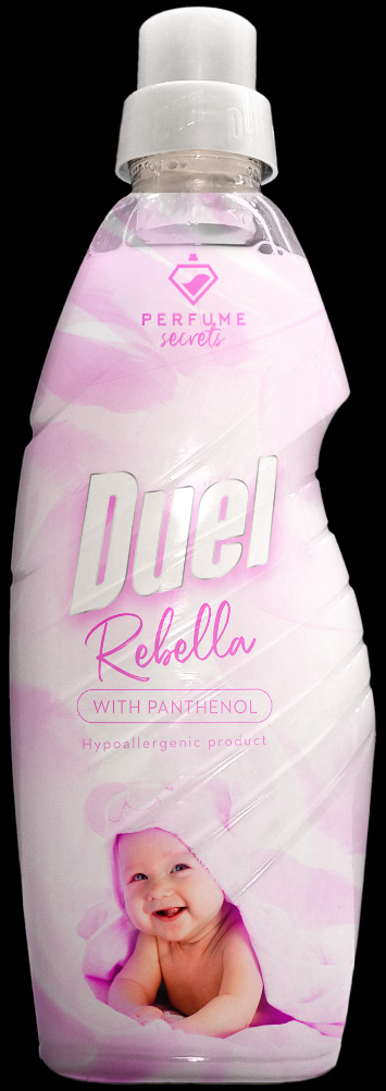
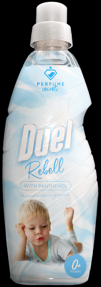
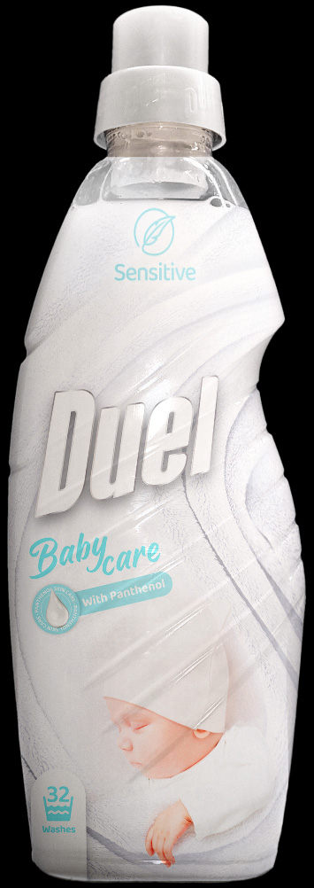
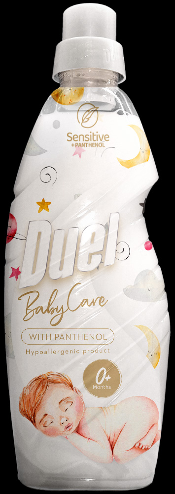
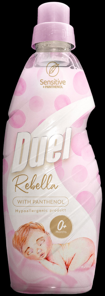
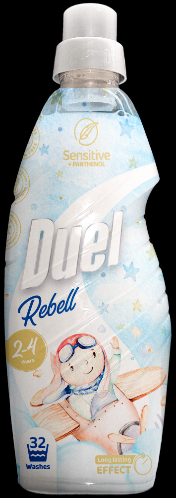
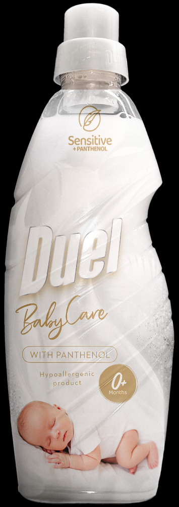
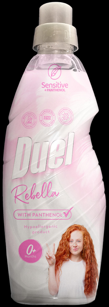
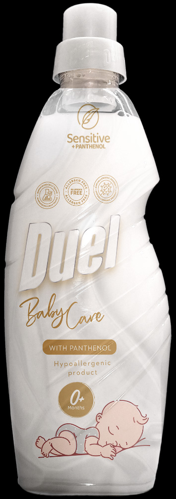
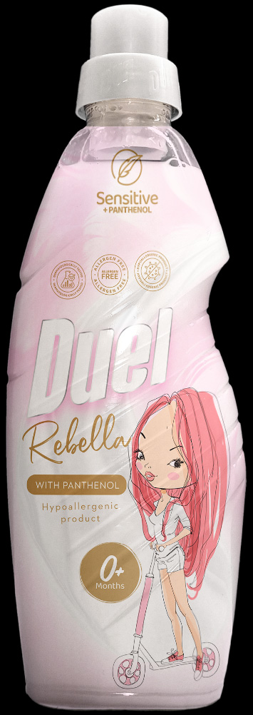
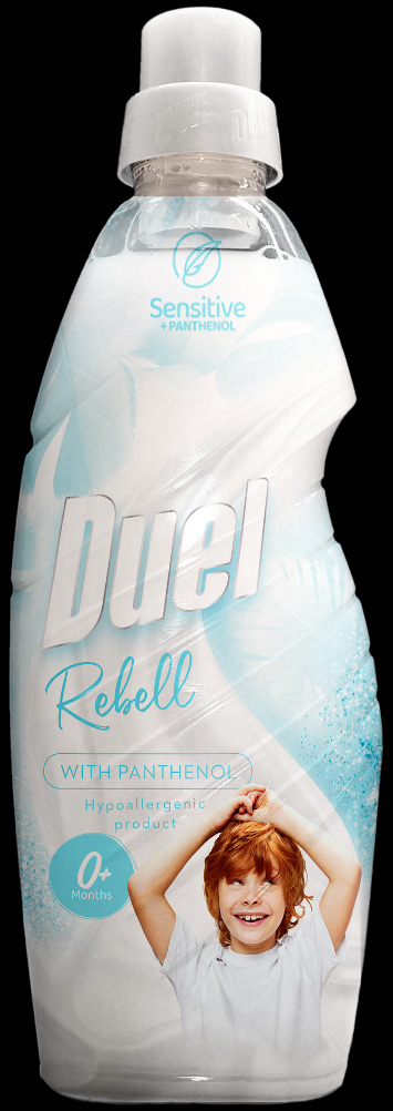
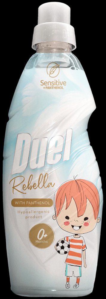
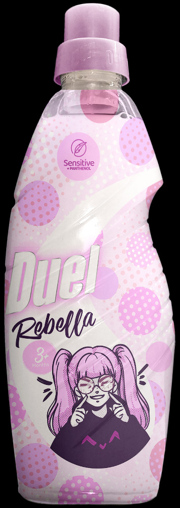
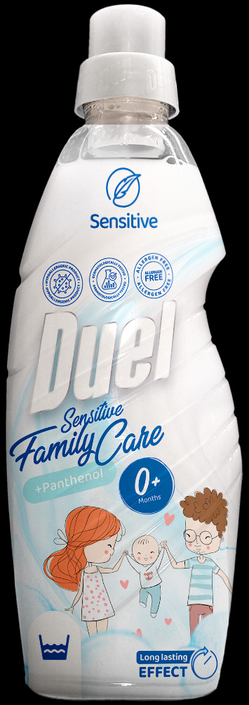
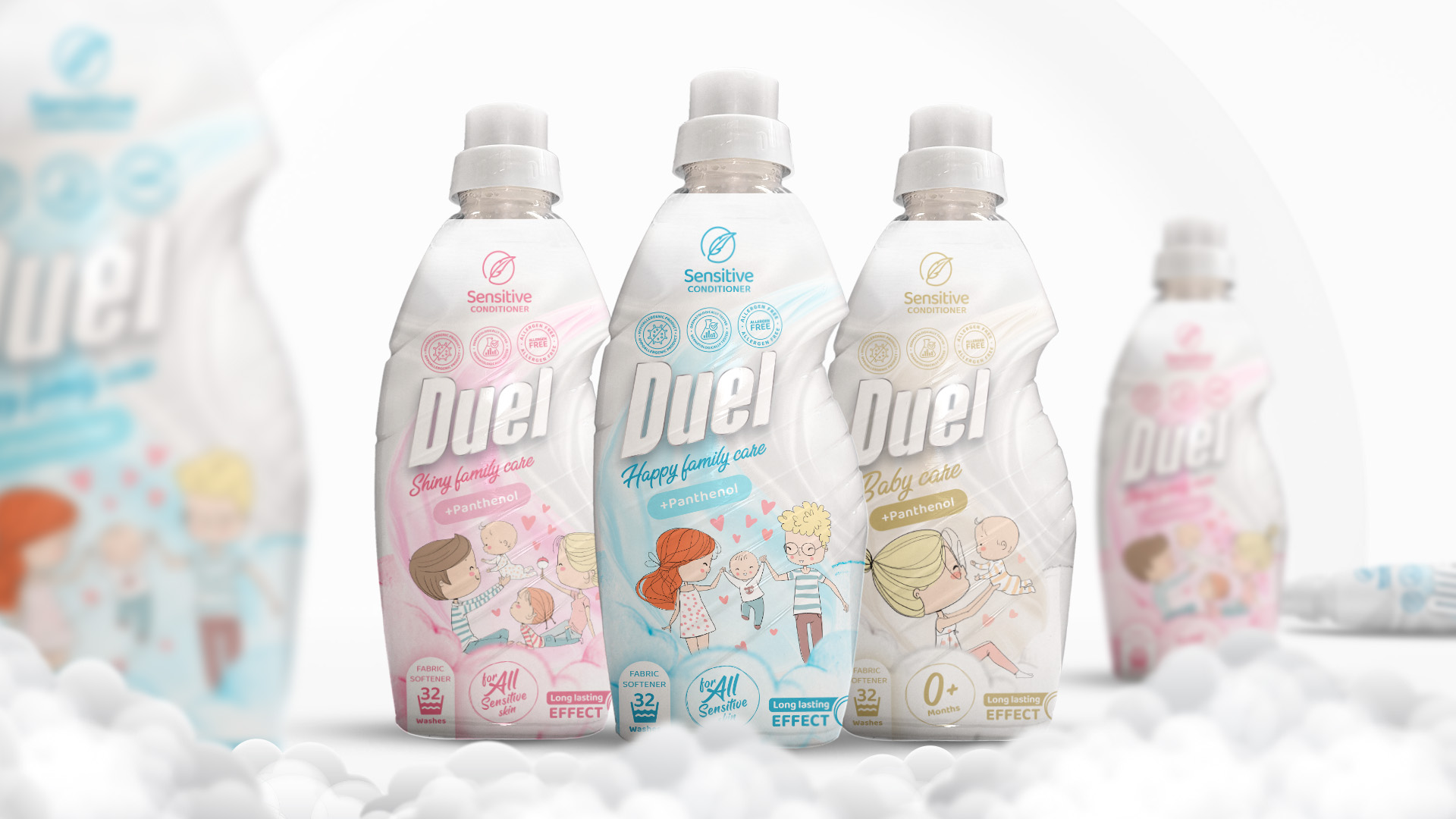
Duel's sensitive softeners come in 3 variants and the task was to make them appeal to families and moms. Communicating the softness and safety is a key point, as the product is mainly to be used on baby clothes.


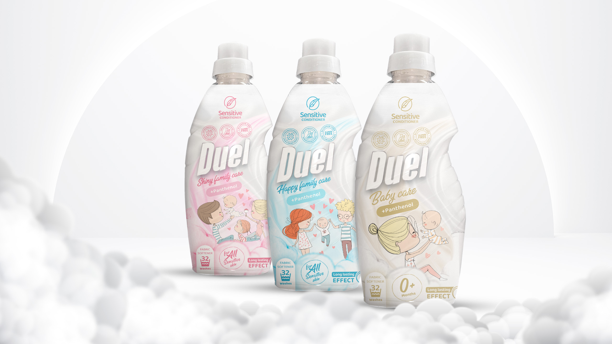
The design process took an obvious direction from the very beginnig: Represent the fabric softener for clothes that need an extra delicate care. Symbolise the softness and the hypoallergenic properties.

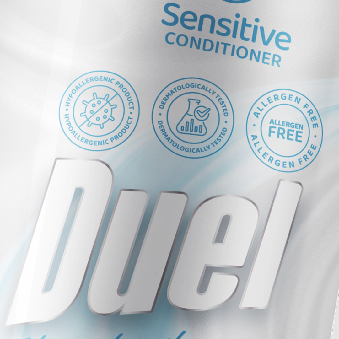
All 3 of the flavours share pretty much the same properties and have a few key advantages that need to be clearly visible on the packaging: Allergen free, dermatologically tested and suitable for all sensitive skin. The colour theme revolves around pastele and more muted tones of blue, pink and gold.
Another important element for our client was to have a large sticker or text “+ Panthenol”. And since conditioner variants are called Family care we decided that a young family with a baby would be the most suitable key visual.

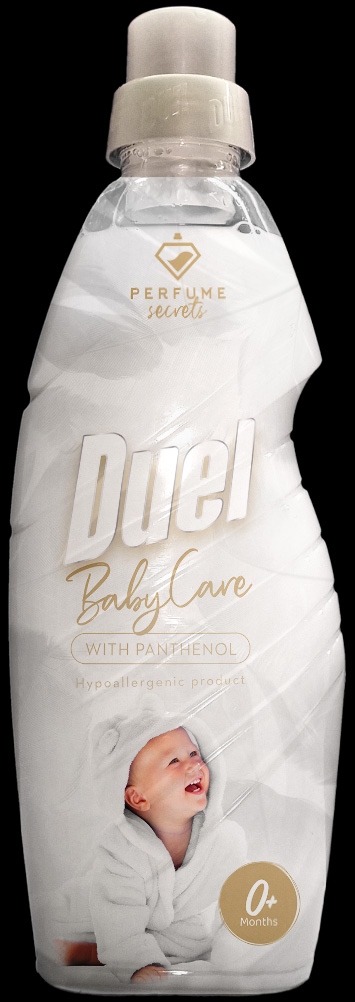
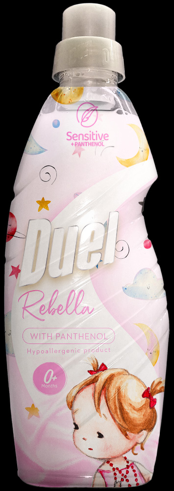
A small selection of the designs that didn’t make it on the shleves.


We will get back to you as soon as possible.