X
share


X
share
view
next


A package design for medical face masks was needed by our client. The main constraint was the time limit - A very rapid (but effective) solution was needed to be built and ready for production within just a few days.


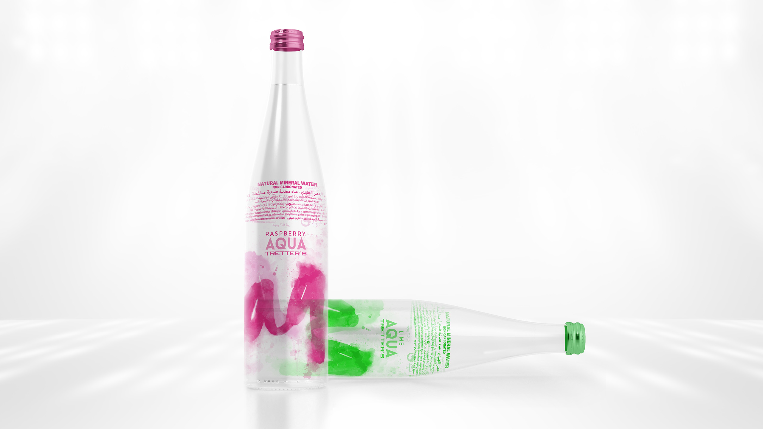
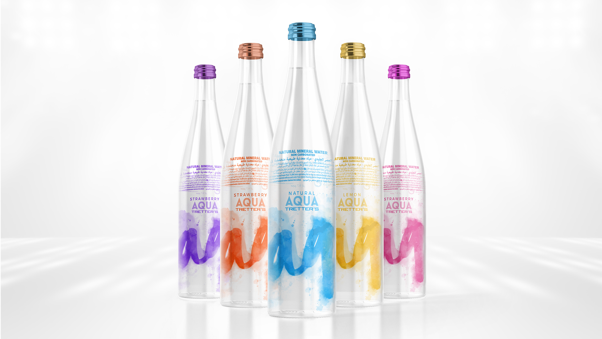
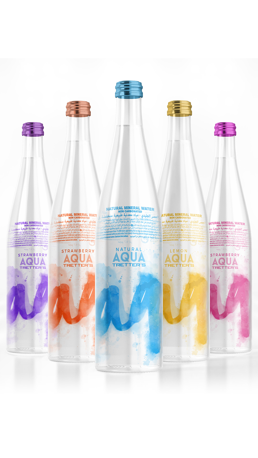
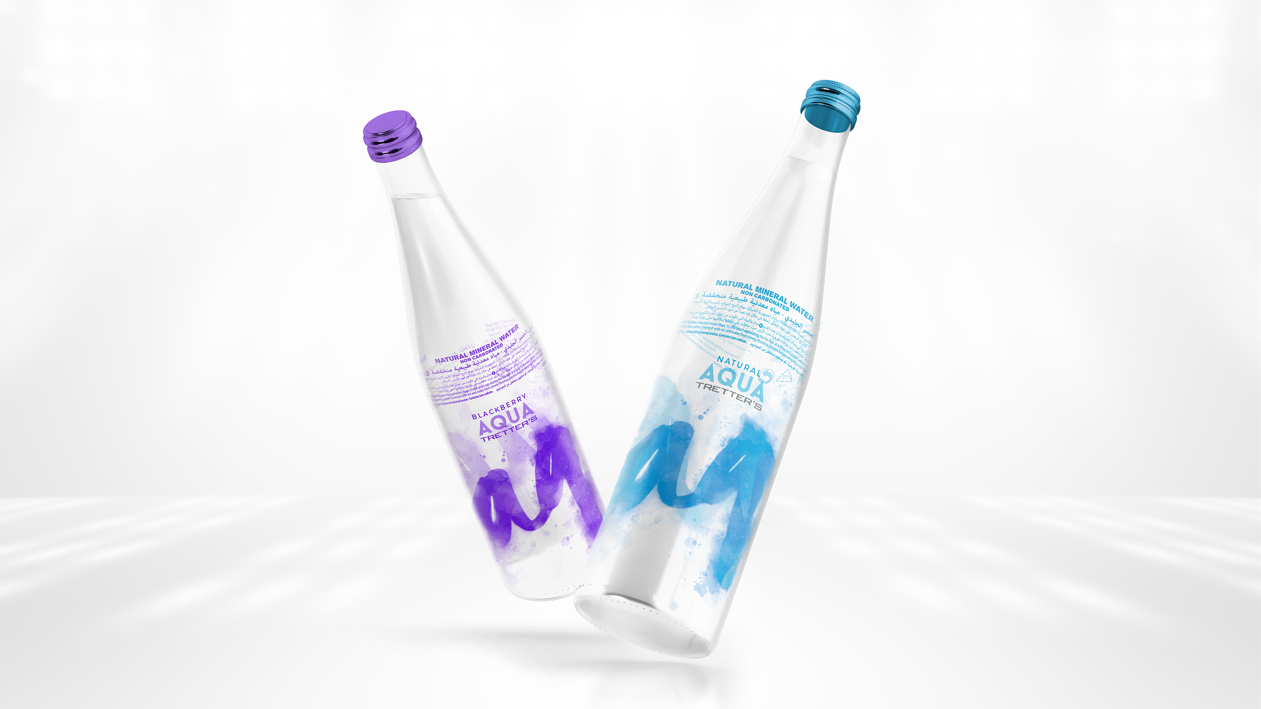
What’s so special about world’s most common and ordinary drink? It’s the fact that it’s a necessity and an item that we are so used to that we don’t even think about. So it was quite a challange to transform this concept into a product that seems new, appealing and worth trying.
Water is tasteless and odourless. Well that’s not entirely true. Plus our client had a few different flavours. We do firmly believe that even something as basic and as “everyday” as water can be transformed into something worth staring at.
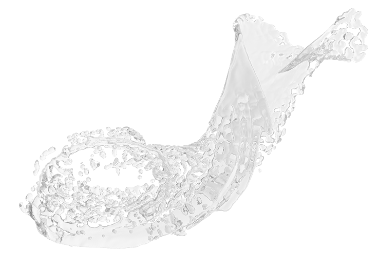
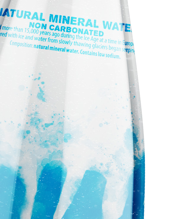
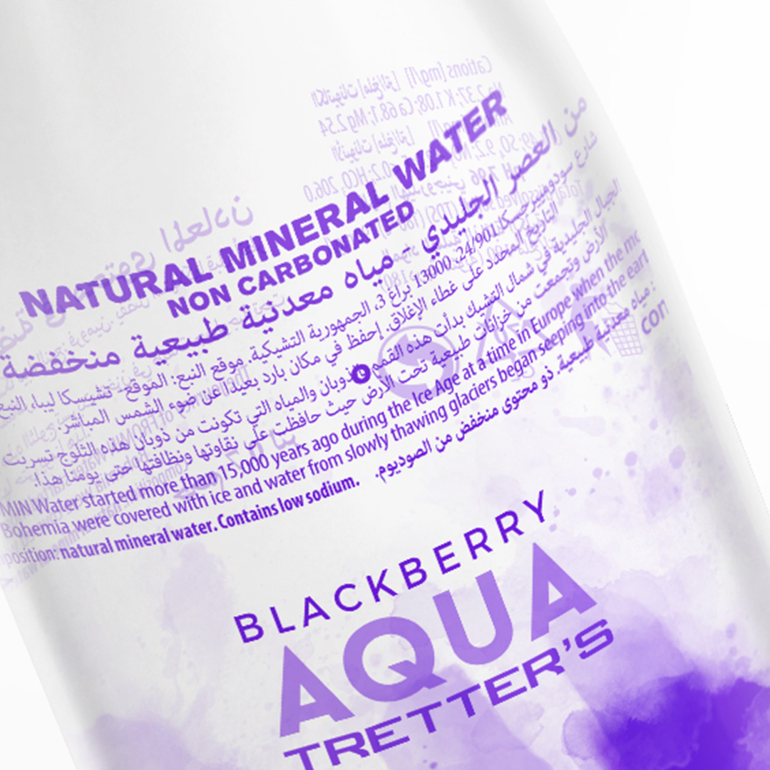
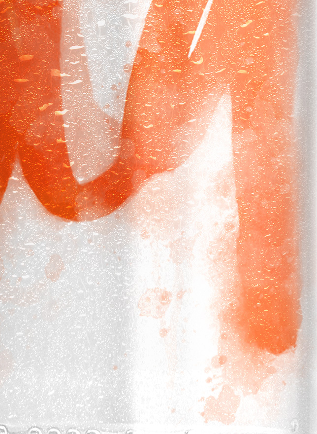
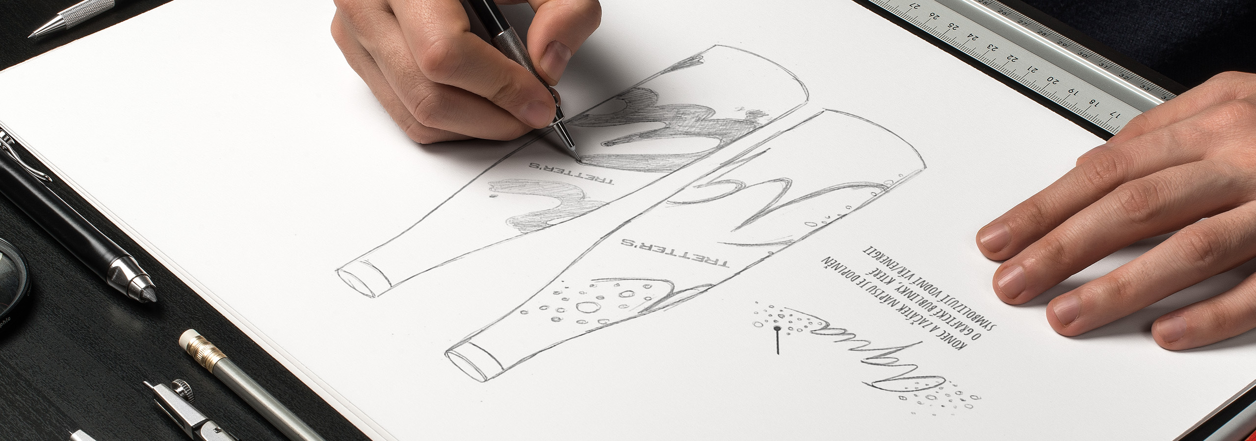
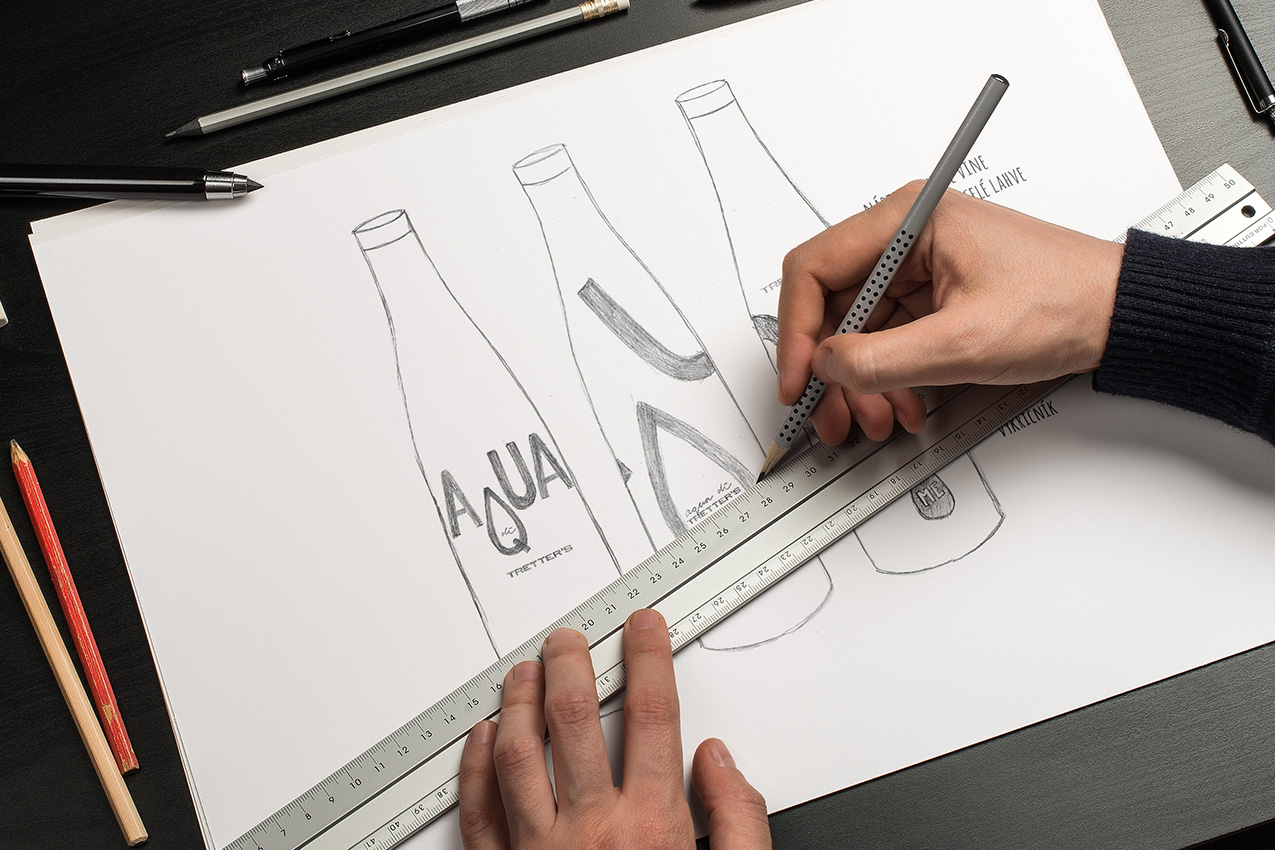
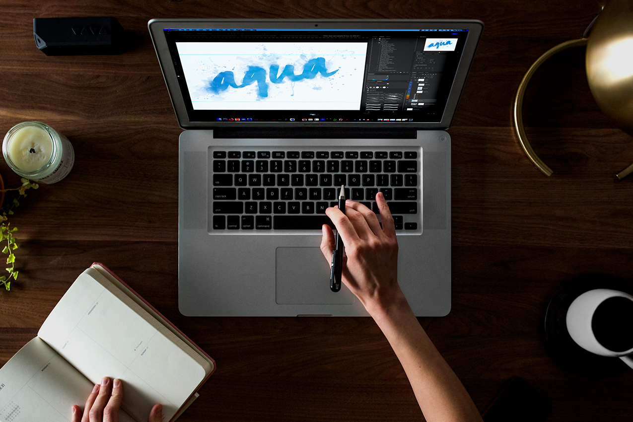
The main idea of the visual aspect was to replicate a text that is dissolving in liquid. Basically to blur the lines between the sticker and the content of the bottle.
― Bruce Mbanzabugabo

We will get back to you as soon as possible.