X
share
view
next

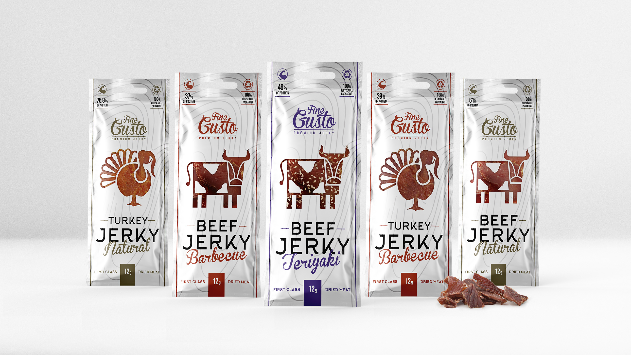

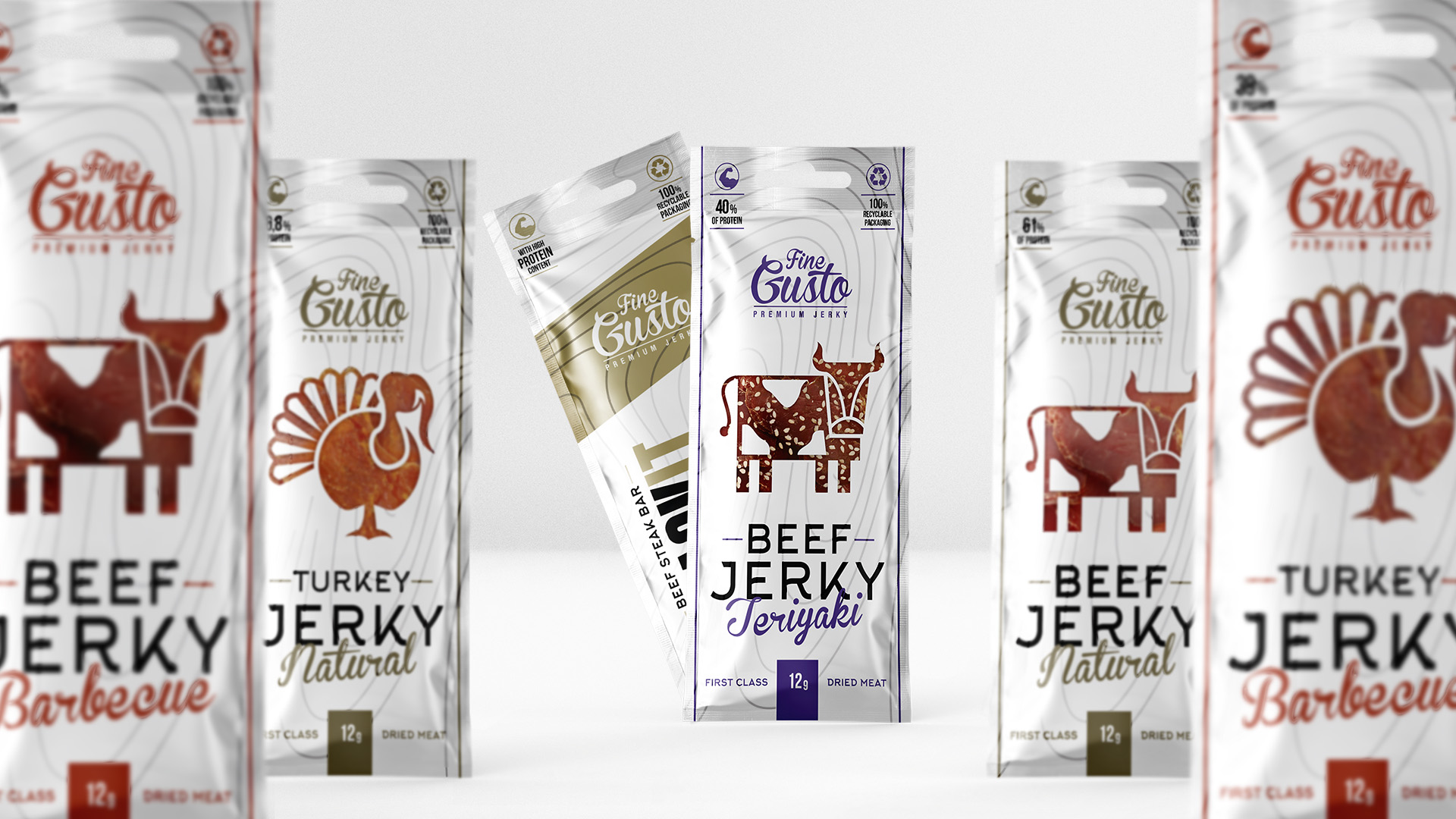
We were tasked with refreshing / redesigning their high quality, premium jerky product line. A key factor was to create a visual identity that clearly communicates that this is both a casual snack and a “first class” product.


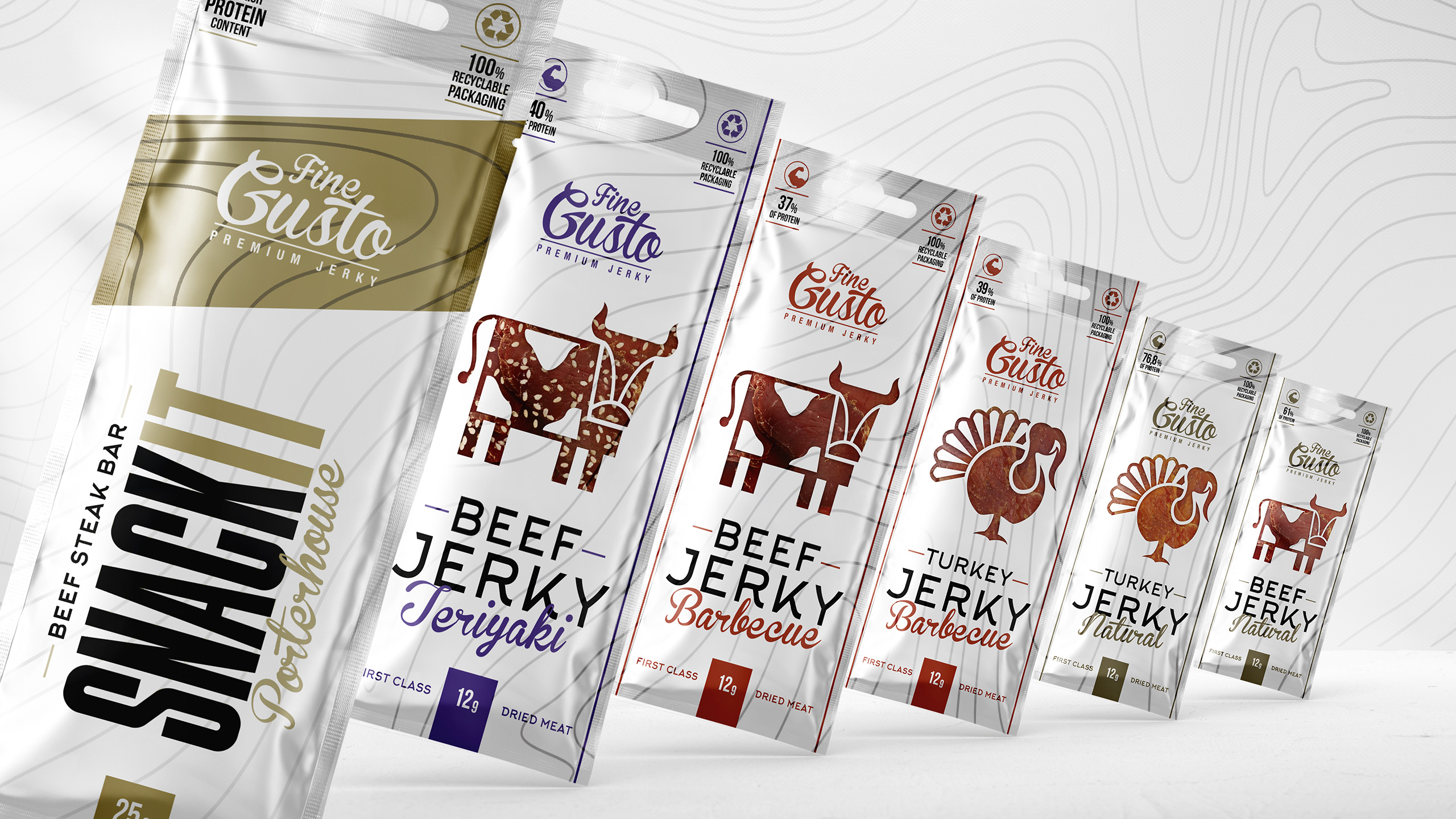

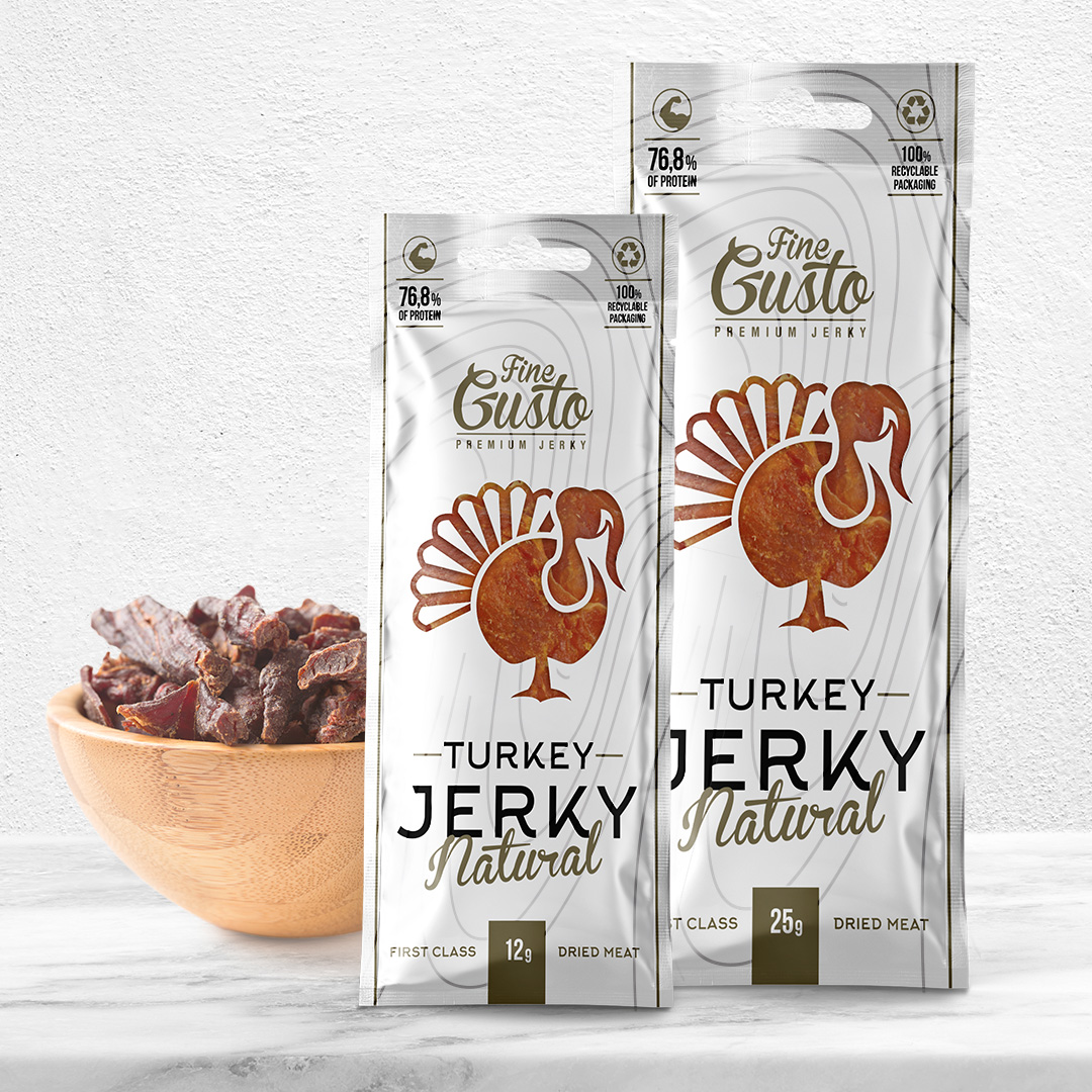
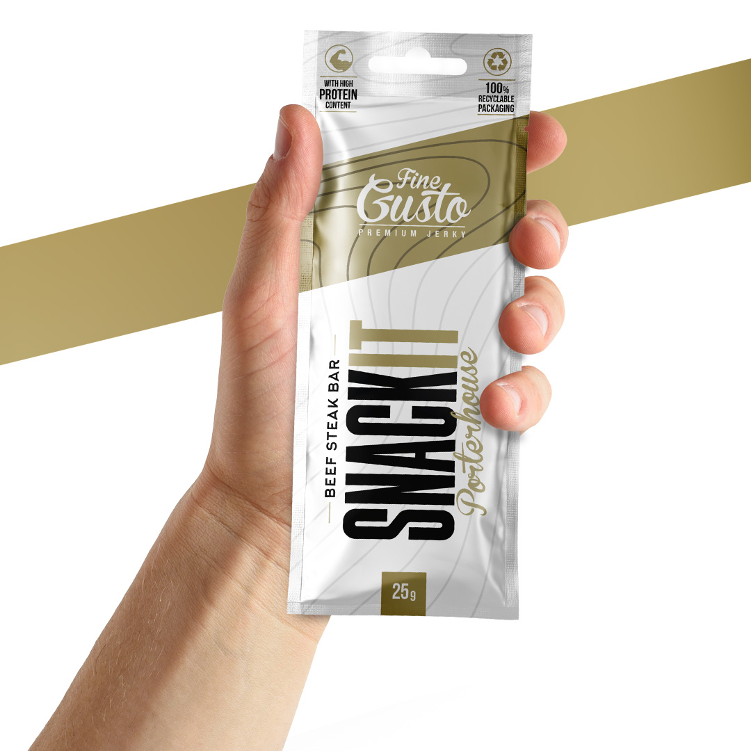
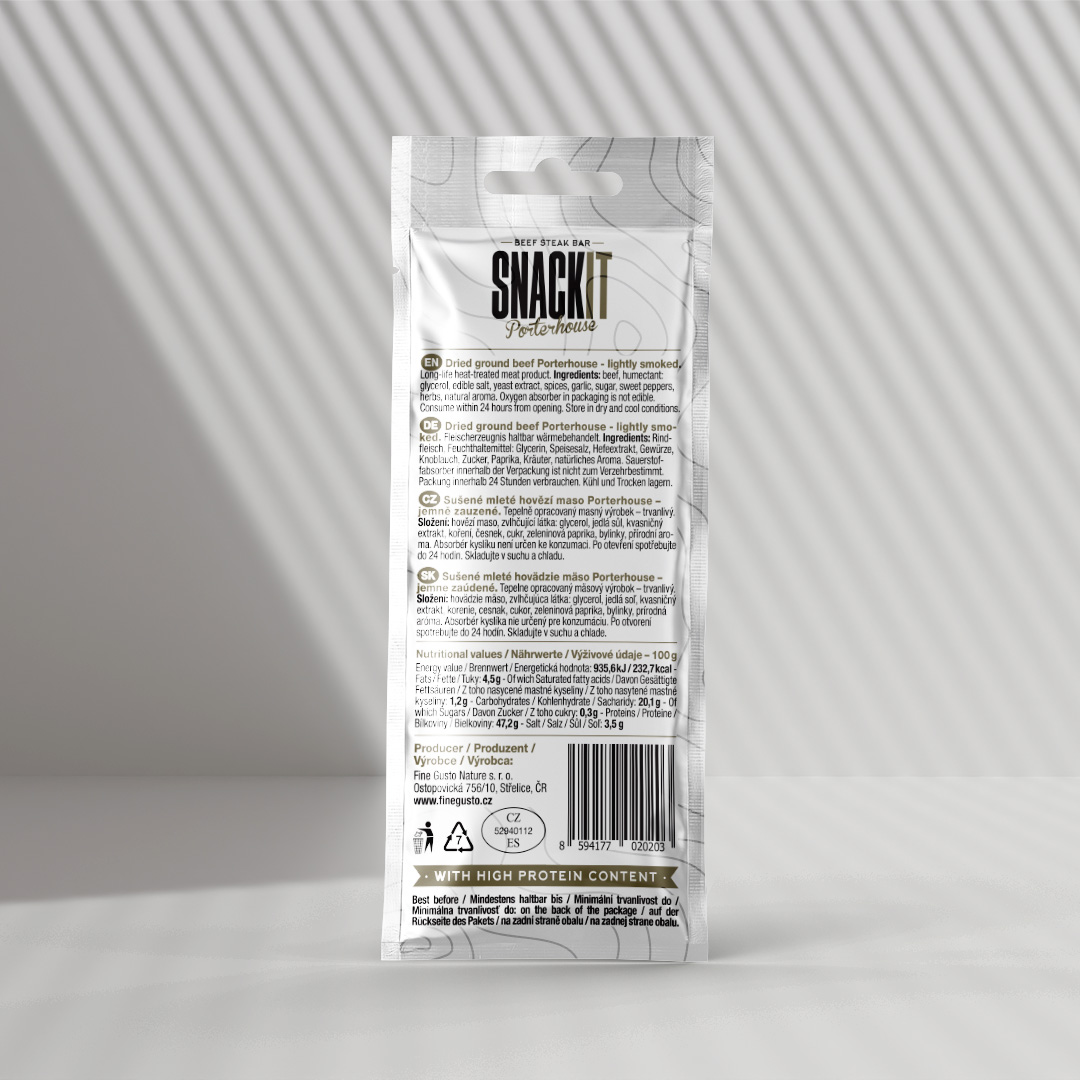
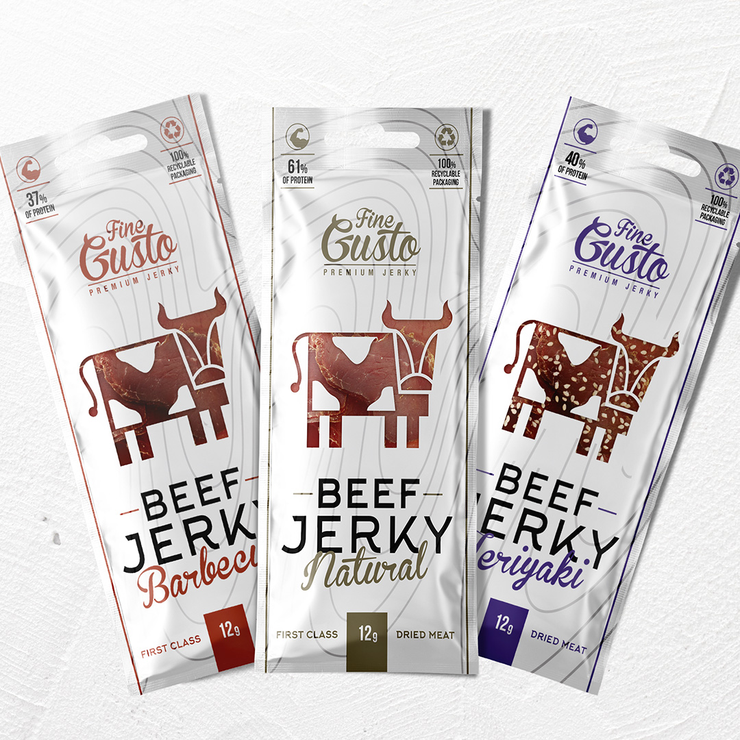
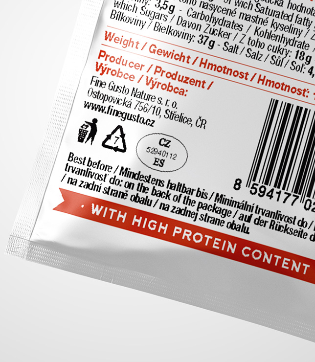
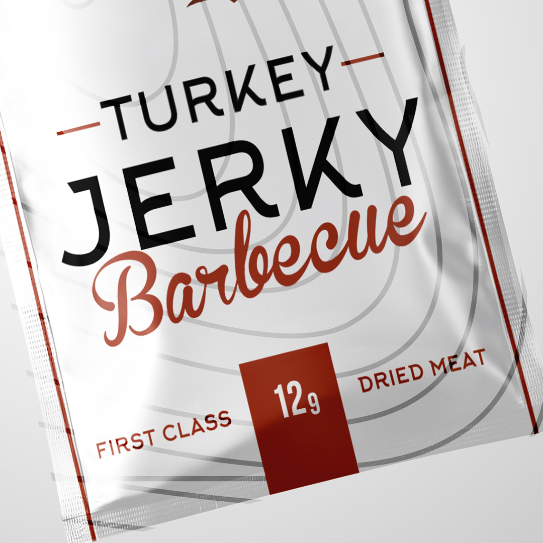
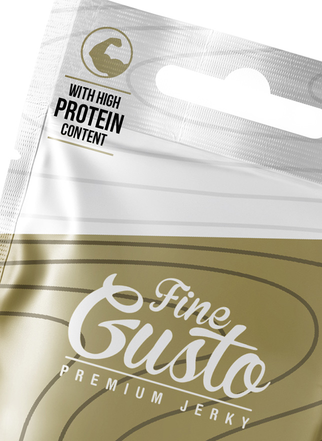
In an attempt to design a premium feel we had to drift away from the traditional jerky packaging (which is usually rustic, rough and has a “power” and “roughness” associated with it).

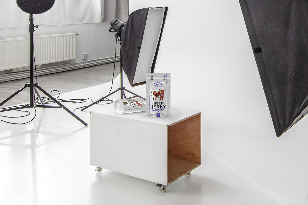
A healthy junk food is how jerky can be described. But it is also a sophisticated and bold protein source. Fine Gusto’s jerky and biltong are a top quality, premium product, made only from locally sourced ingredients from small farms, so the packaging has to reflect those factors.
A protein packed dried, cured meat cuts doesn’t sound very posh but our client made it possible. So the packs combine modern typography, subtle colour scheme and light-reflecting lines to really stand out from the rest.
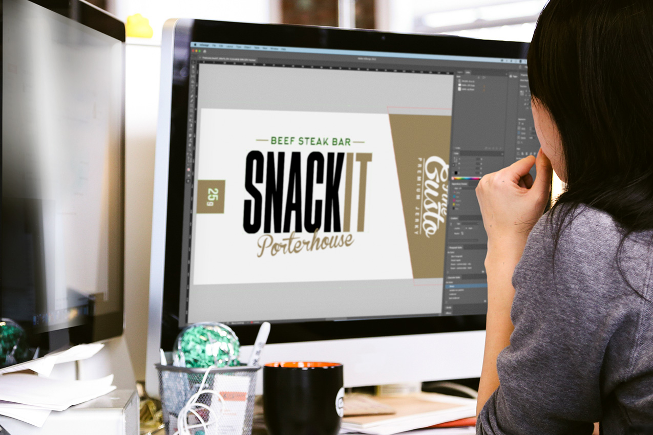
A small selection of the designs that didn’t make it on the shleves.


We will get back to you as soon as possible.
