X
share


X
share
view
next

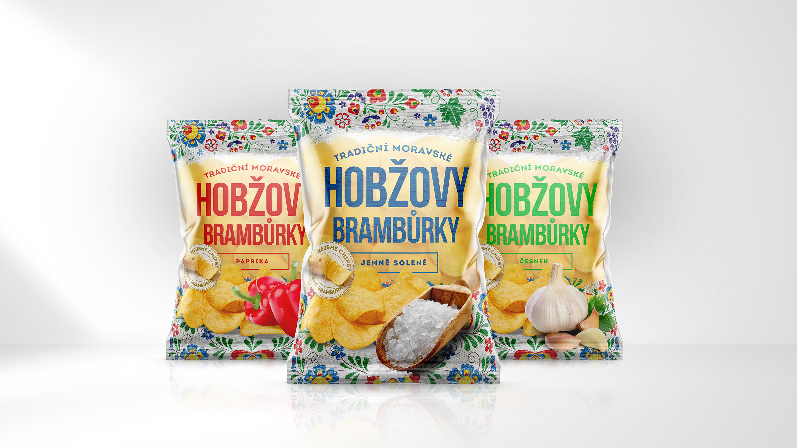

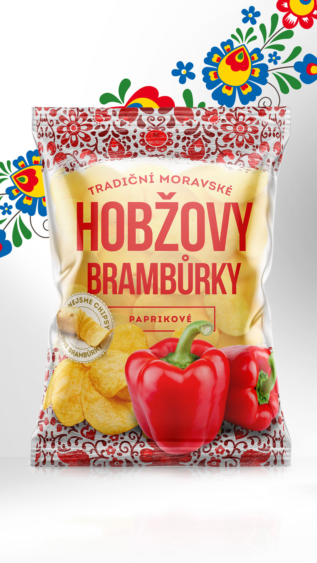
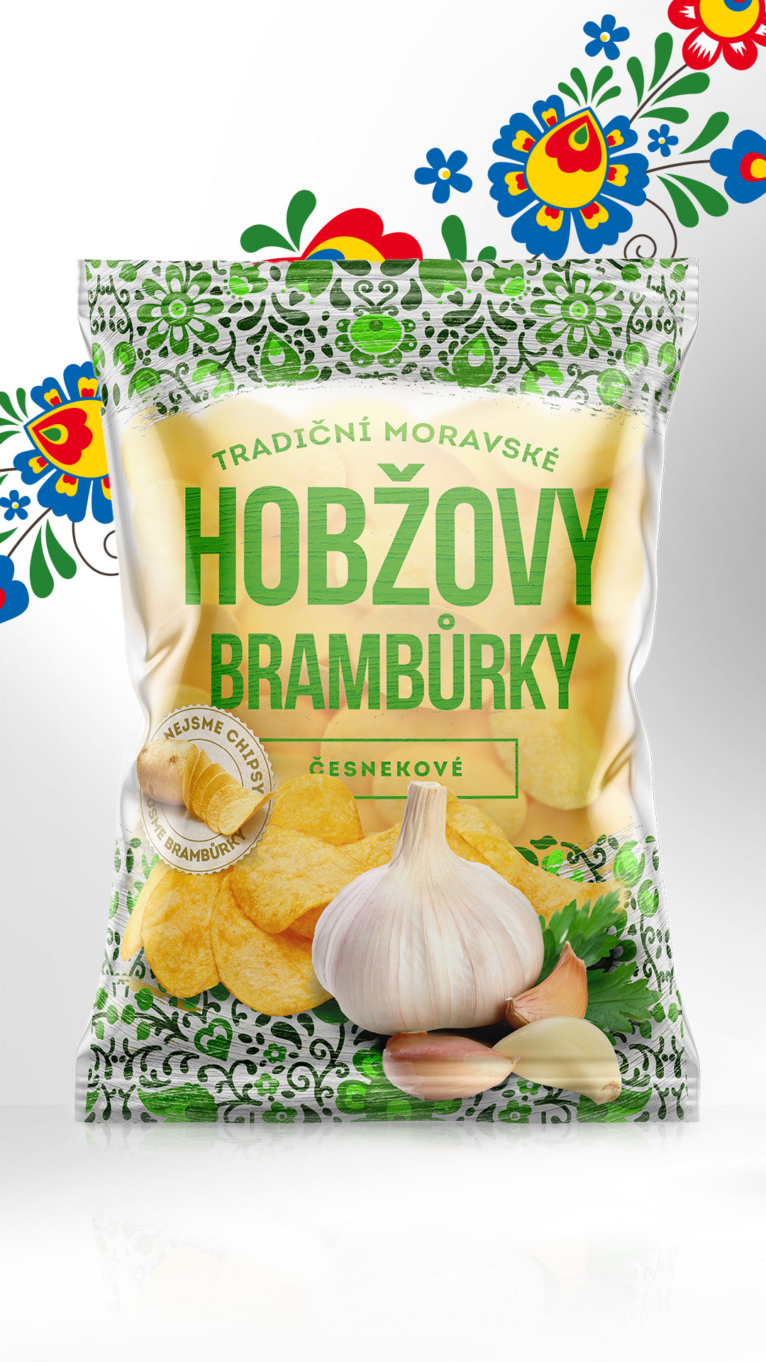


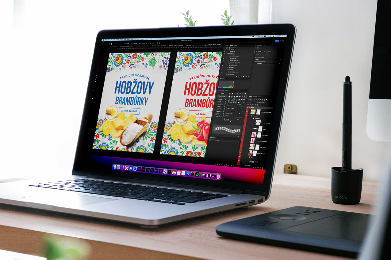
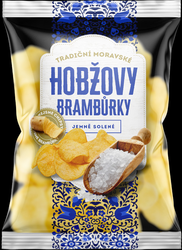
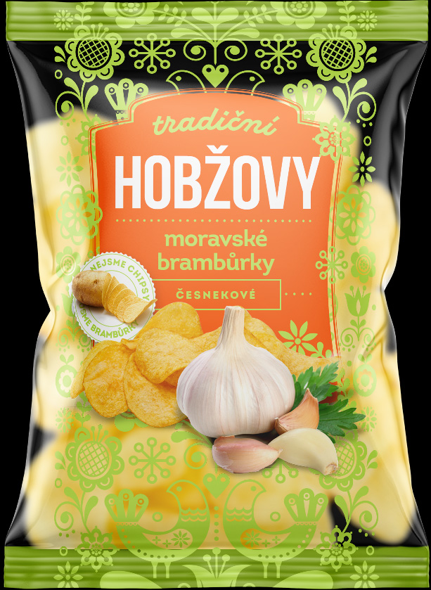
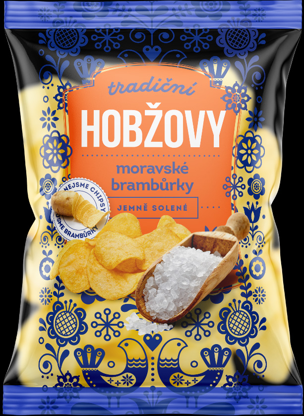
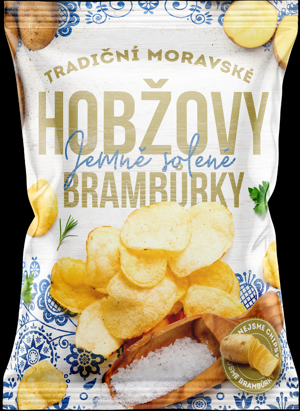
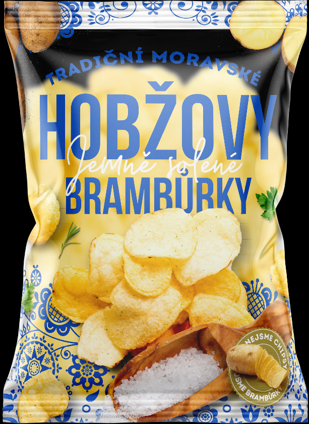
Redesign the famous potato snack, the Moravian product line, by Petr Hobža. Important notes: Keep the traditional Moravian motives, but make it feel modern, stay true to our brand concepts and emphasise the fact that it’s not chips (no “chips” or “crisps” on the packaging).


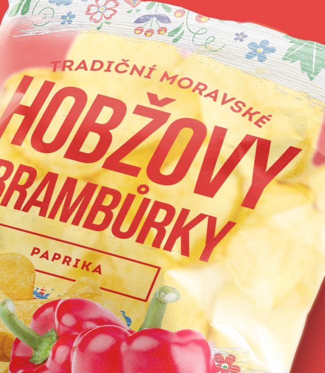
Being one of the most famous snacks brands in the Czech Republic, Hobža needed no revolutionary ideas to break into the market. Instead it was all about blending the familiar with the new.

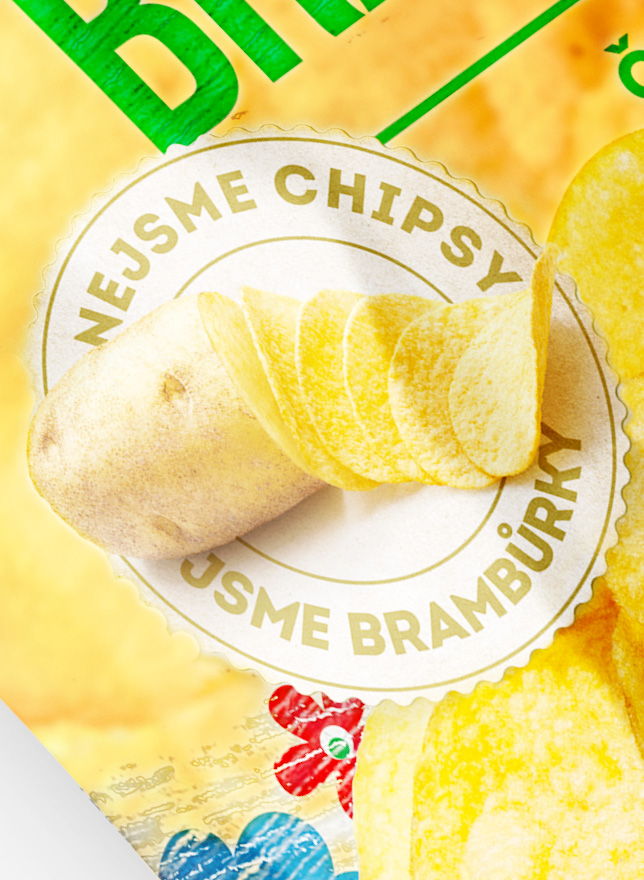
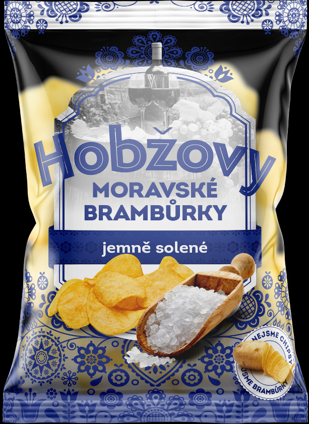
A highly important detail was the claim that the potato pieces do not refer to themselves as “chips” but rather with the Czech word “brambůrky” which for all intents & purposes means the same thing.
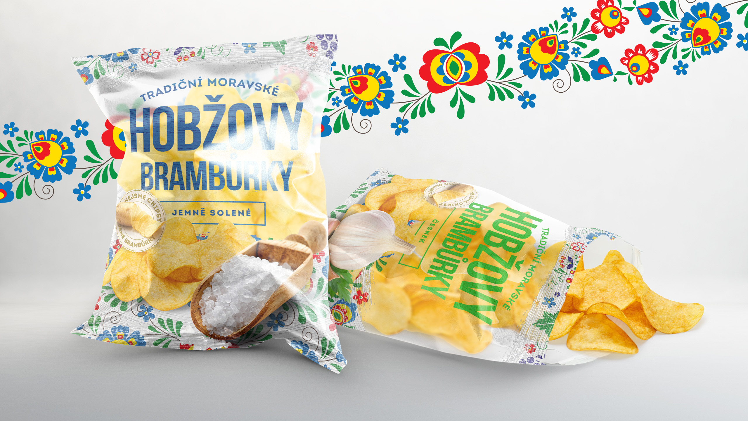
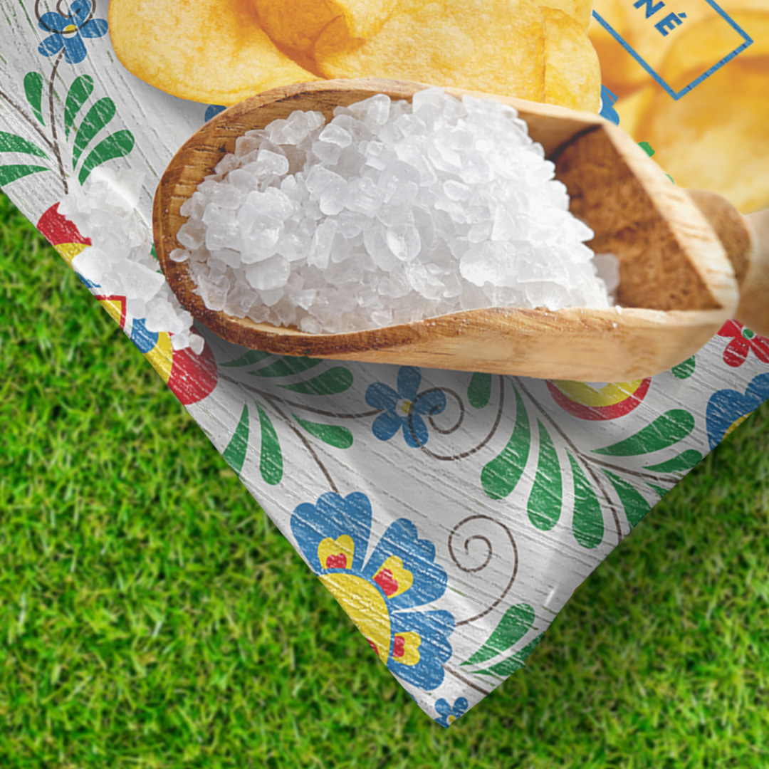
The key to this redesign was the seamless blend of traditional Moravian folklore elements and the new, modern approach. The pattern represents the culture and the other elements - what the customer would expect from a modern chips bag. Chips bag? No wait … a bag of brambůrky.
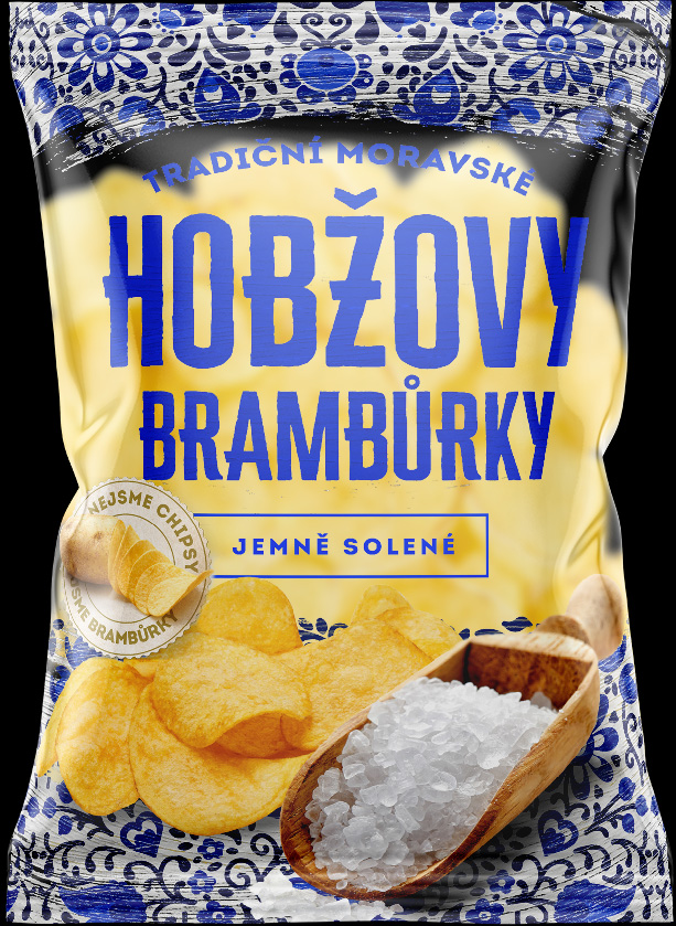
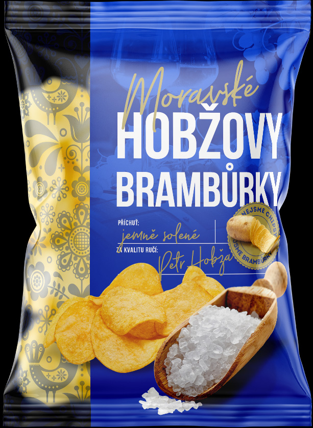
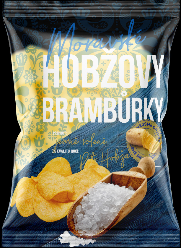
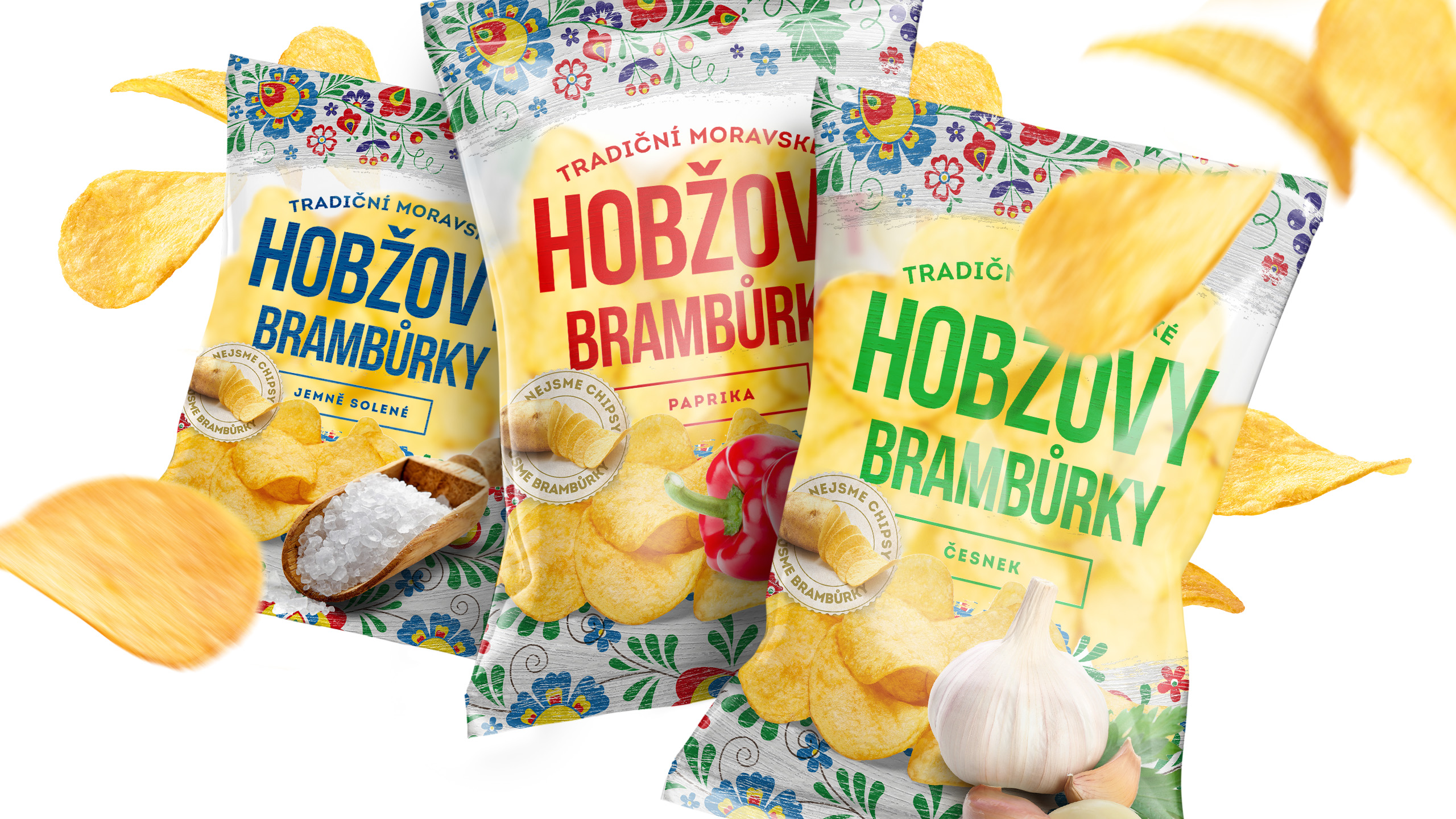
A small selection of the designs that didn’t make it on the shleves.


We will get back to you as soon as possible.