X
share
view
next

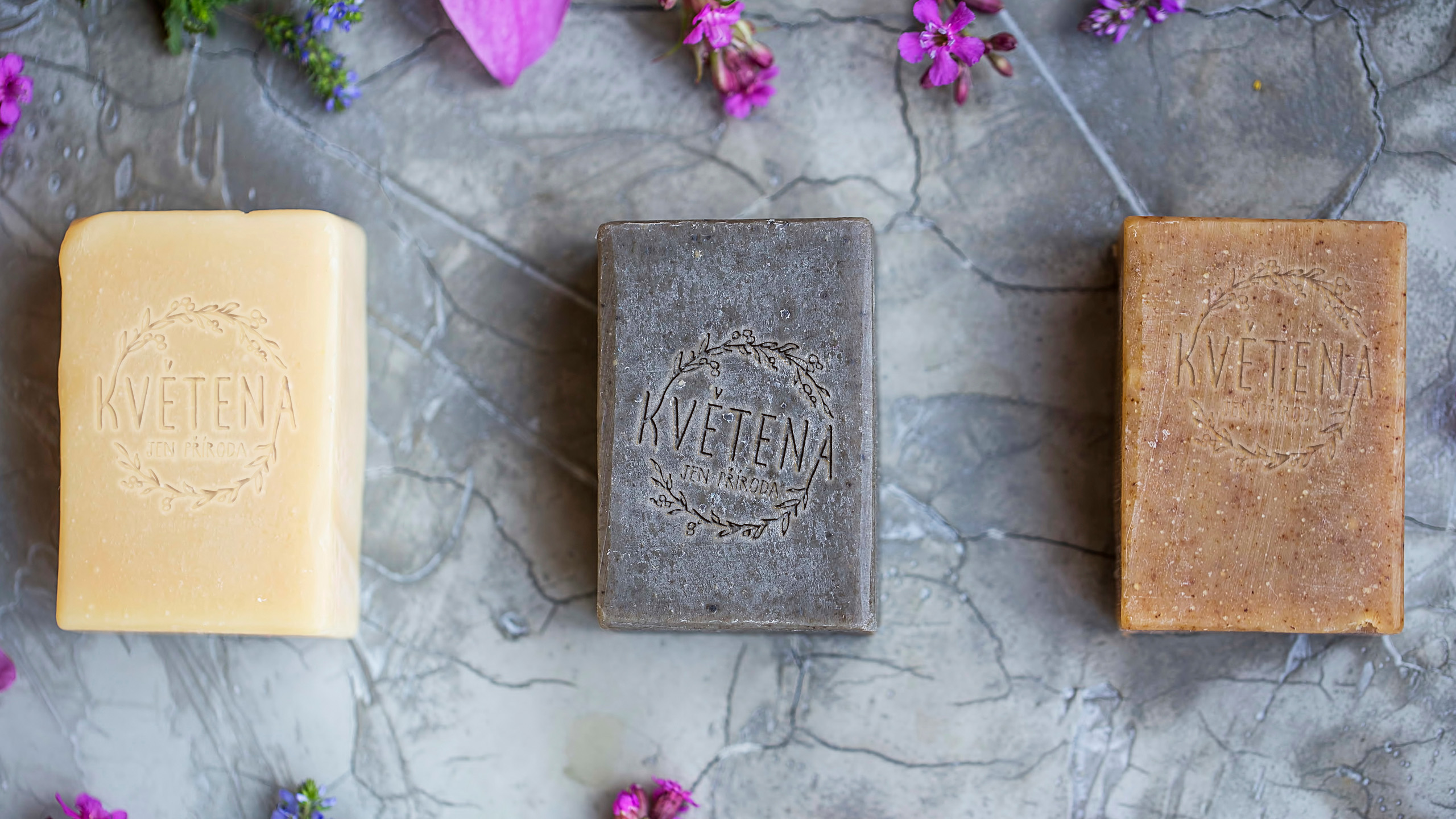

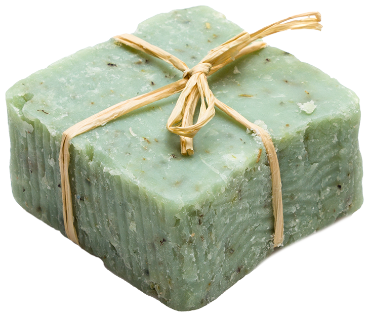
“Creating everything from the packages for all the products to the overall brand strategy and online presence was the job given to us by Květena, an eco-friendly, natural, organic cosmetics brand with a focus on locally sourced ingredients and sustainability.



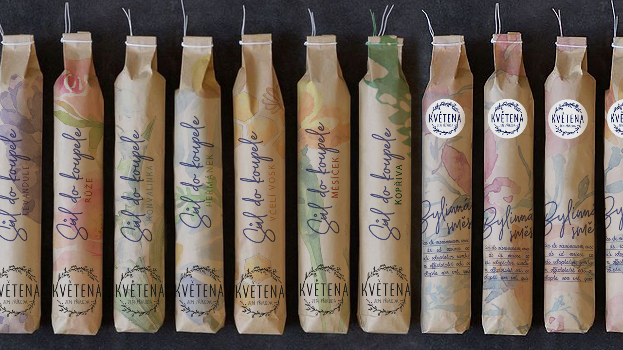
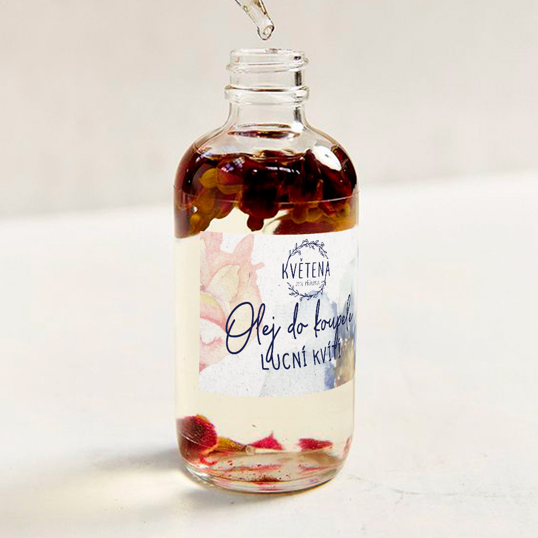
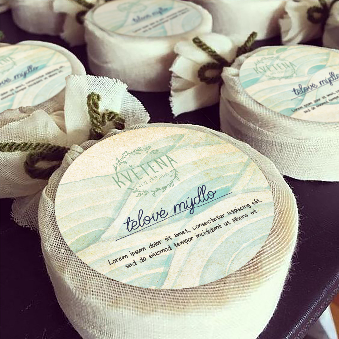
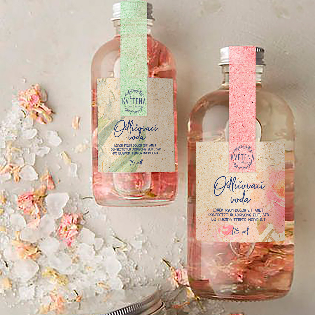
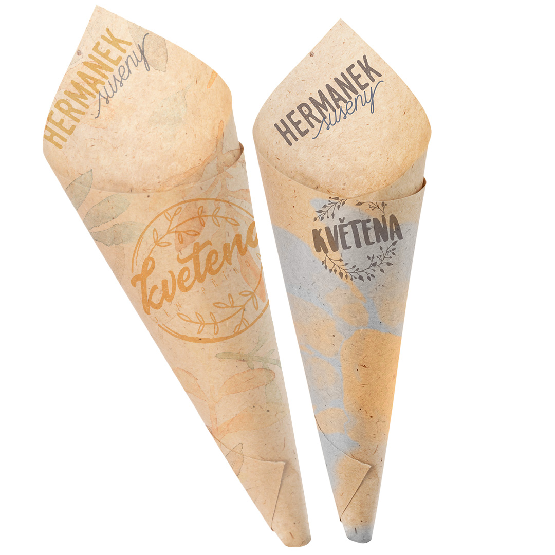
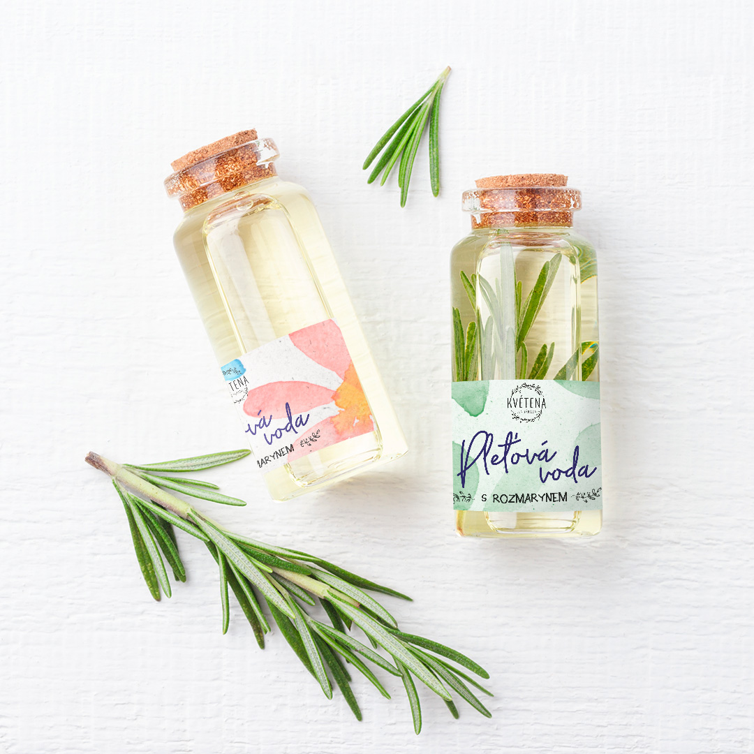
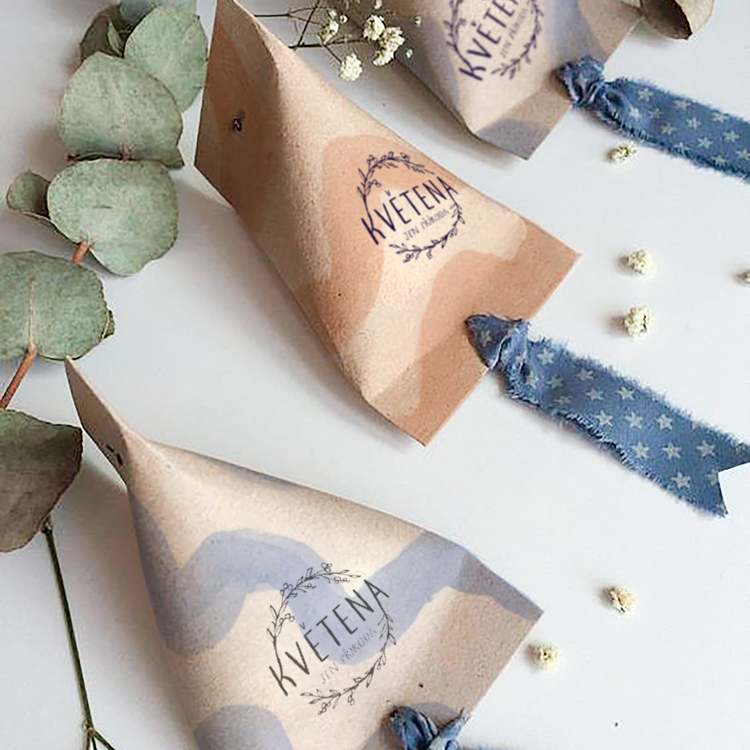
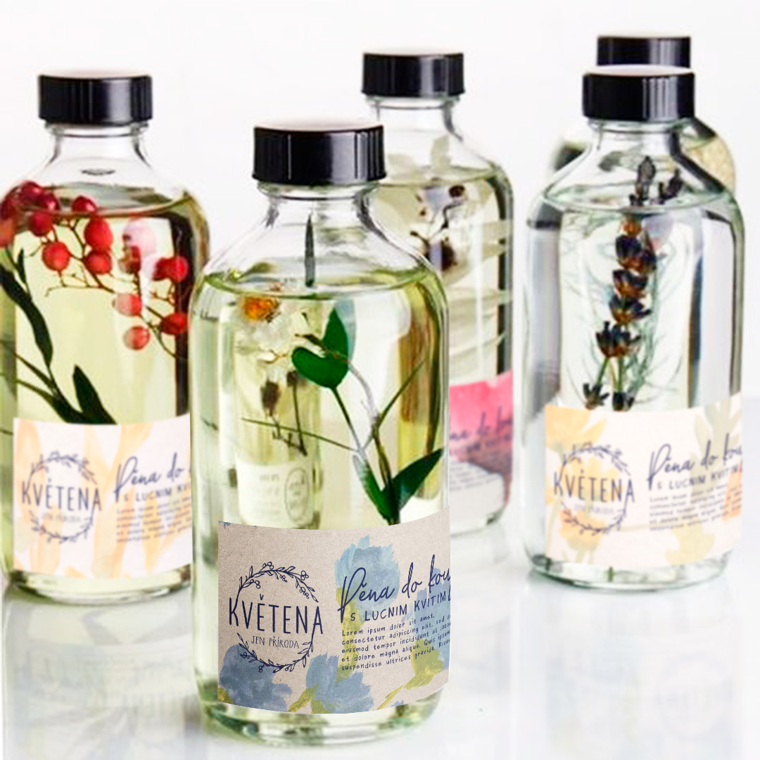
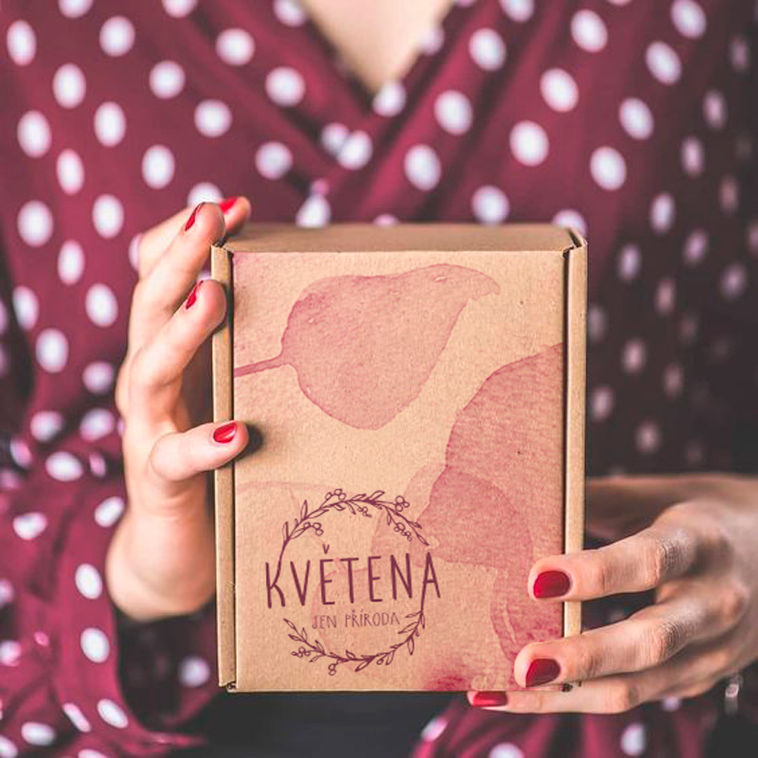
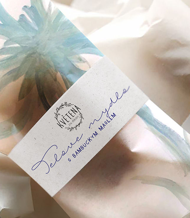
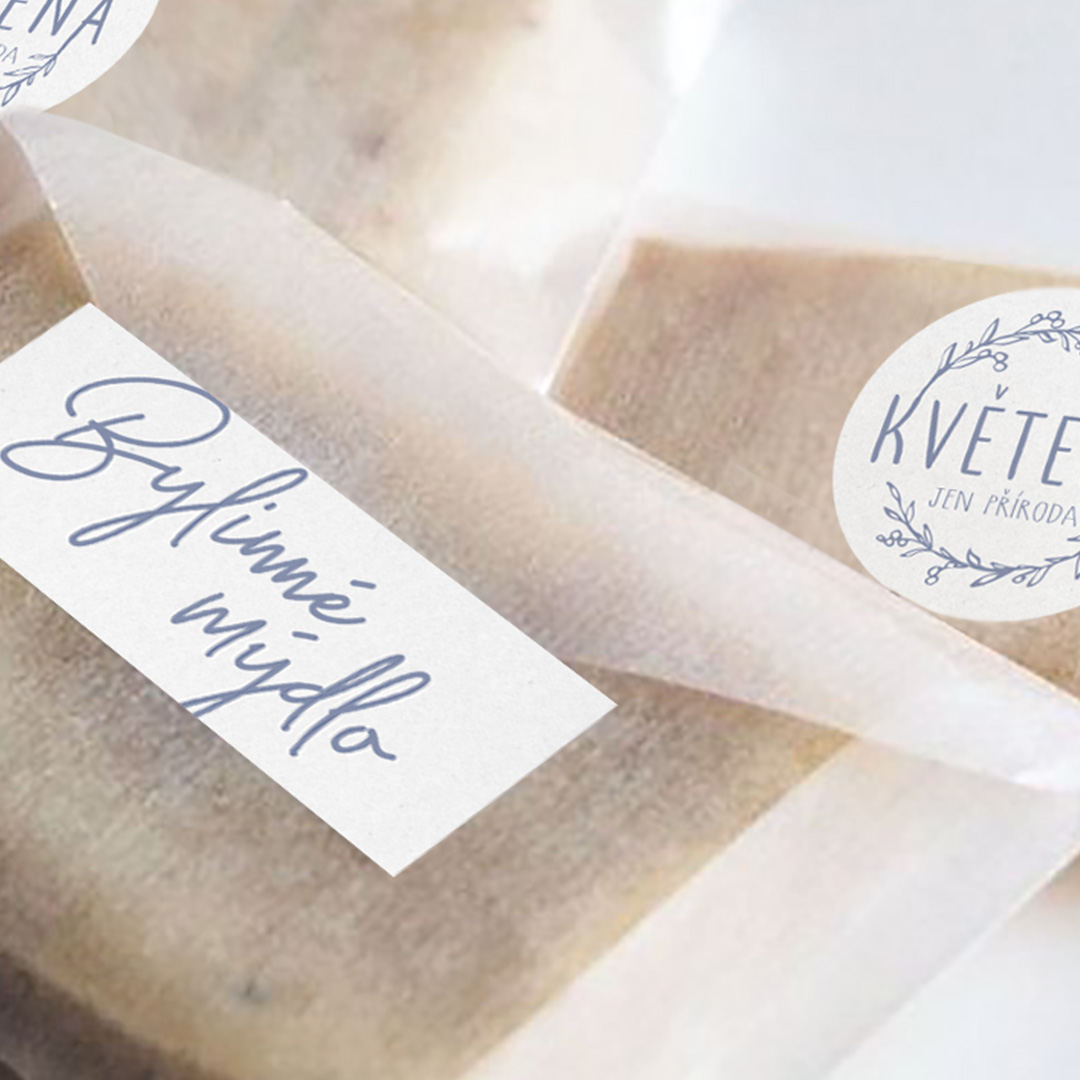
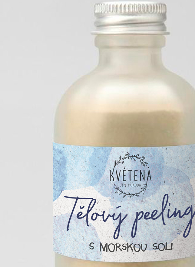
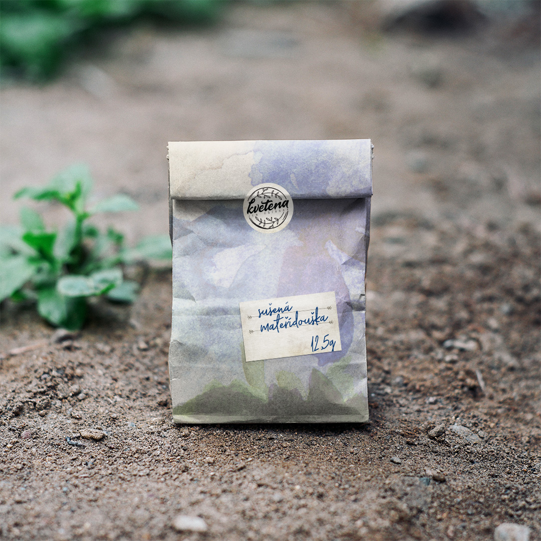
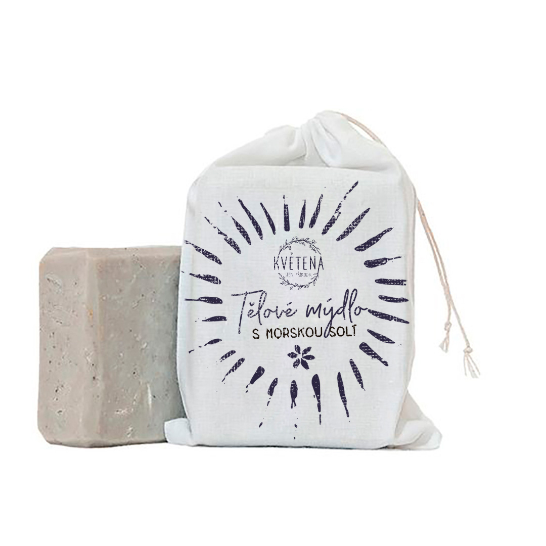
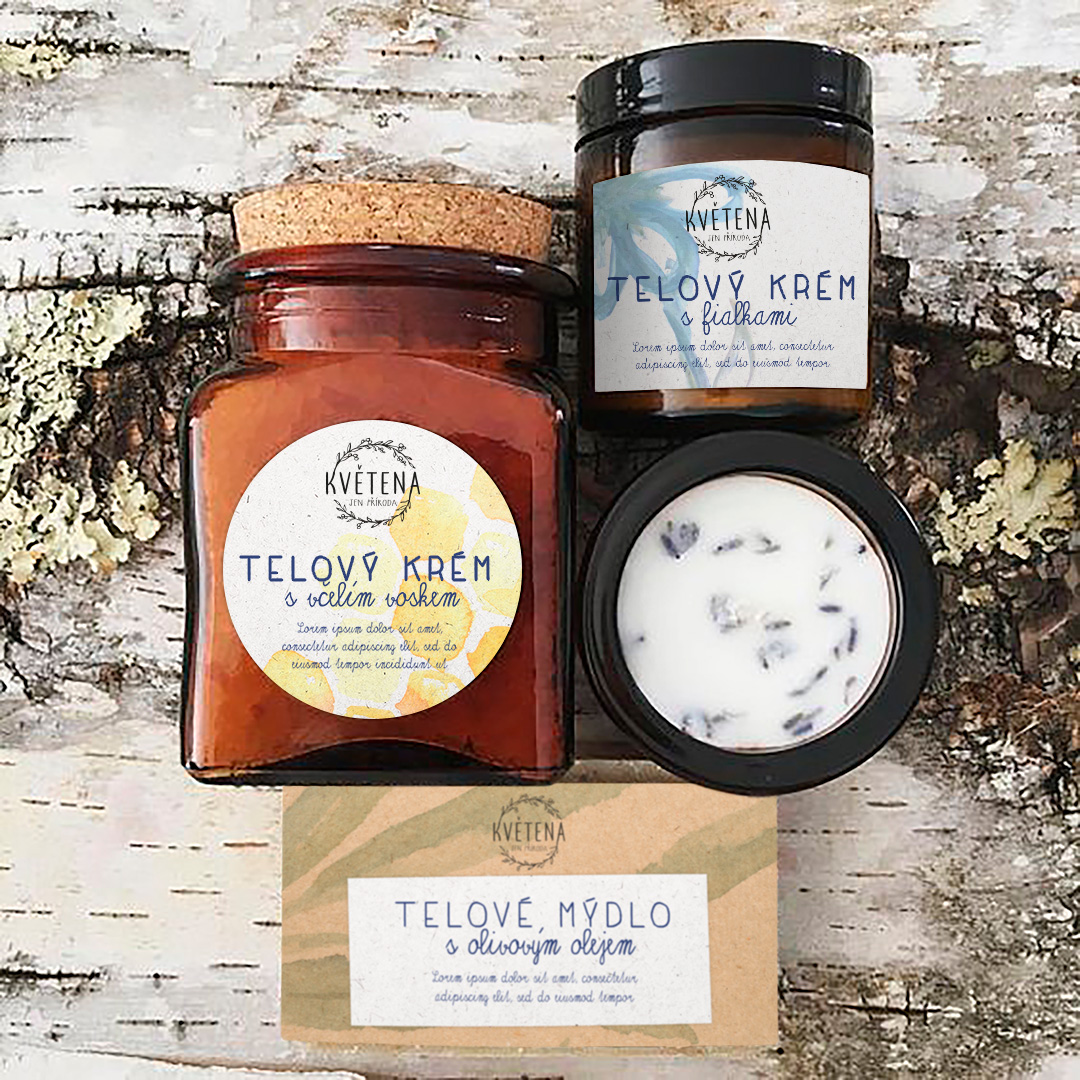
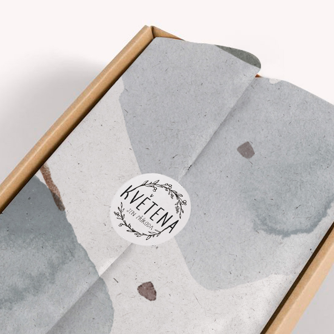
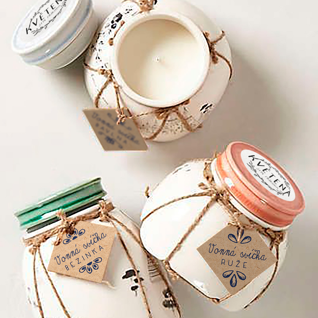
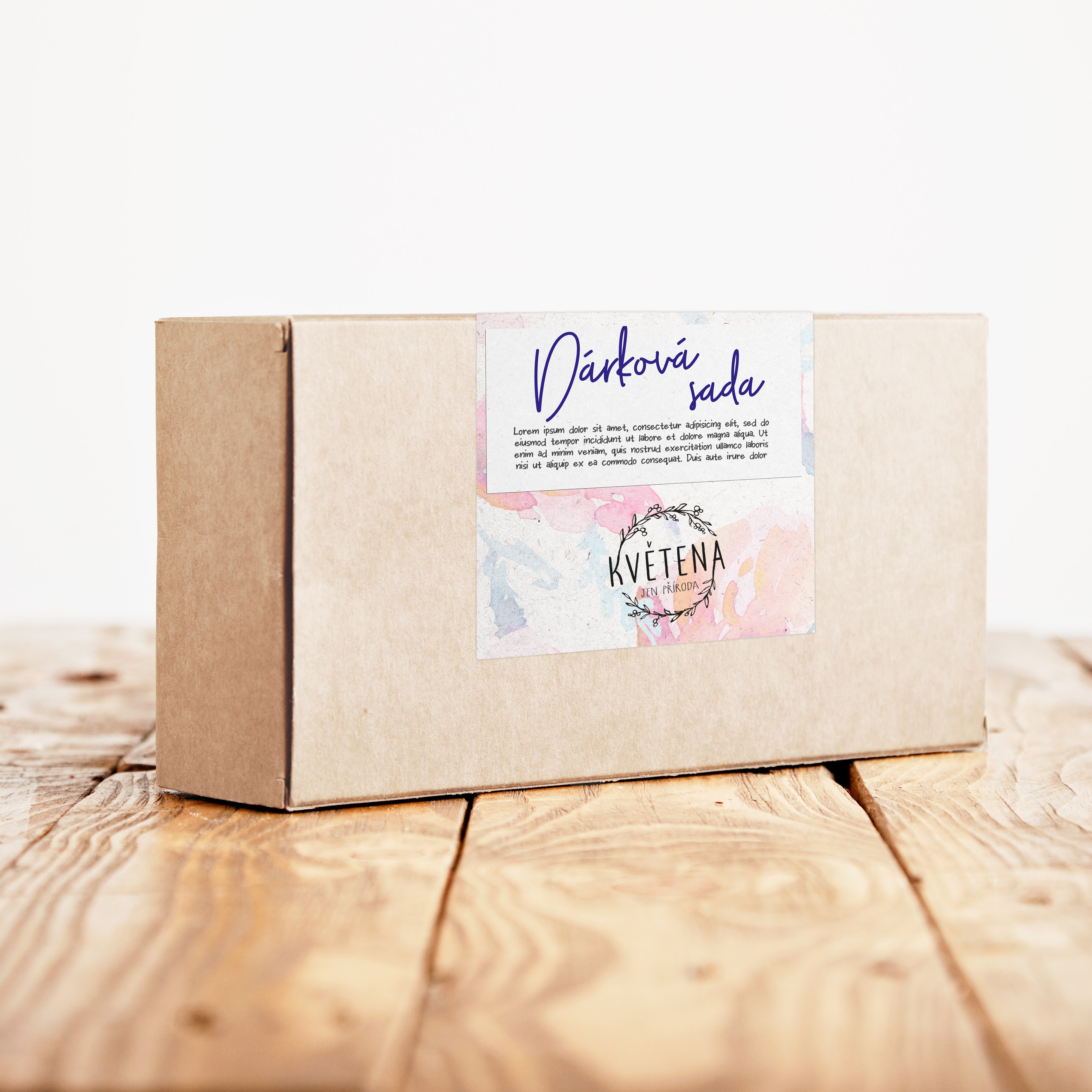
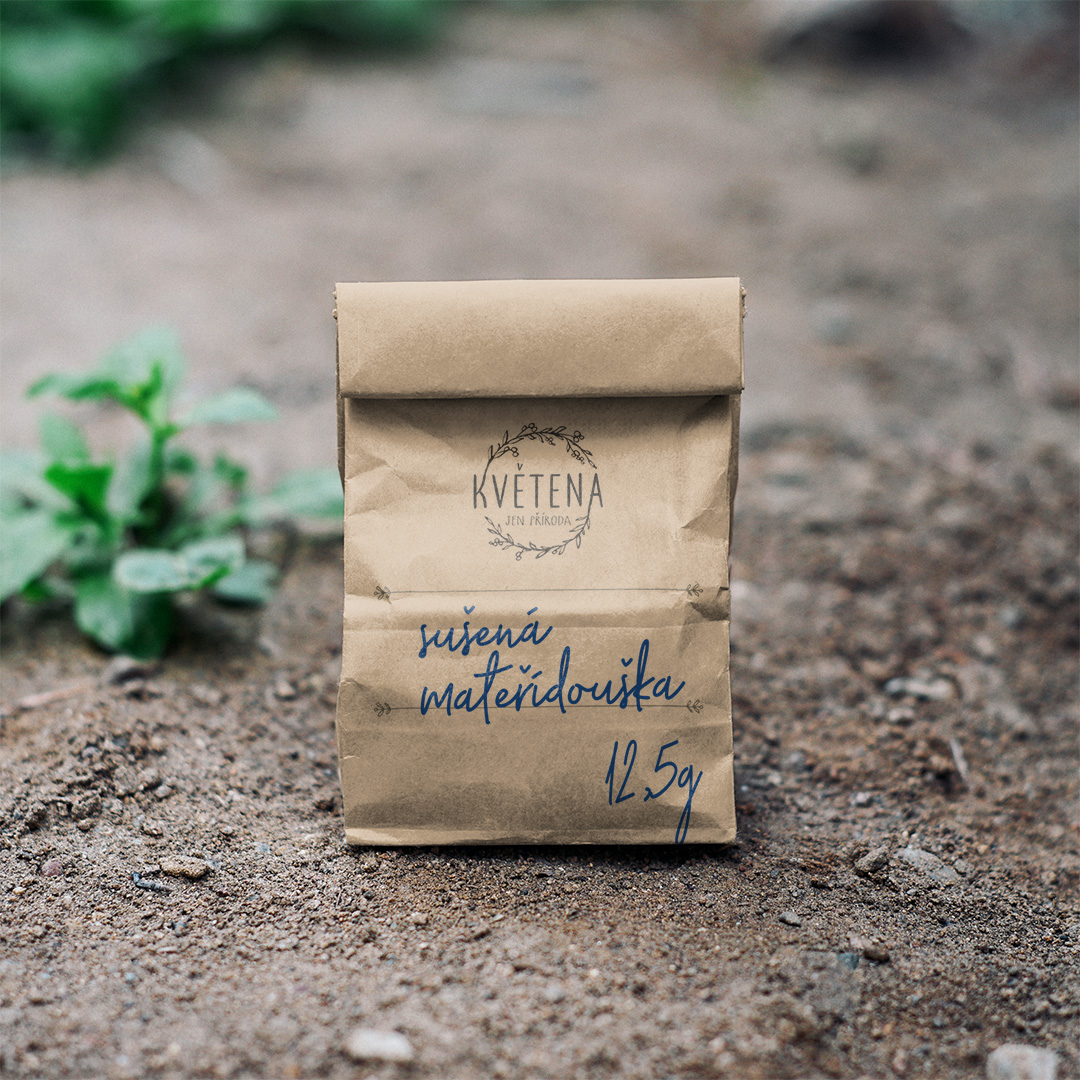
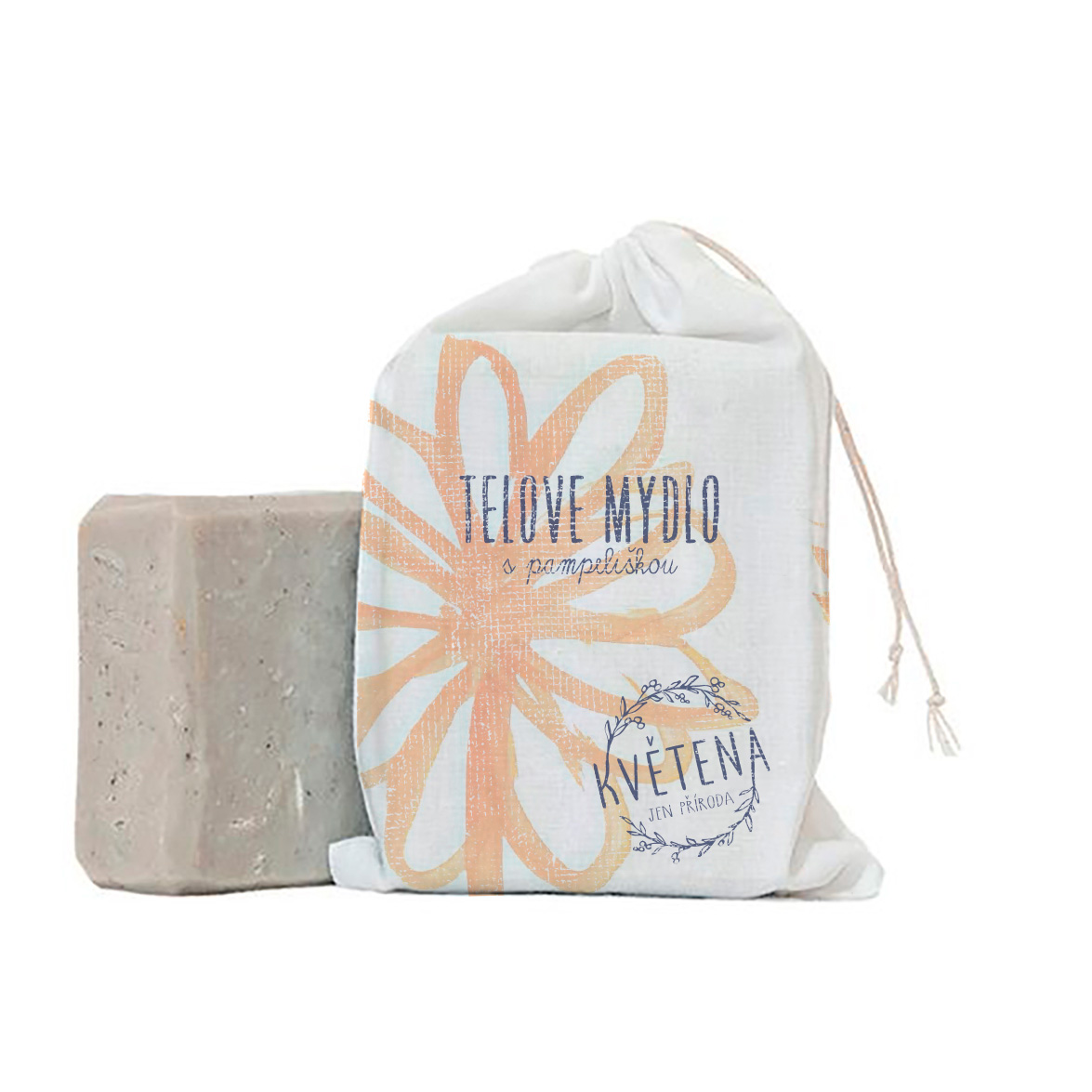
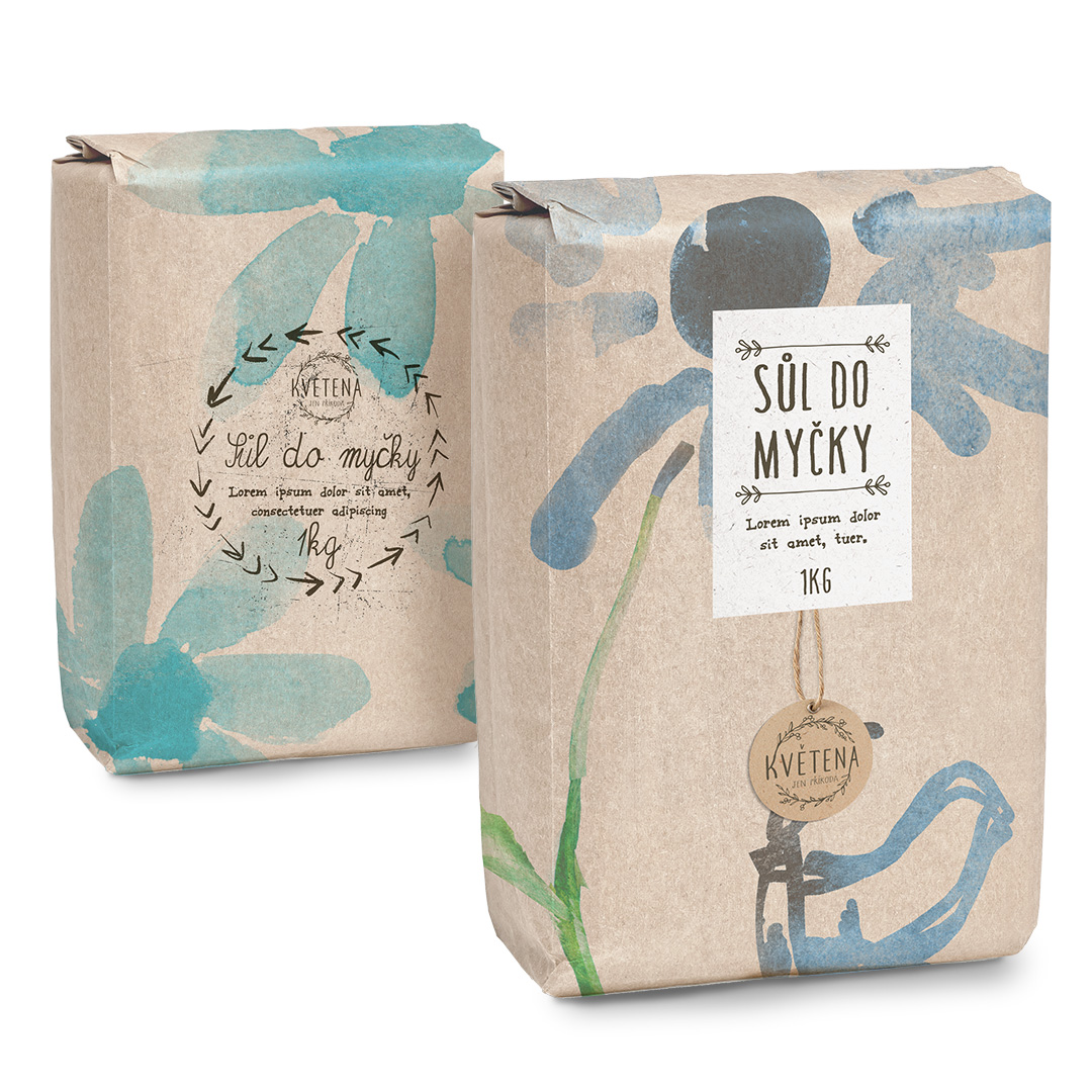
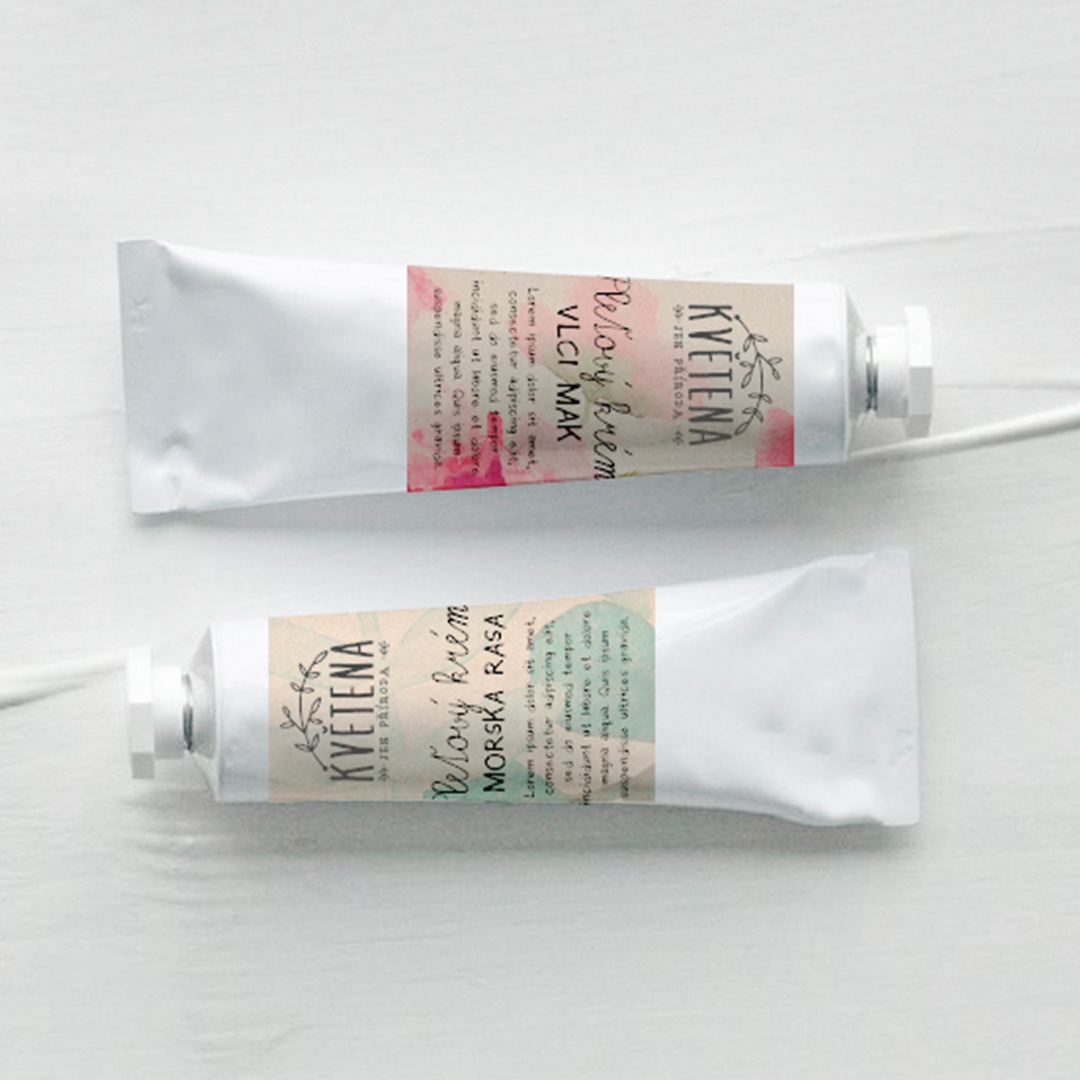
There was no lack of inspiration when it came to the creation of the visual identity of the brand. In fact the market is flooded with brands with similar concept and philosophy. So the challenge here was to make Květena stand out from the rest,.

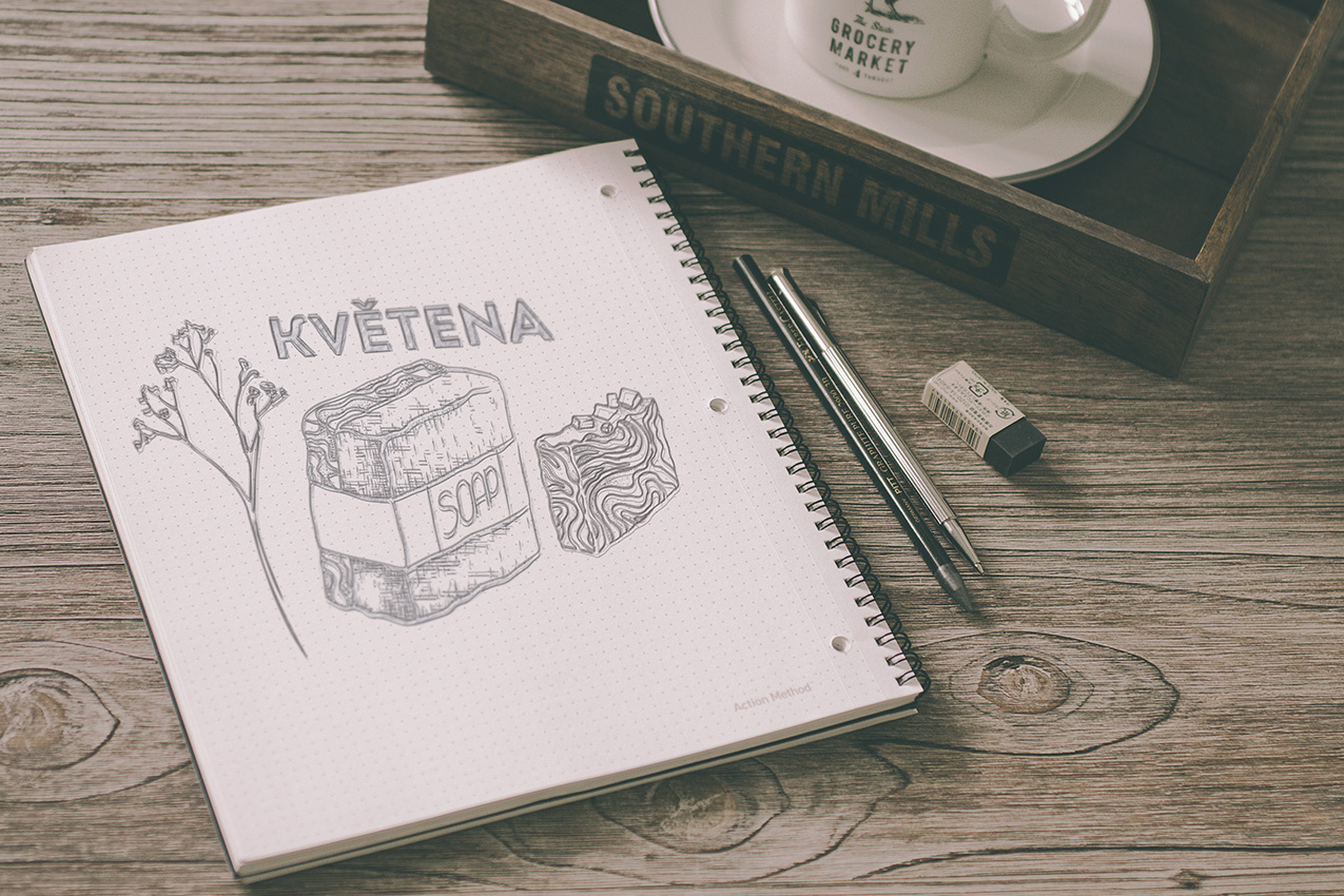
A rather unique thing about our client was that they focused on a plethora of different products. Mostly oils and salts, but also a variety of skincare items and home products. Everything however has the common traits of being a quality, eco-friendly product, with environmentally friendly package.
The key here was to keep it simple. A blend of pastele colours, motives from nature, “handwritten” labels and an overall sense of it all being rustic, homemade in smaller batches and of really high quality.



We will get back to you as soon as possible.
