X
share
view
next

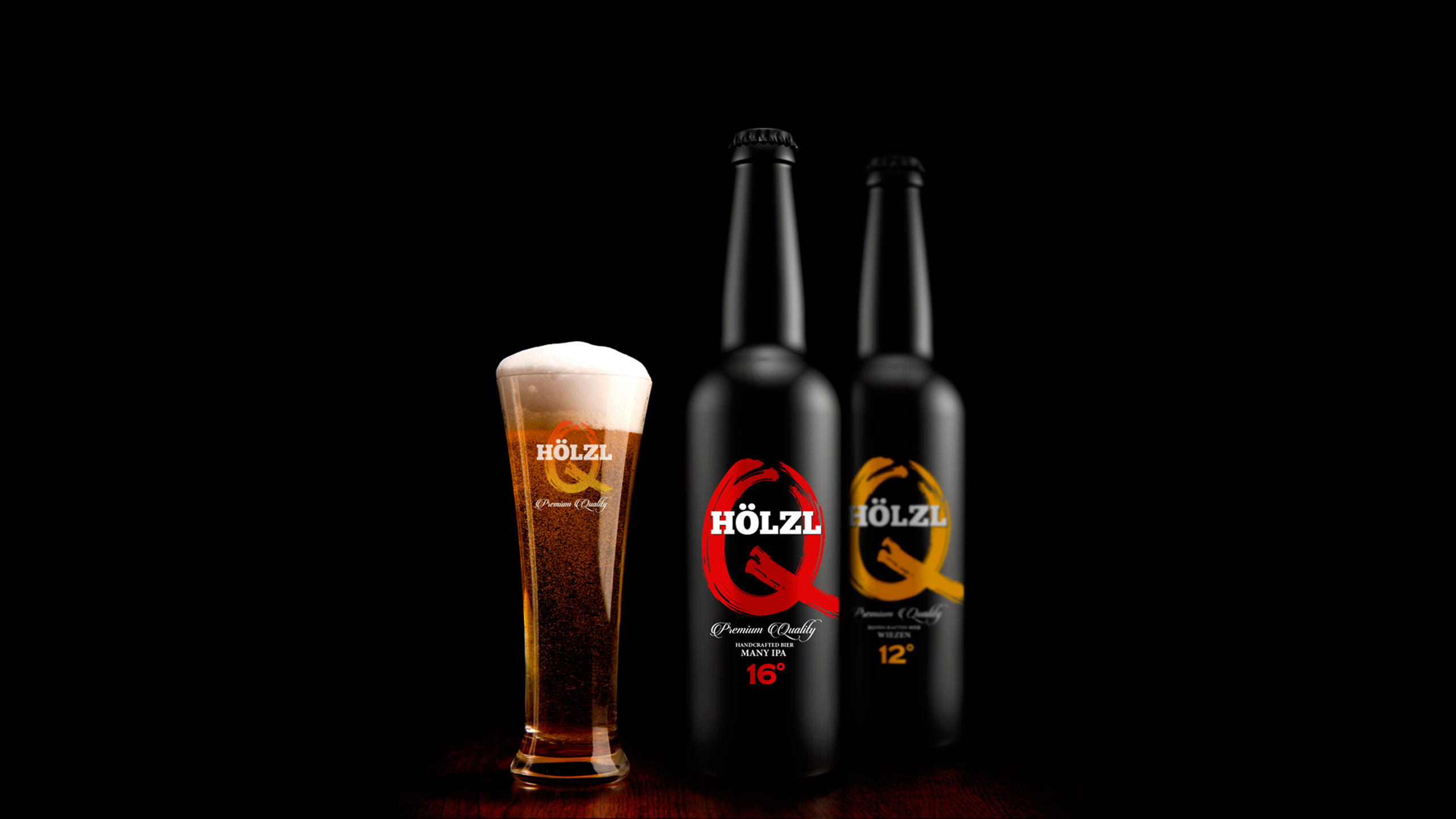


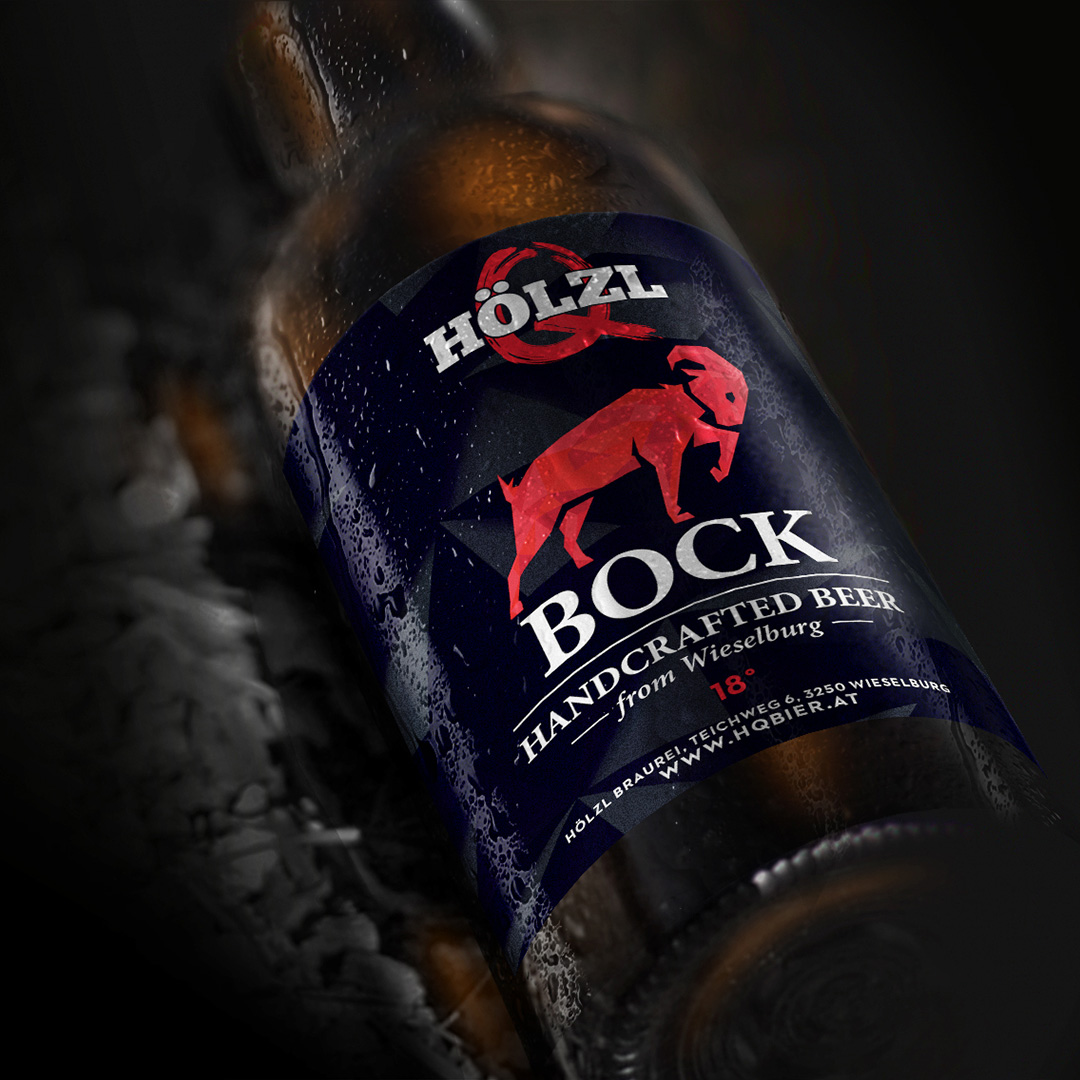
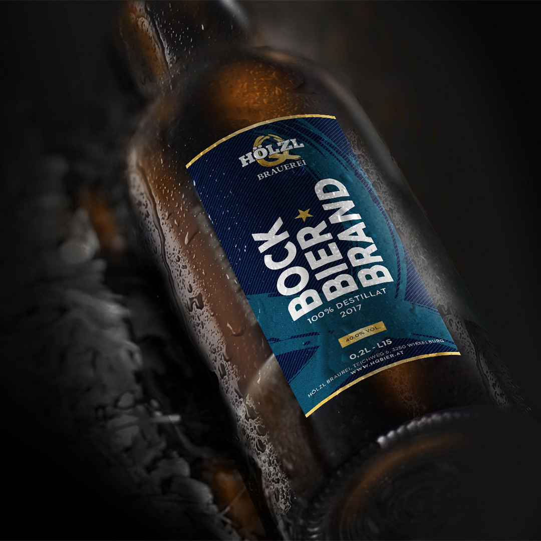
“Build the whole brand from the ground up, was what we were challanged with. We created everything from the brand identity itself to the actual logo, packaging, digital & physical / print presence.


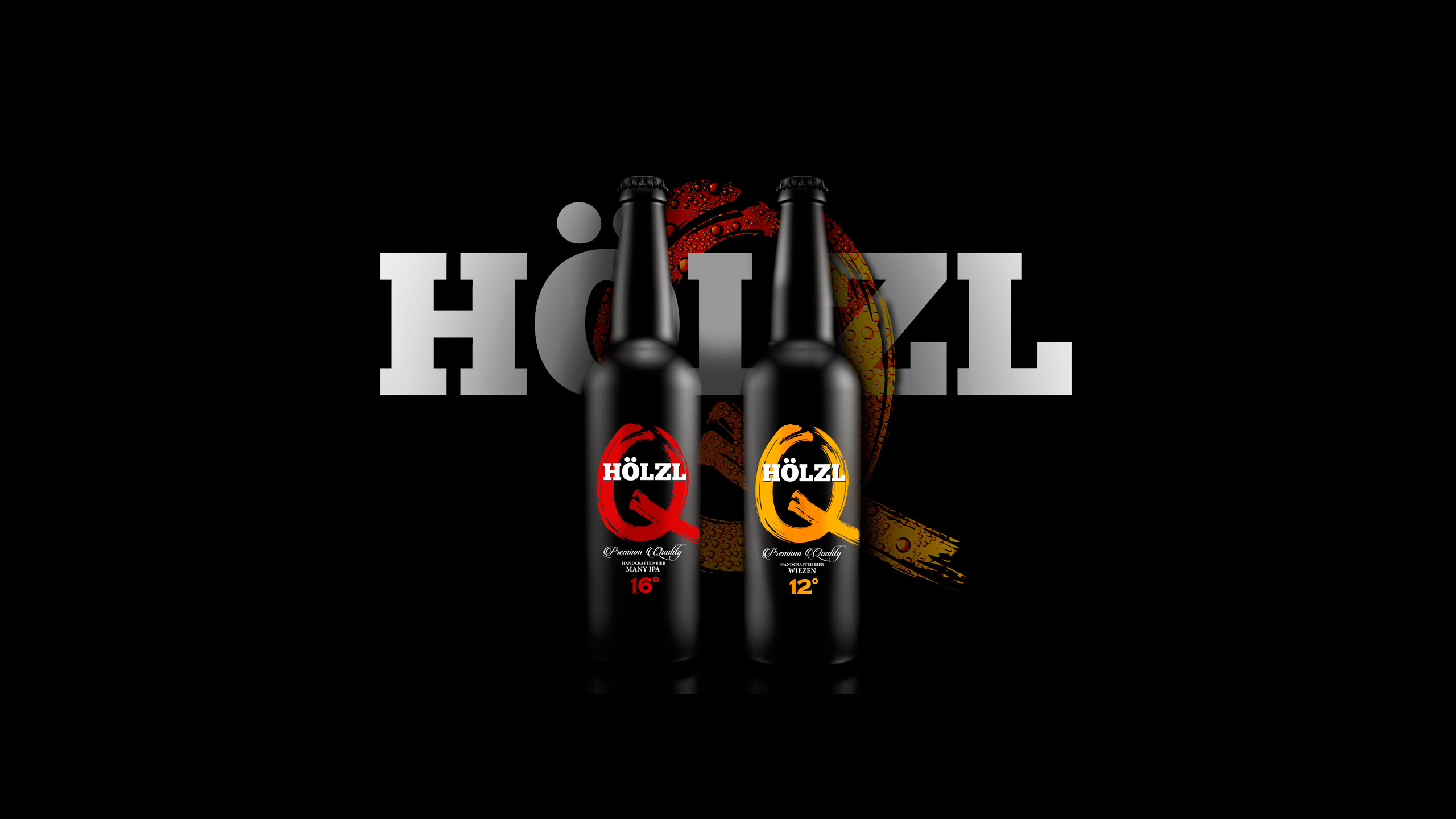
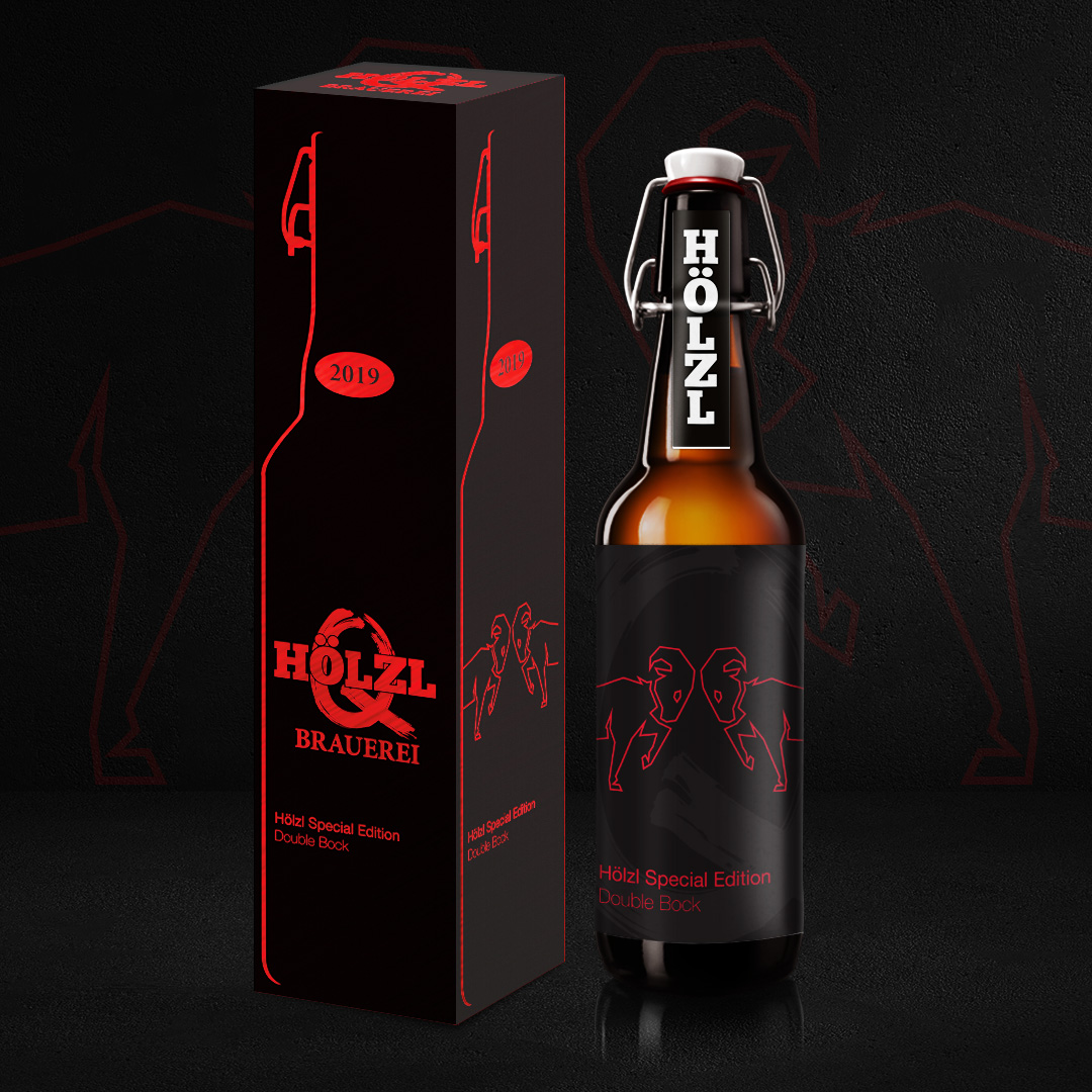
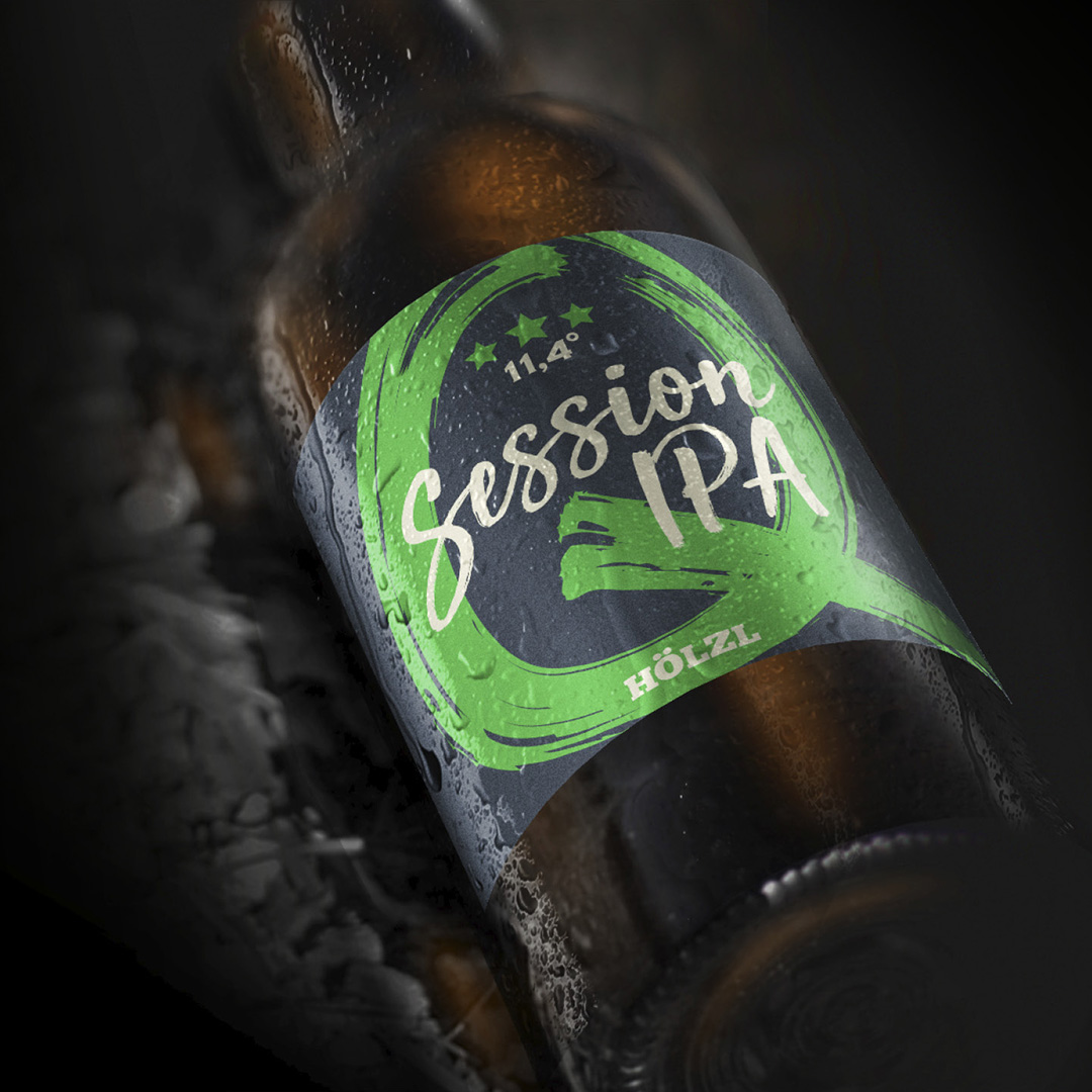
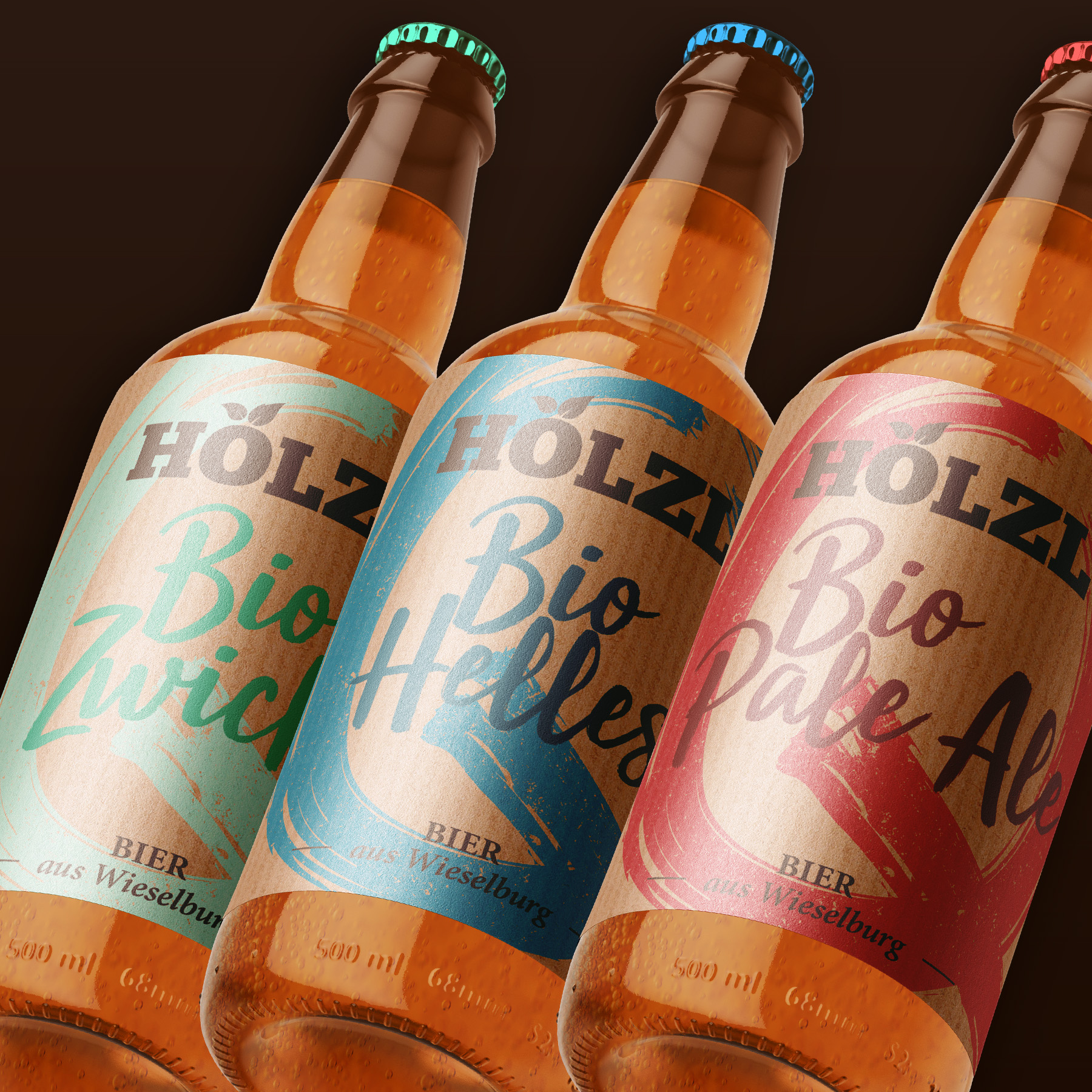
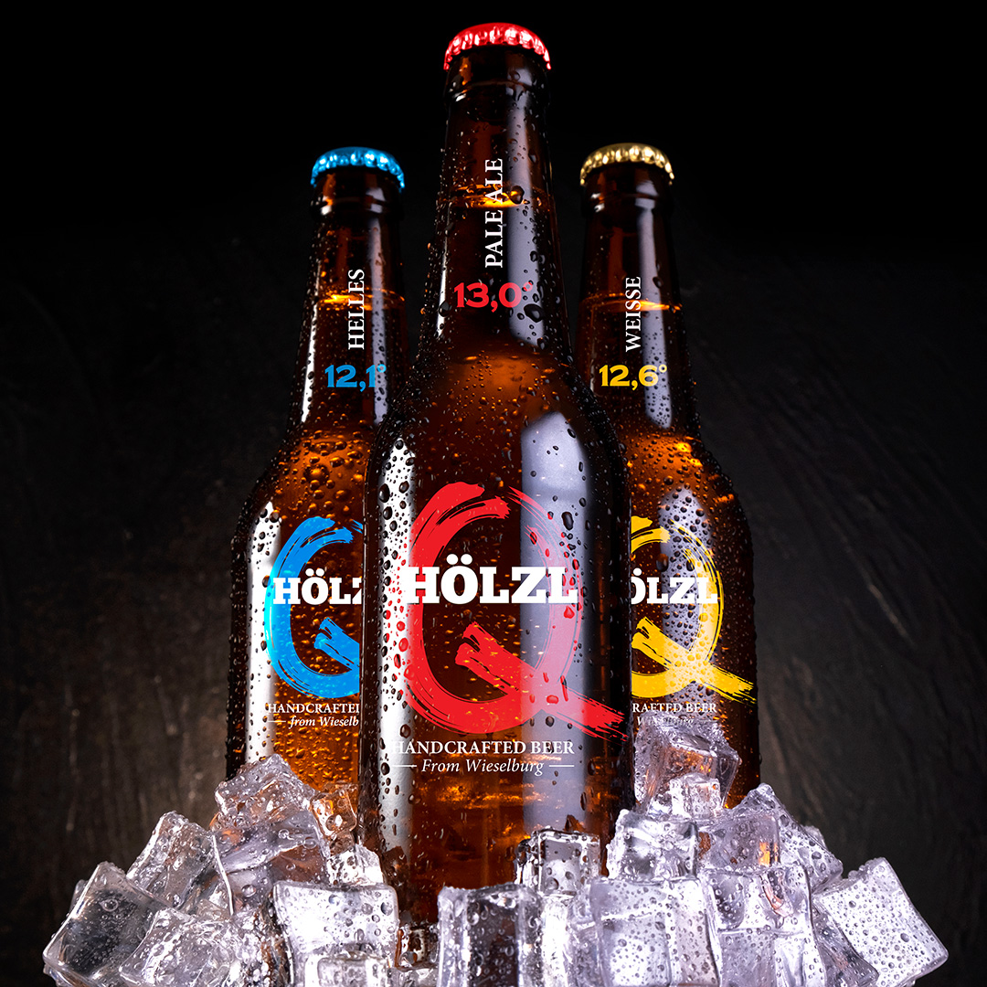
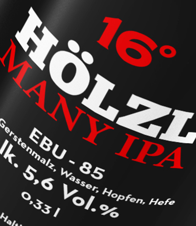
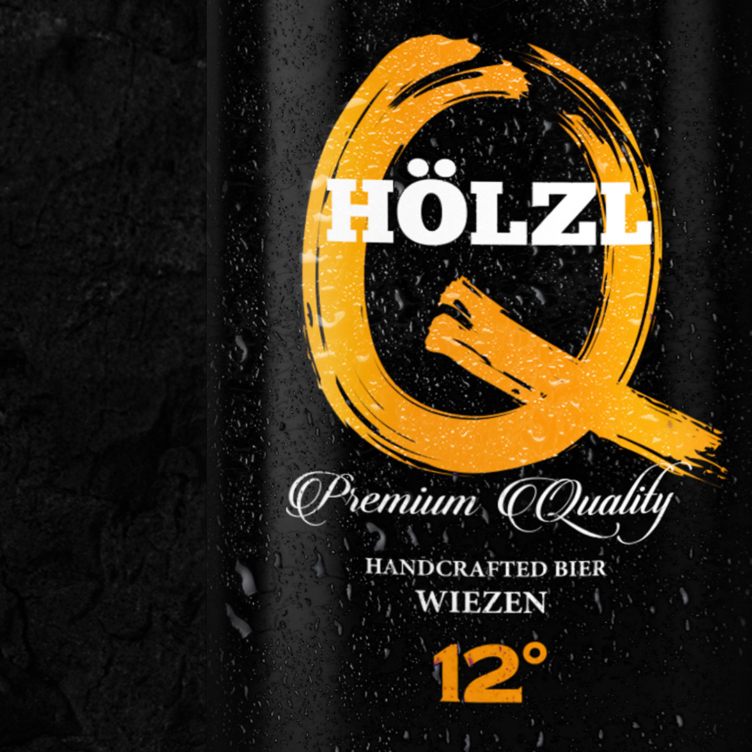
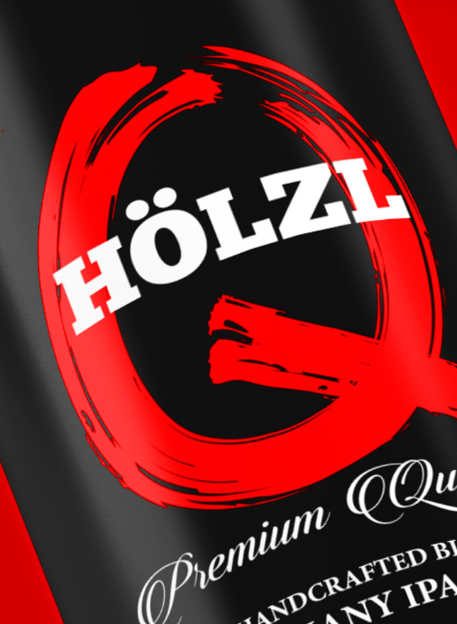
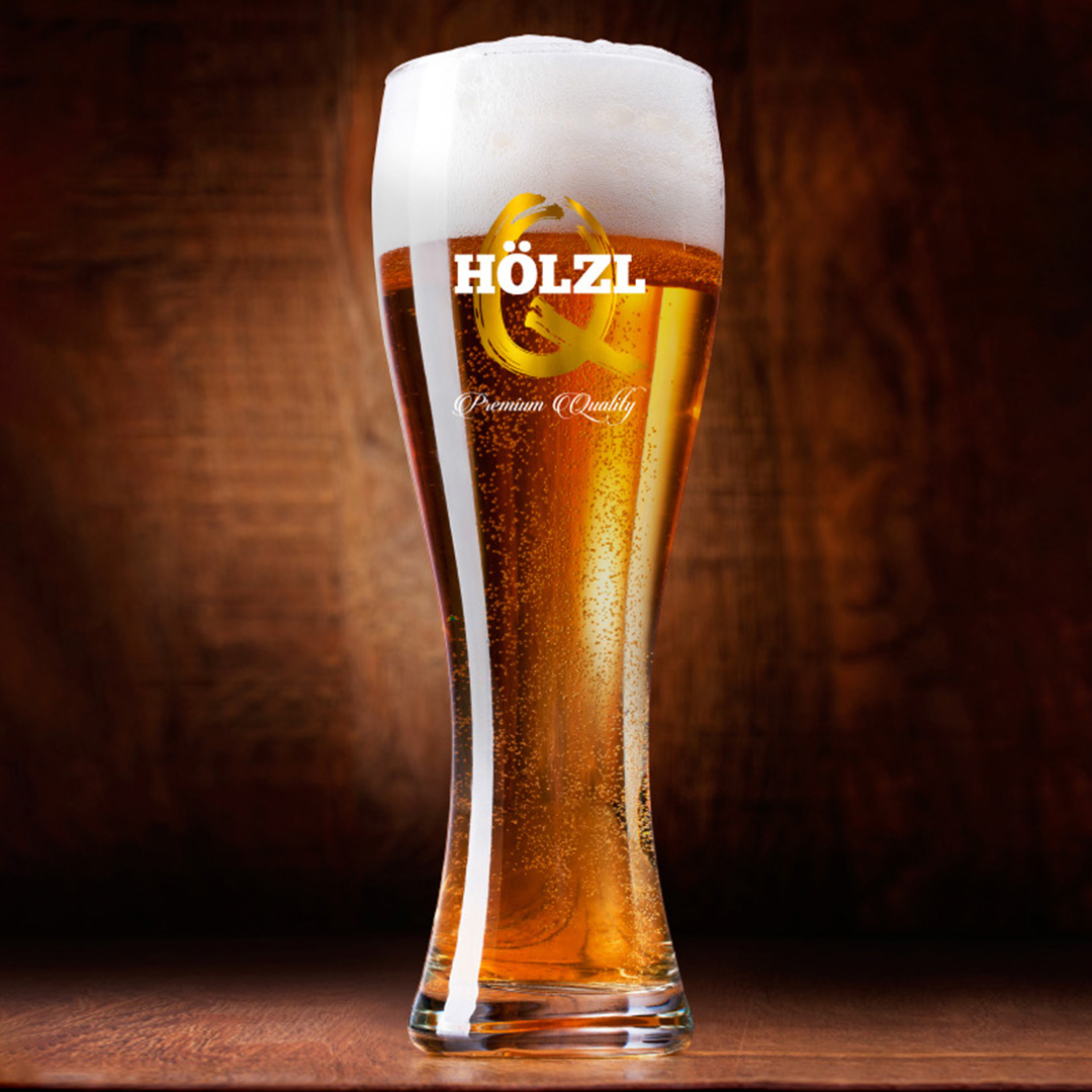
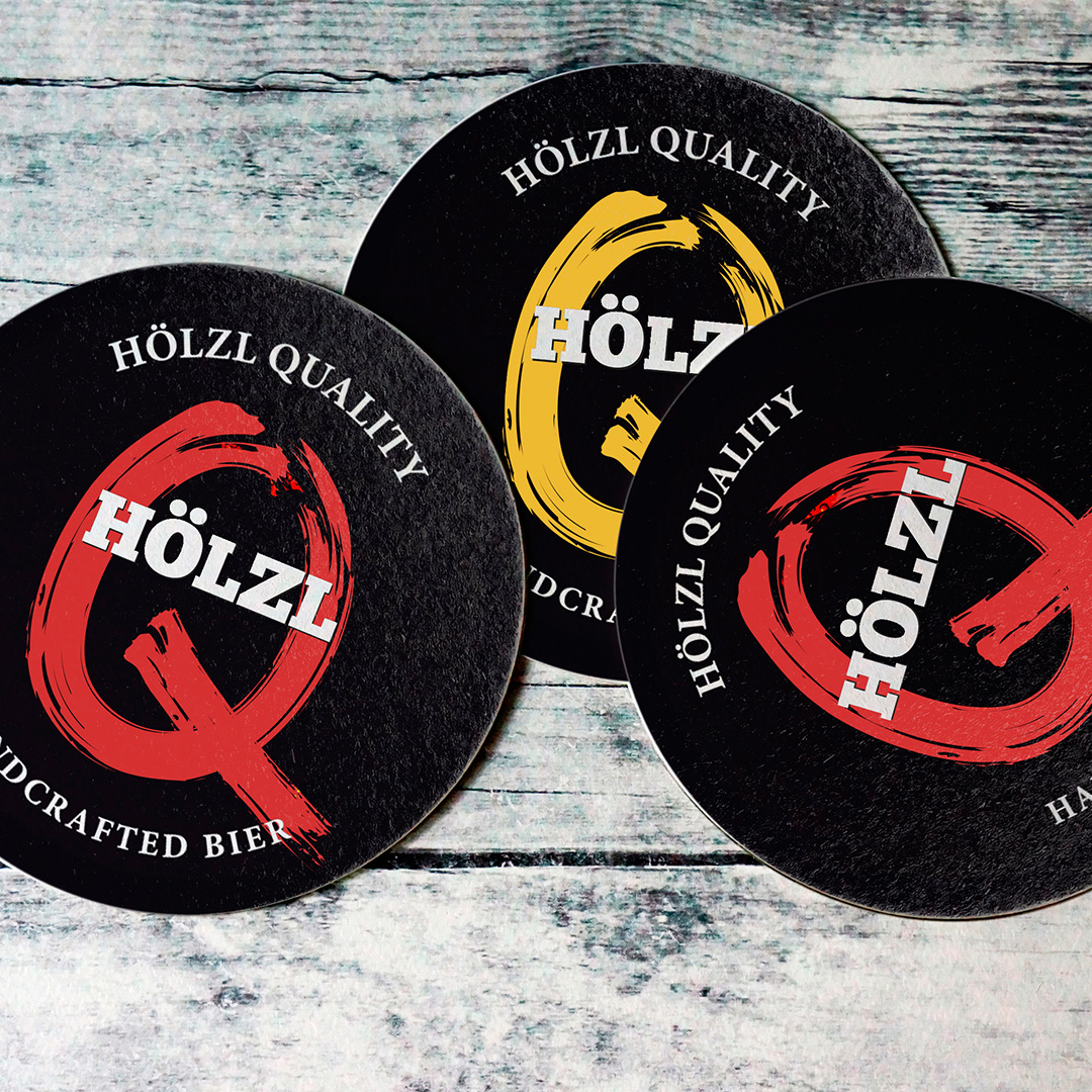
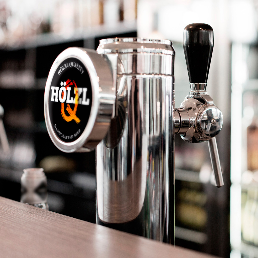
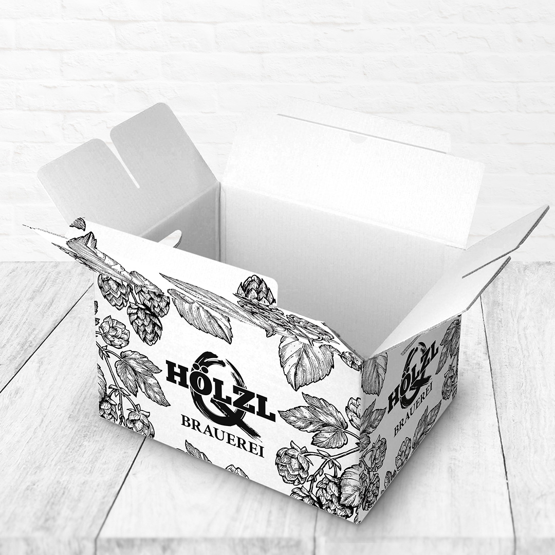
We began with a more “traditional” approach, however we soon shifted towards something truly special, something that really stands out, even in the endless supermarket isles filled with beers.
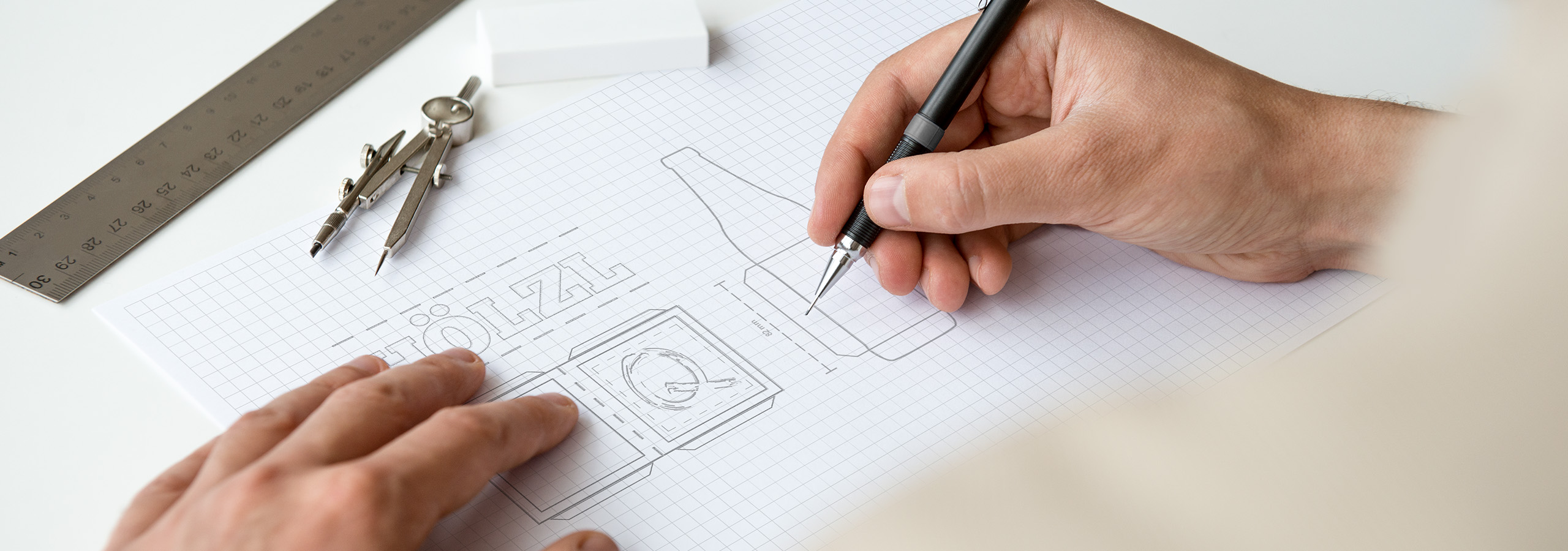

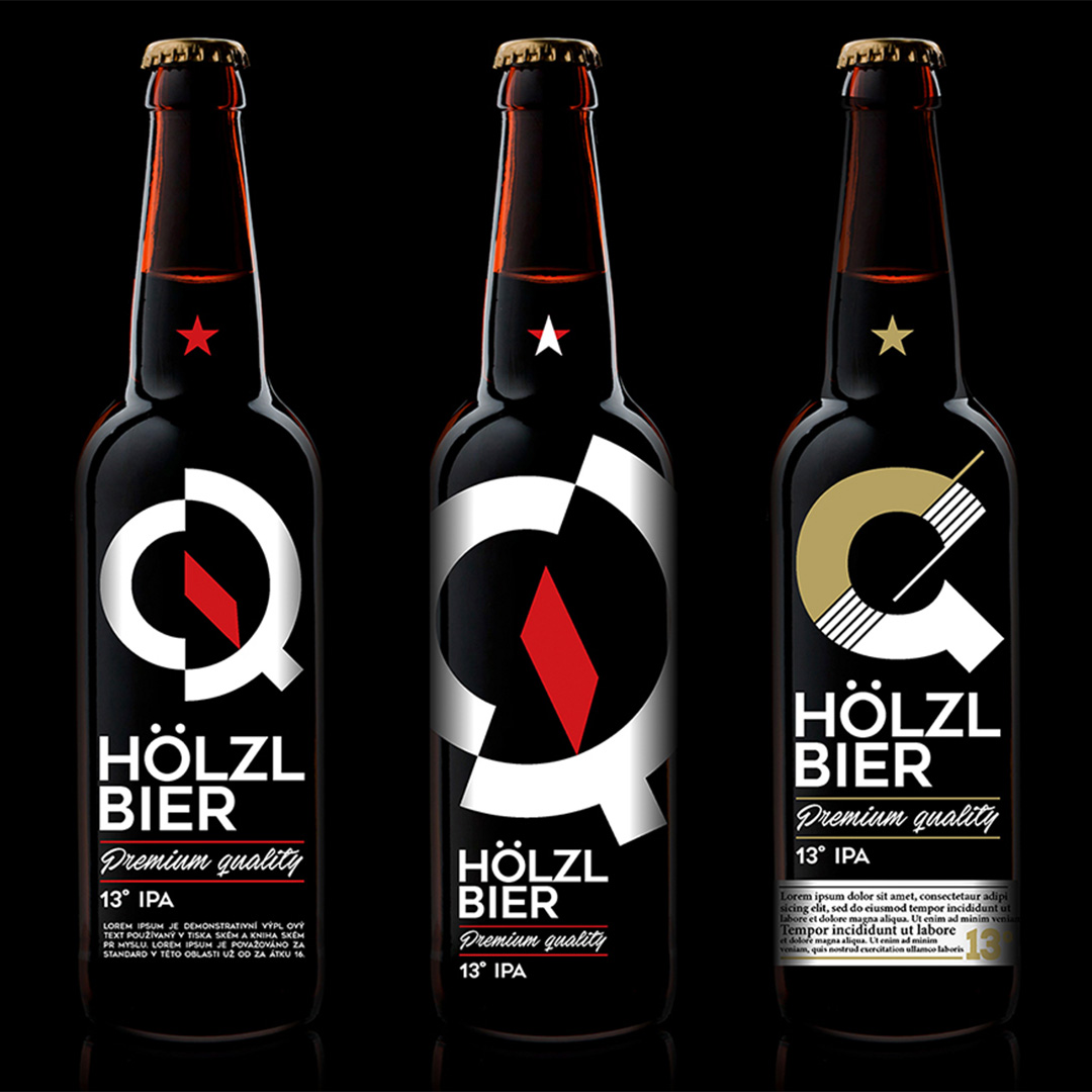
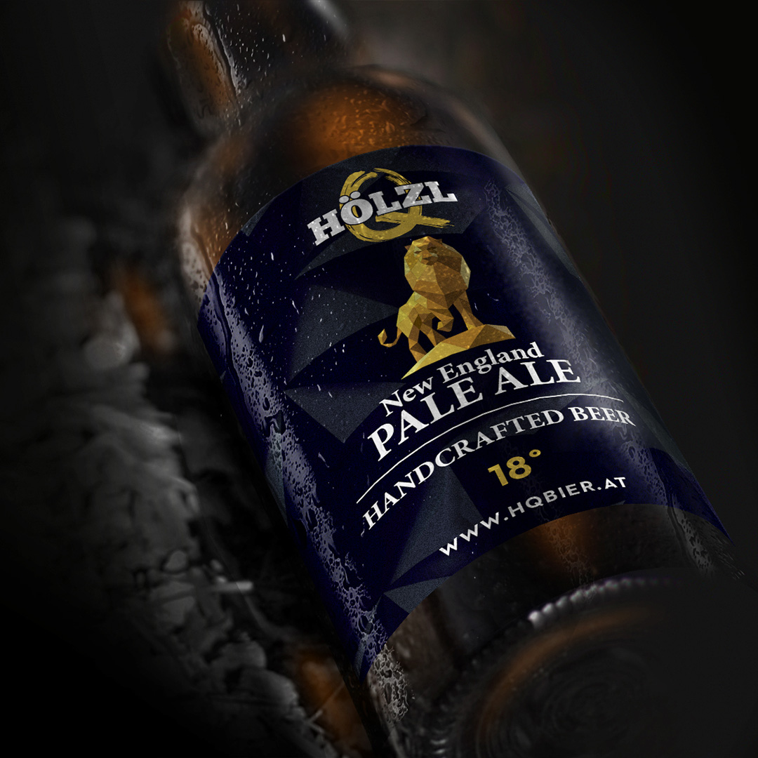
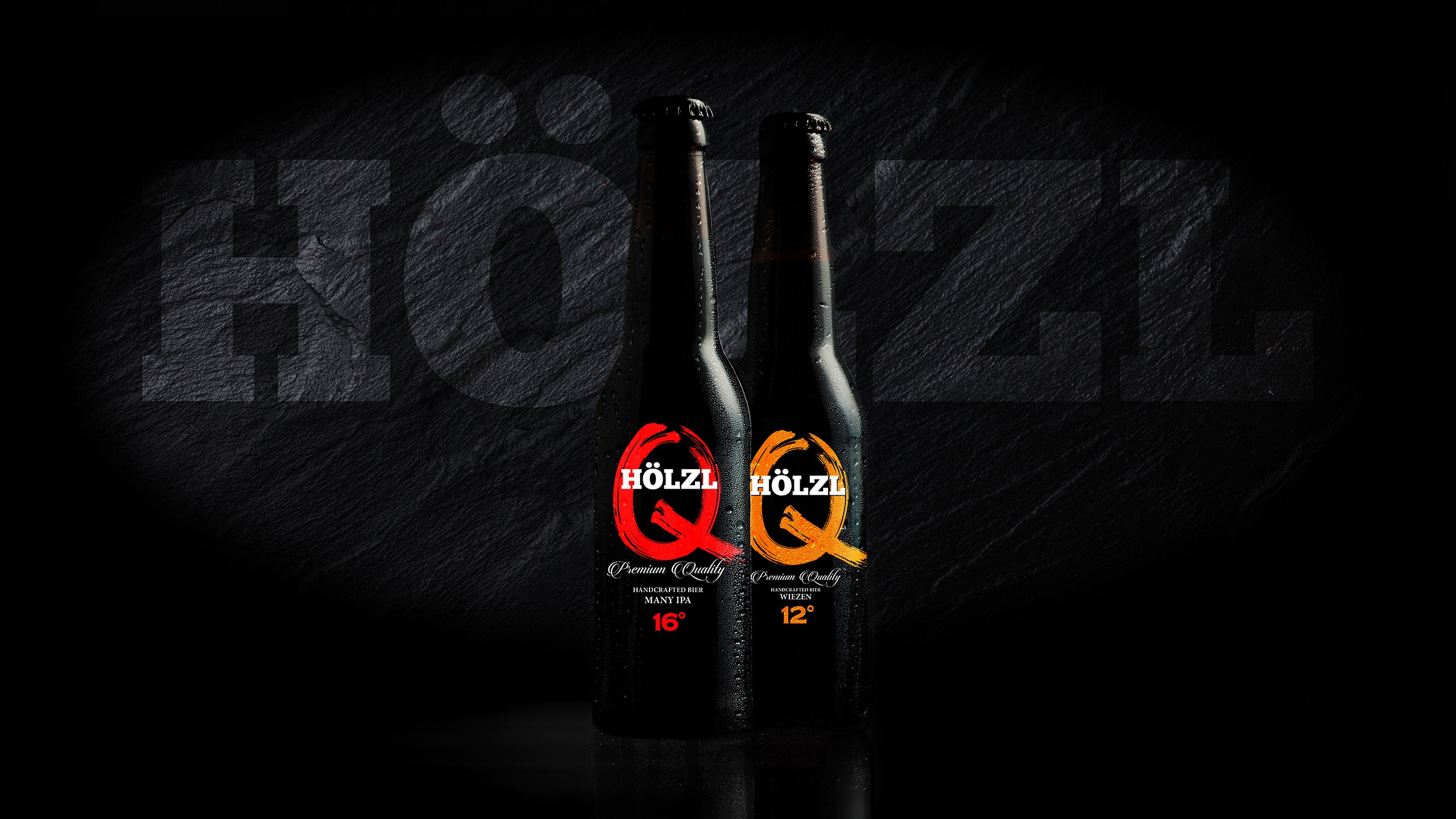
The Q in the Hölzl logo stands for quality, since it’s a handcraft beer of the highest quality, a premium product. It also adds a certain irregular touch that also symbolises that this is not your everyday machine-made liquid gold.
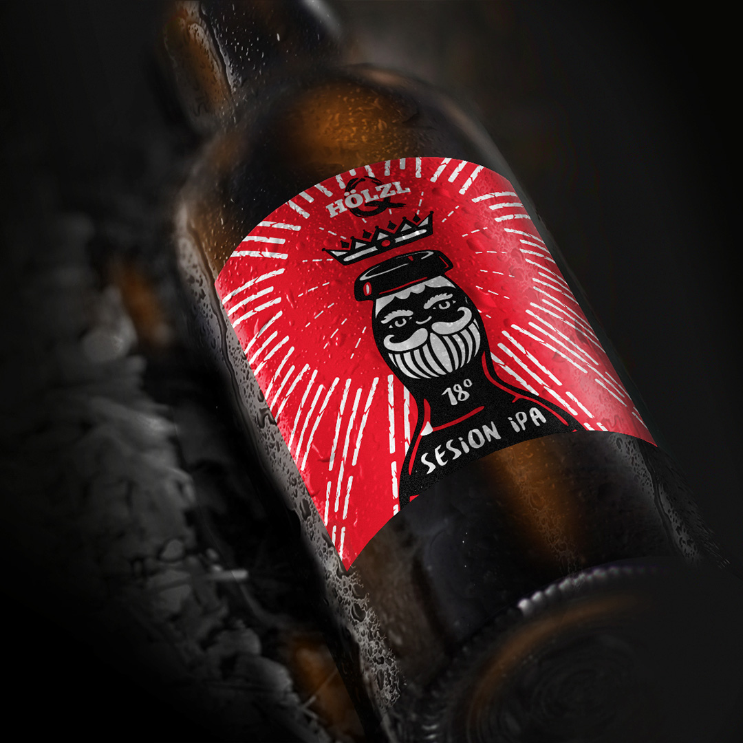
Dark, stylish, modern, bold. Those are the words that describe what Holzl bier really stands for and the bottle needs to represent this. That’s why we went with an out-of-the-box solution in order to distinguish the beer from the competition.
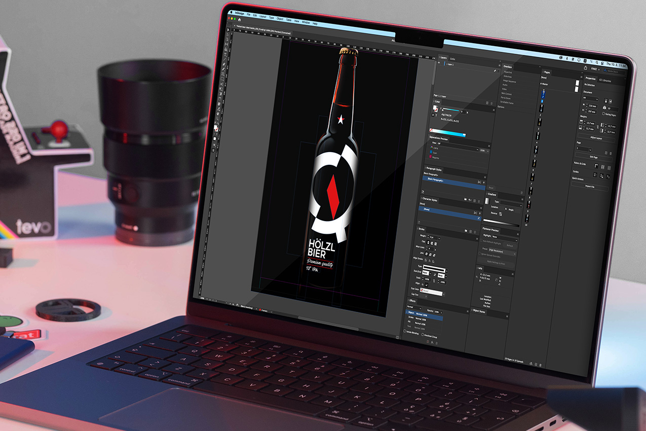
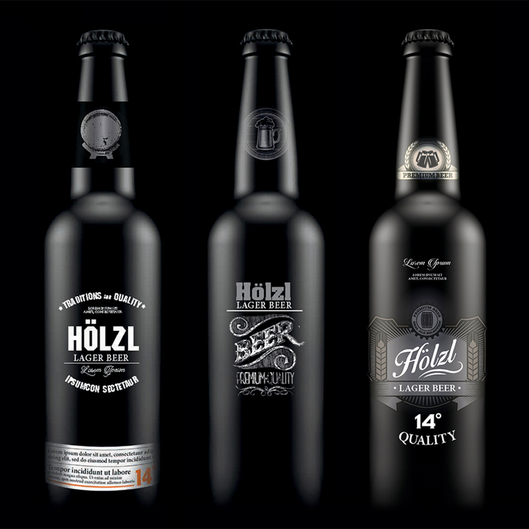
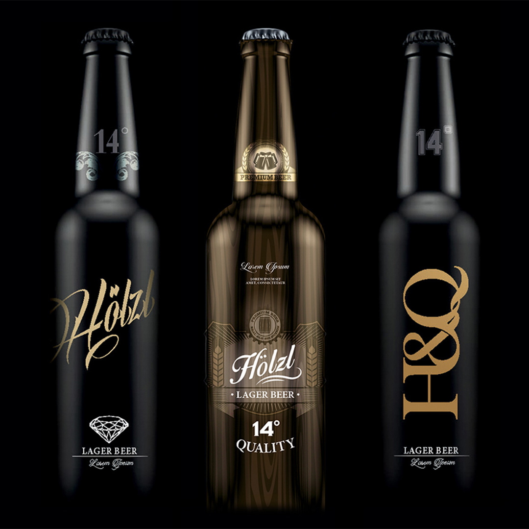
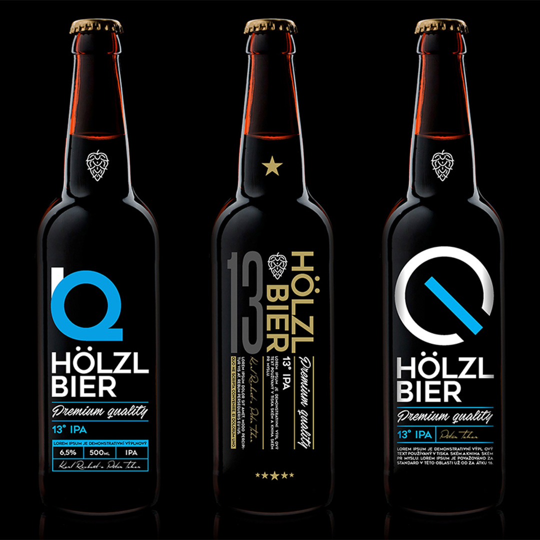
A small selection of the designs that didn’t make it on the shleves.
― James Hauenstein

We will get back to you as soon as possible.
