X
share
view
next

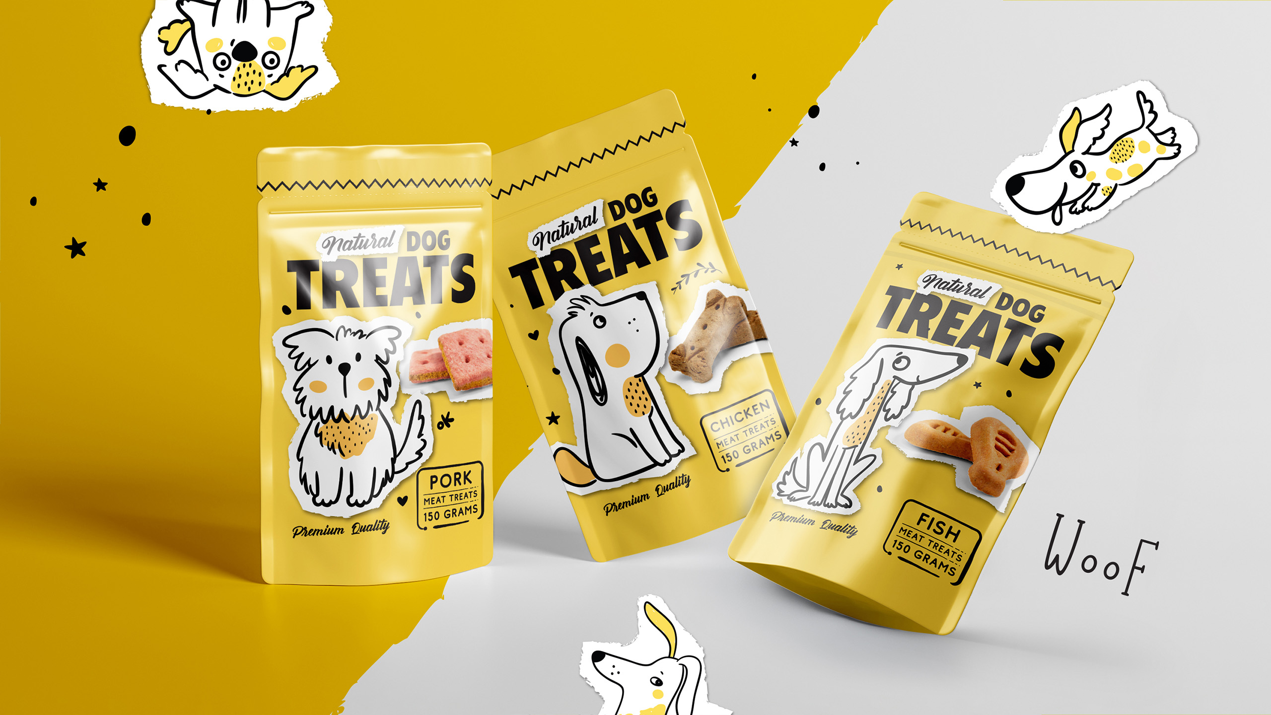

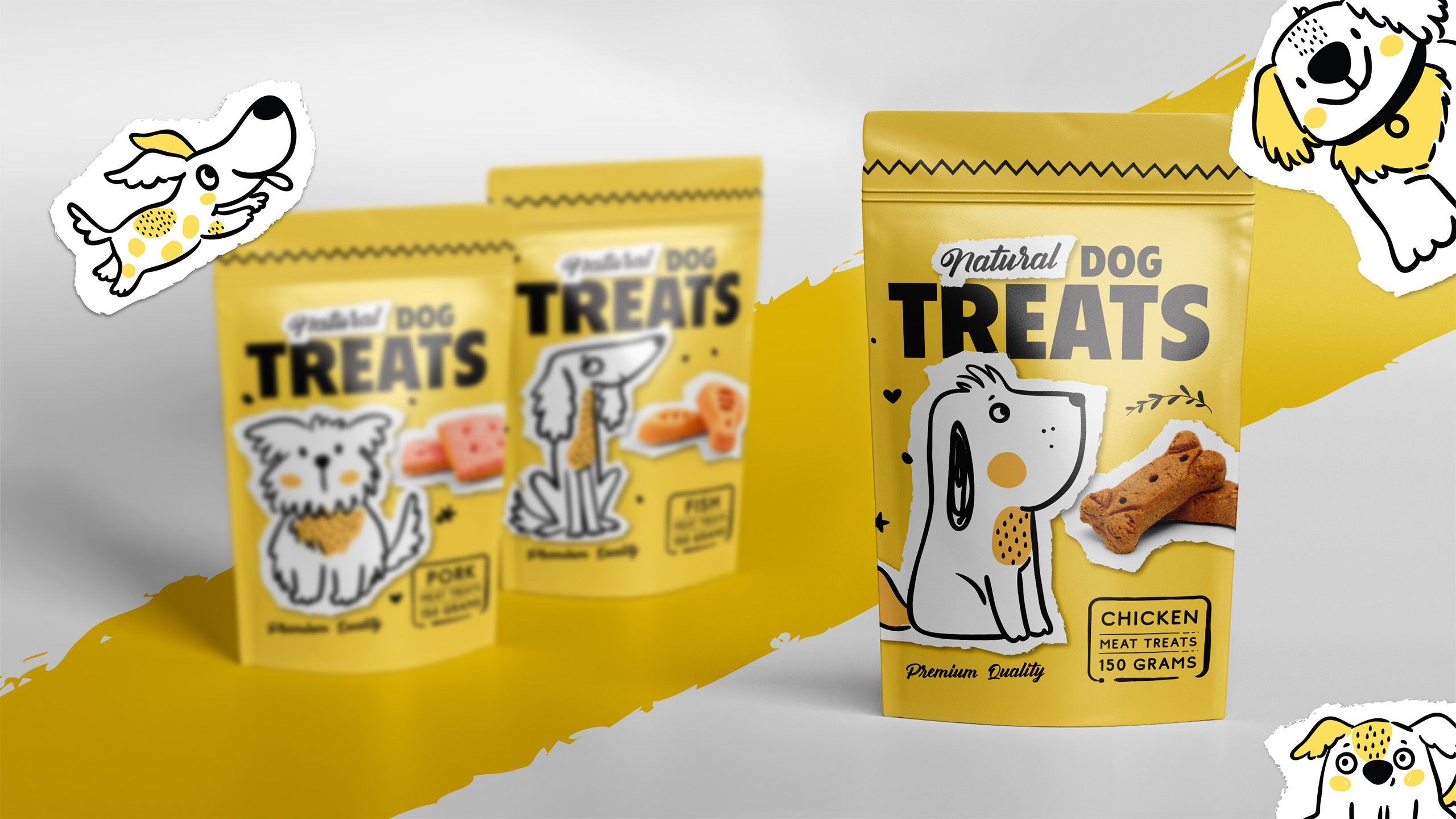
To create a design for a natural dog treat product line. That was our challenge. It was not the first time for us, and definitely not the last. It had to be distinct from the competition. And also very fun and playful.


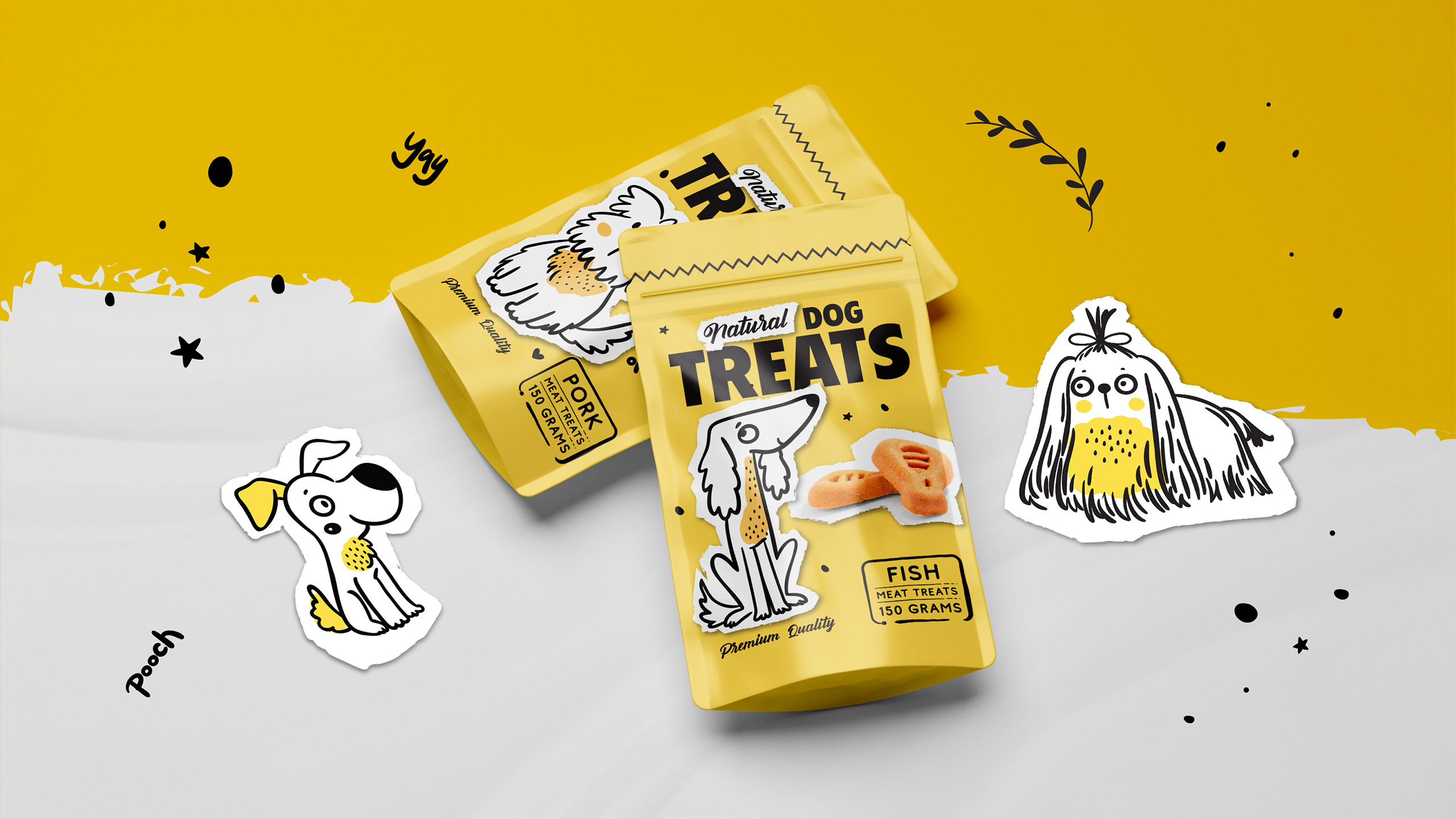
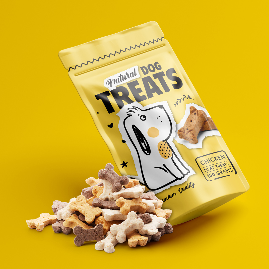
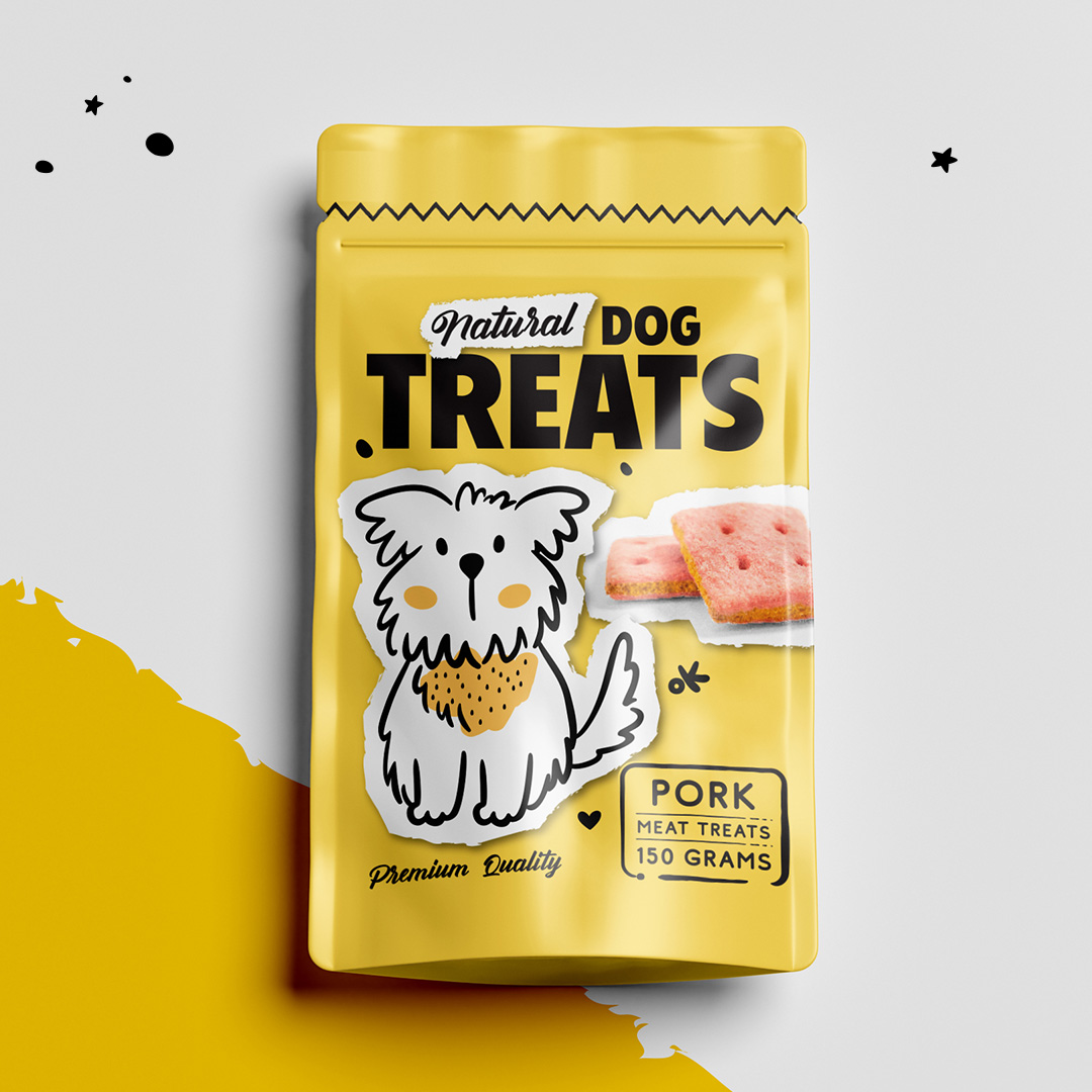
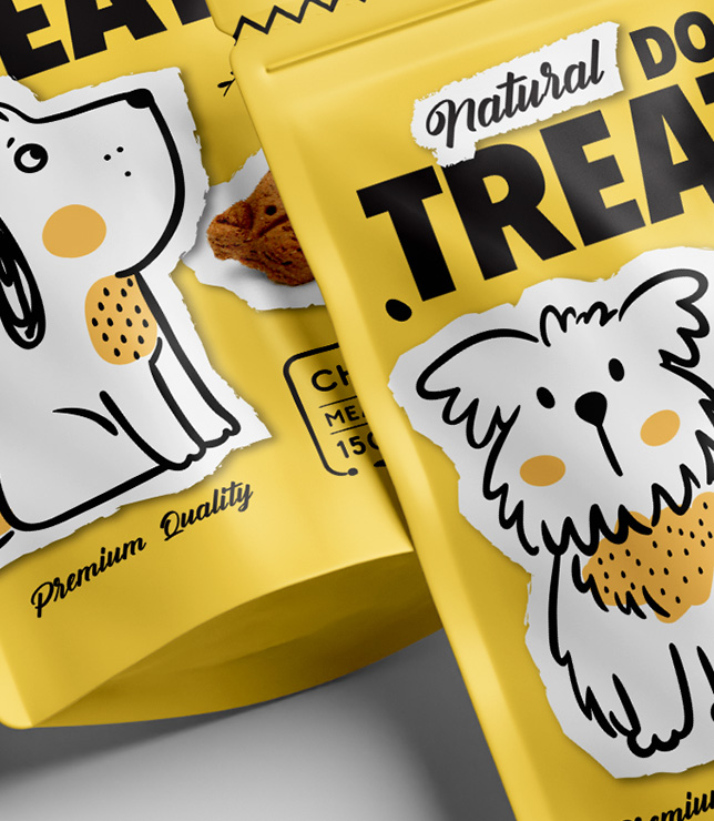
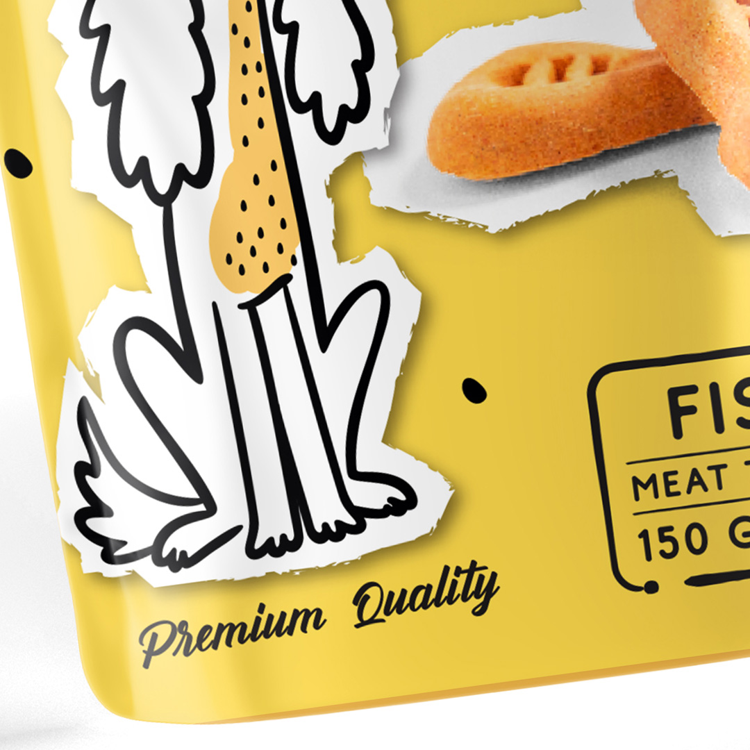
No small amount of time was spent on different ideas. Considering the fact that this project has been developed hand in hand with another dog treat package design, there were tons of iterations.
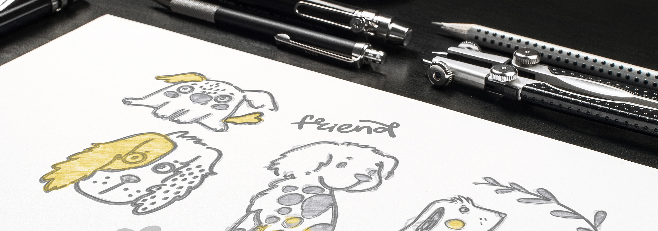
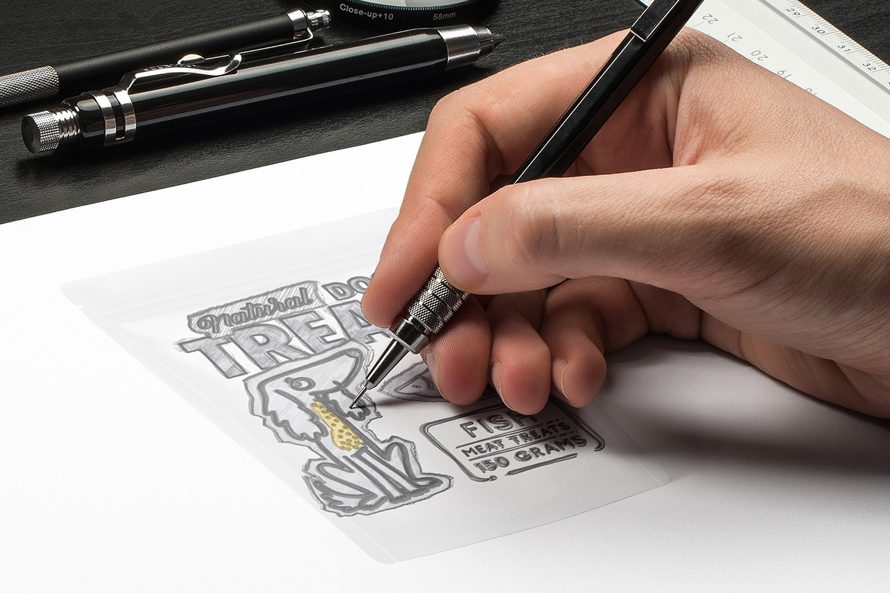
With a few different dog treat projects, we had a large portfolio of ideas and designs. At the end of the day, the goal with any packaging is to differentiate yourself from the competition and show the product in the best light possible.
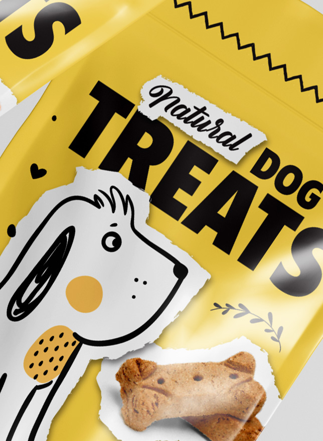
At the end, we settled on the vibrant yellow packaging with "cut-out-like" illustrations. The whole feel of the product line was one of happiness and good times. And that's exactly what the client wanted to achieve. .
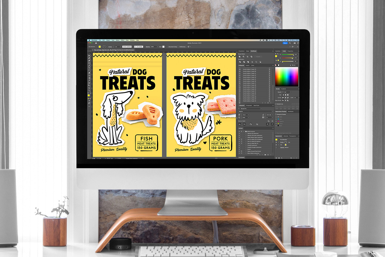
A small selection of the designs that didn’t make it on the shleves.

We will get back to you as soon as possible.
