X
share
view
next

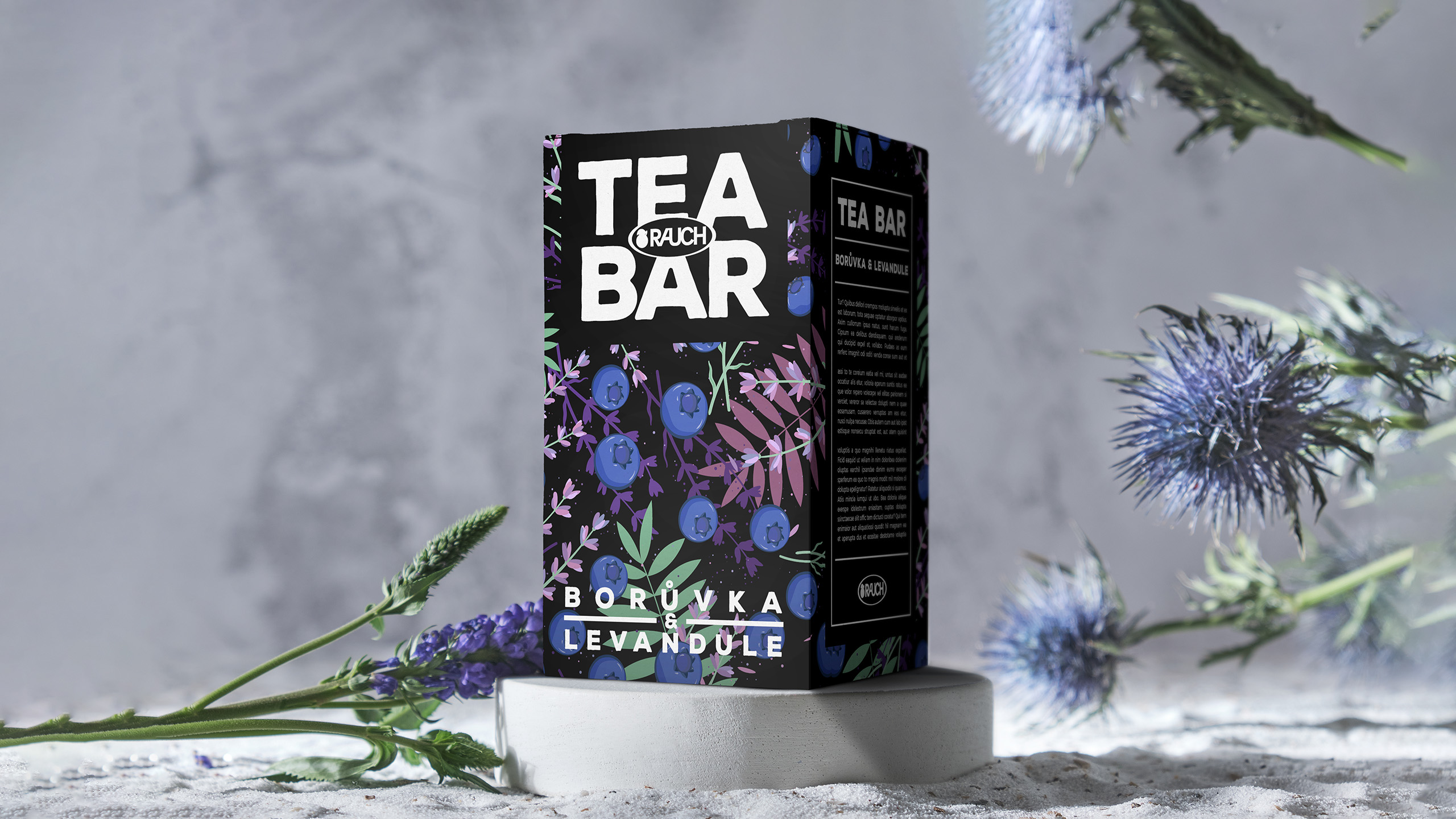


One of the biggest juice and tea brands in Europe approached us with a request to create packaging for their new line of teas (Tea Bar and RooiBos). Make it evoke calmness and, at the same time, be modern and appealing.


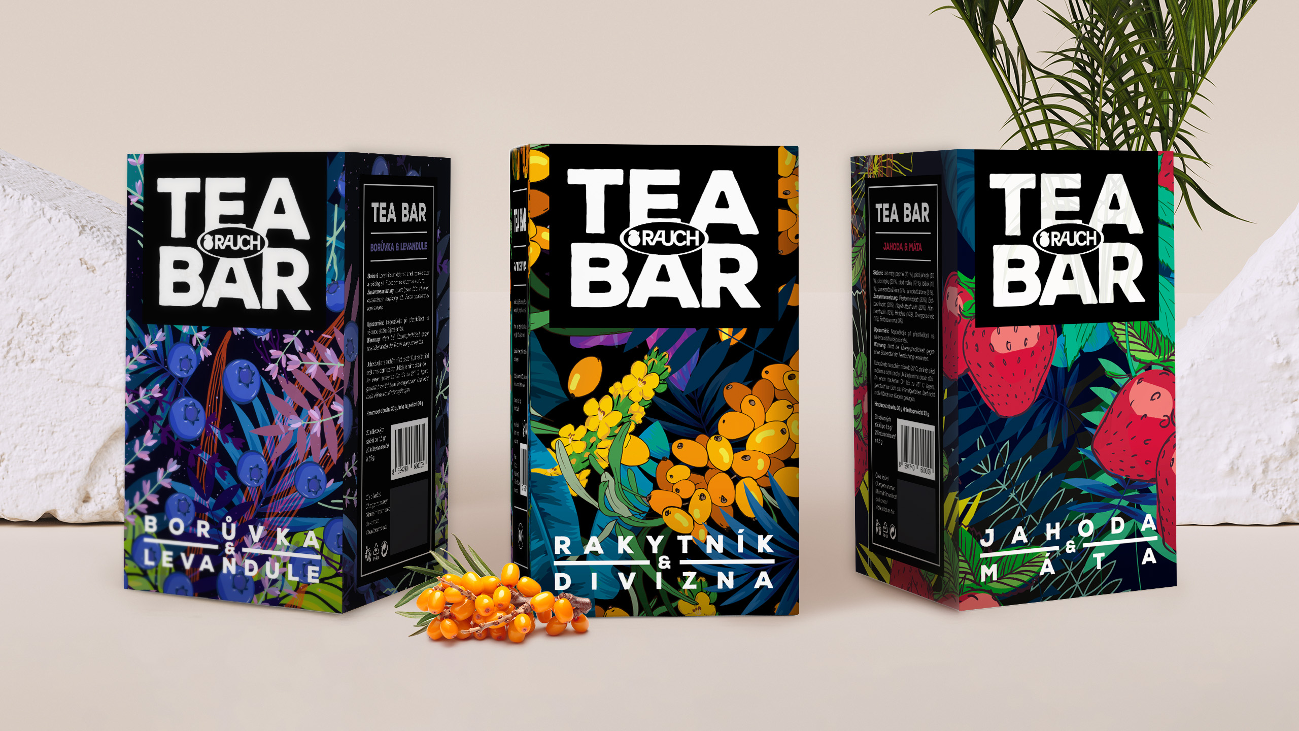

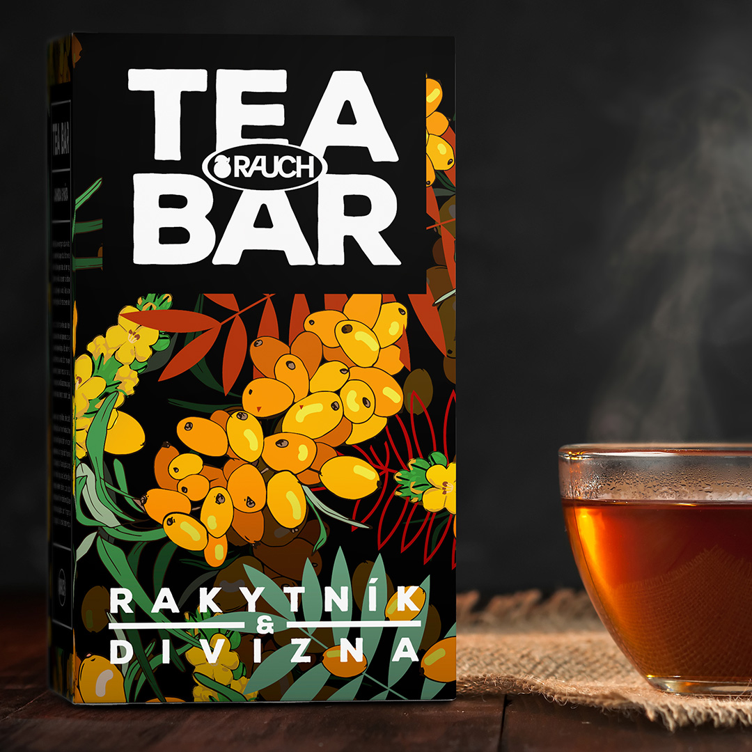
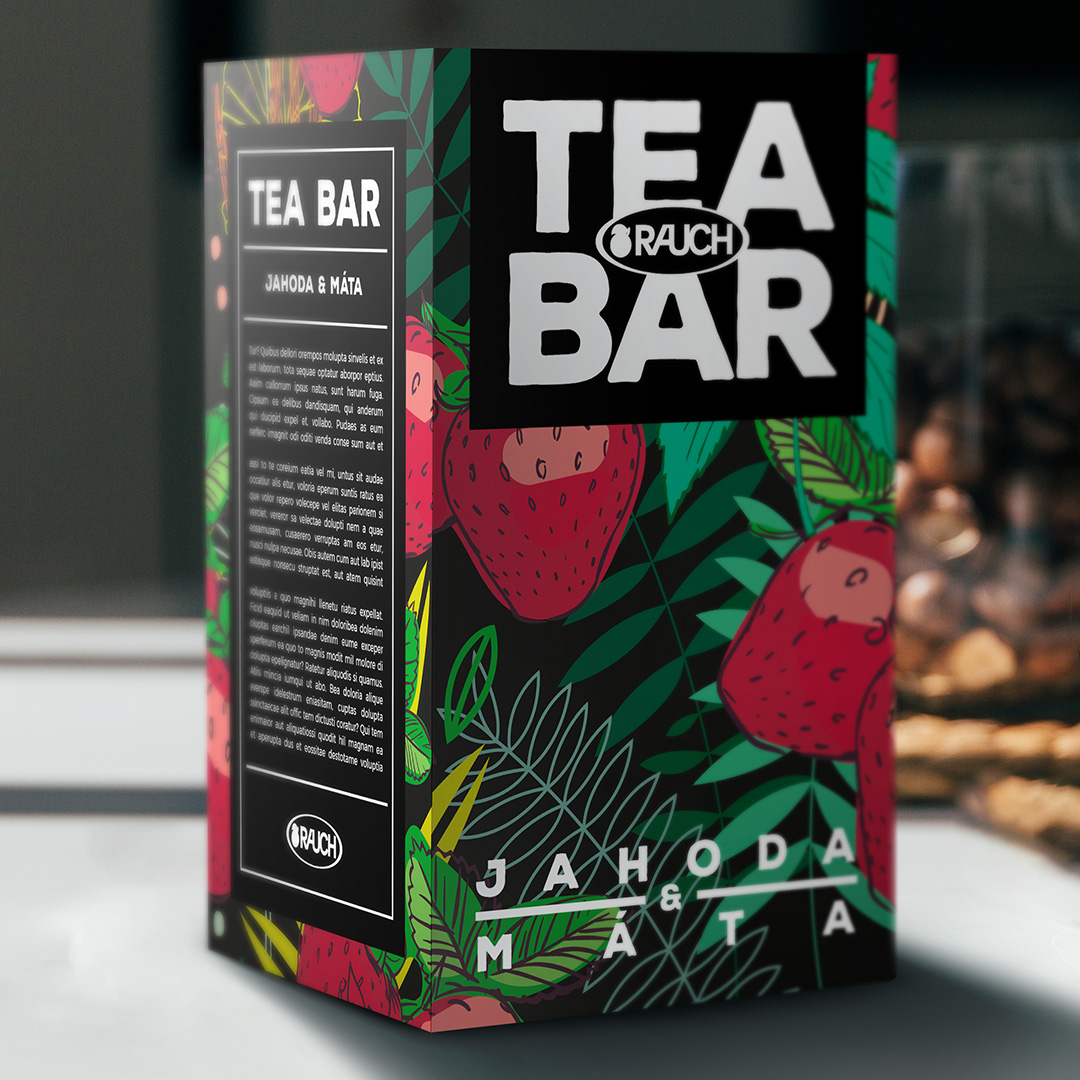
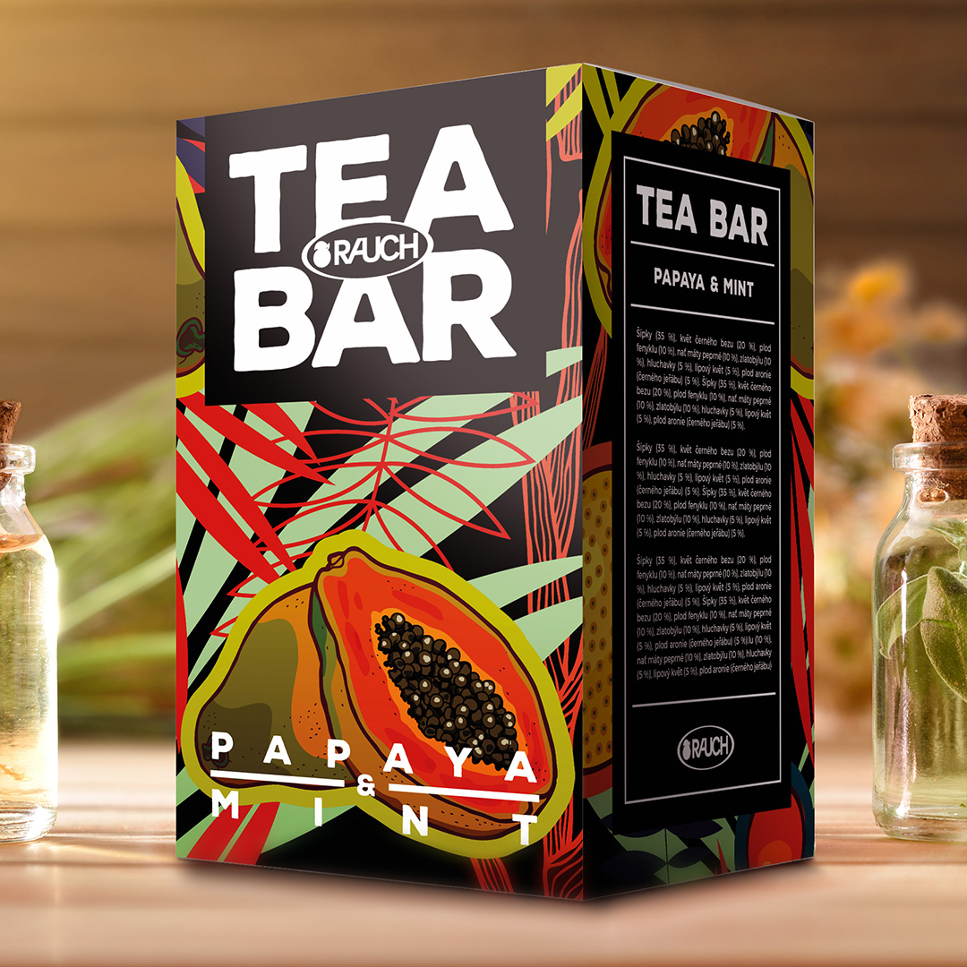
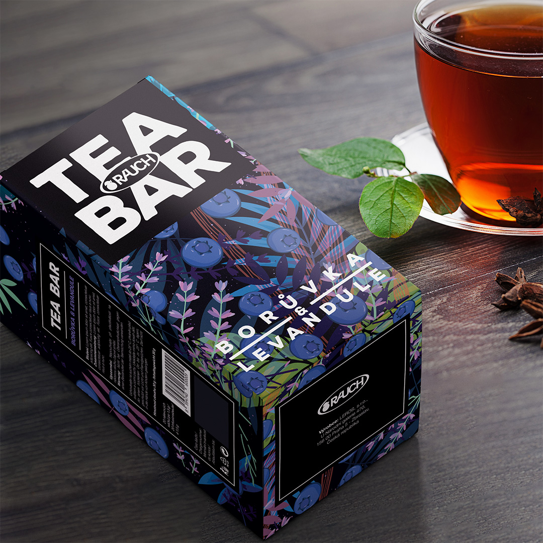
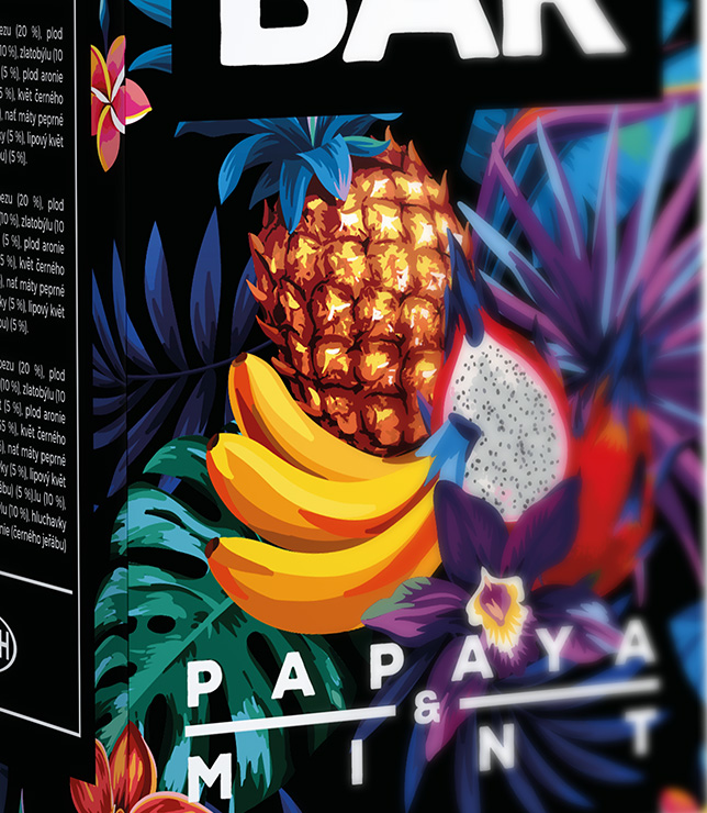
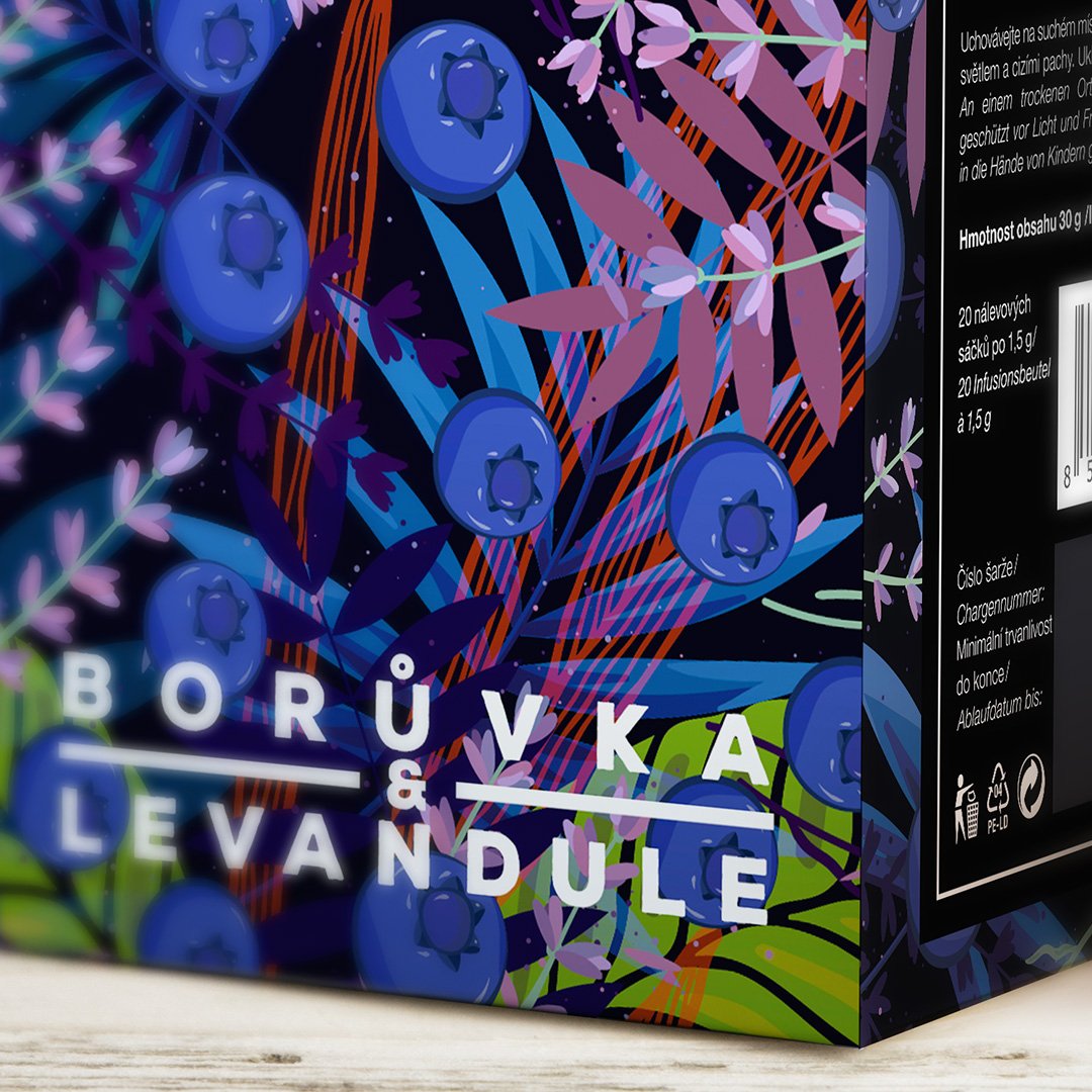
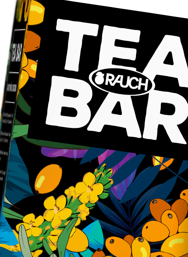
Both Tea Bar and RooiBos were brand new product lines, so we started from scratch. It was important to combine freshness with the sense of calmness usually associated with tea.
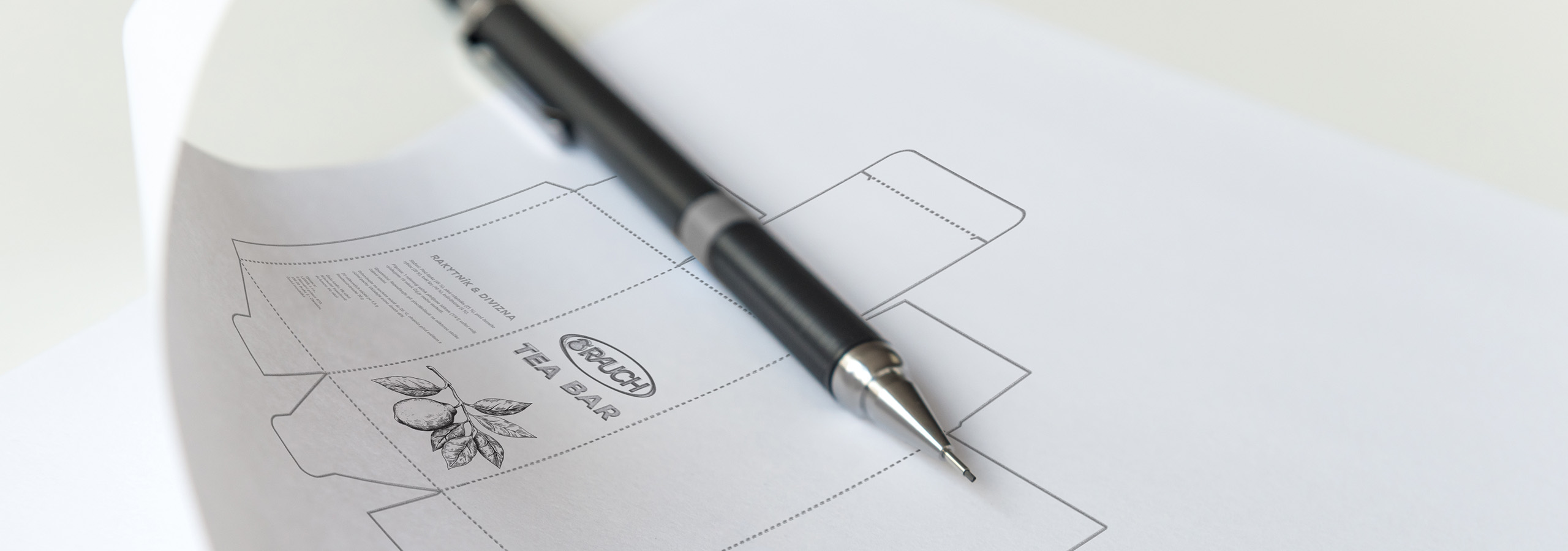
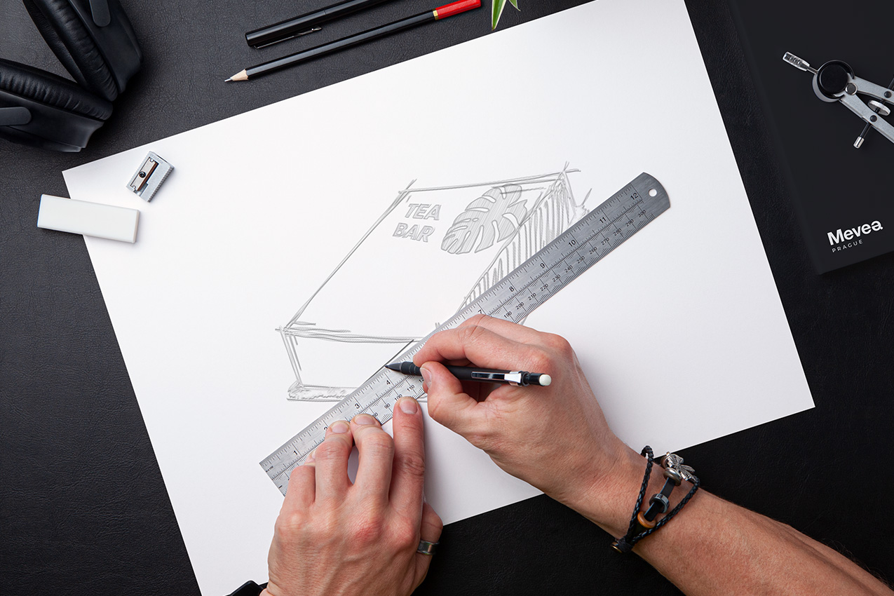
Our approach to the RooiBos tea specifically was to emphasize its origin and play with the concept of a jungle biome. The packaging was playful but organic and still evoked the sense of a natural product.
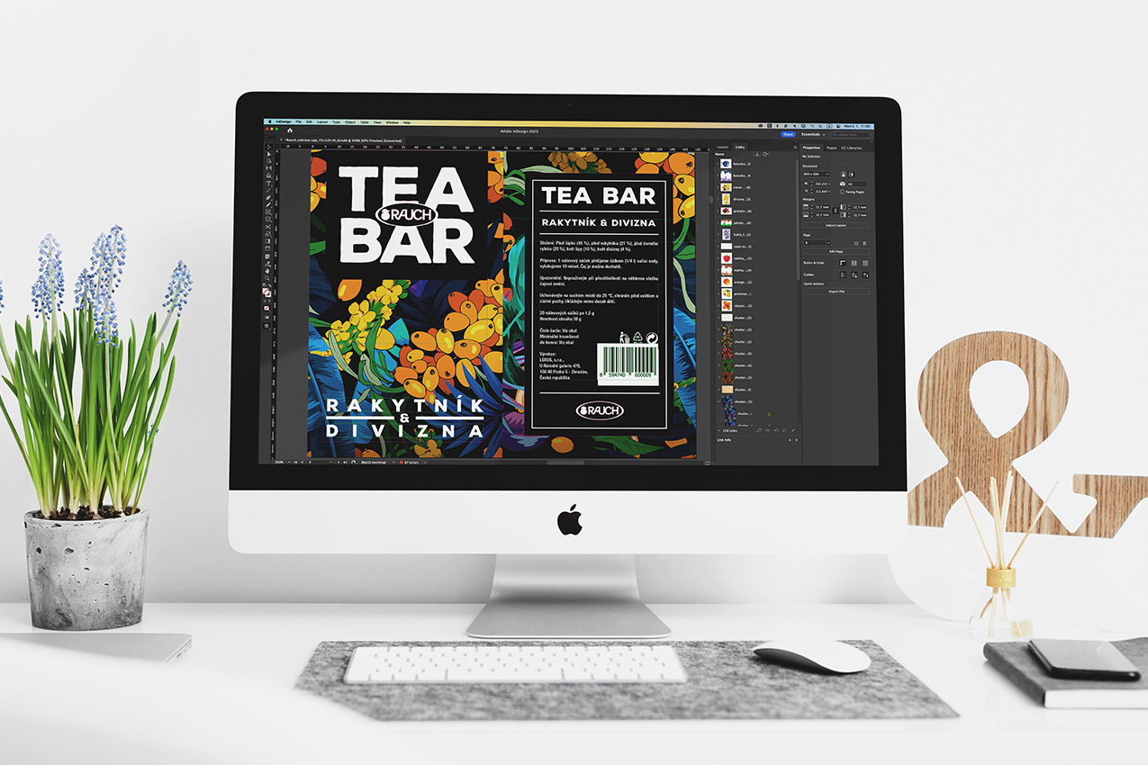
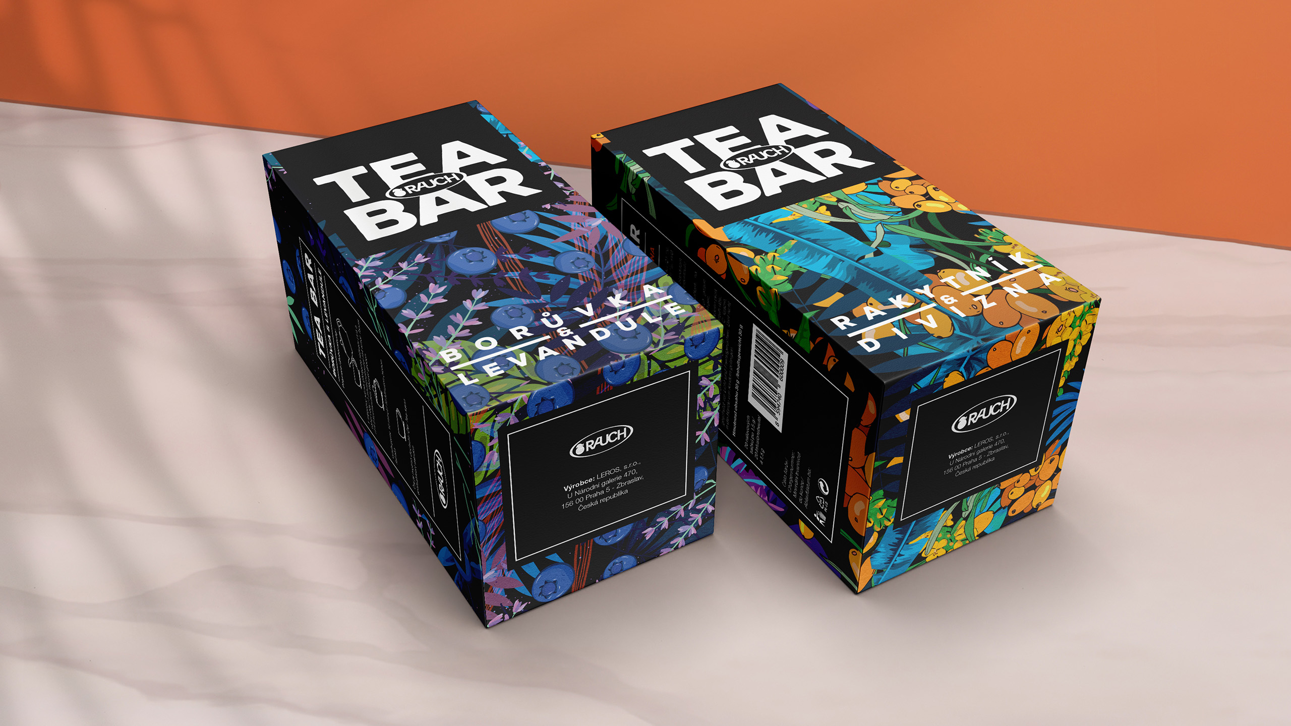
When designing the Tea Bar packaging, we went through many iterations of the "illustrated ingredient mix." Show the user what to expect, but do not make it dull (like many tea brands actually do).



We will get back to you as soon as possible.
