X
share


X
share
view
next

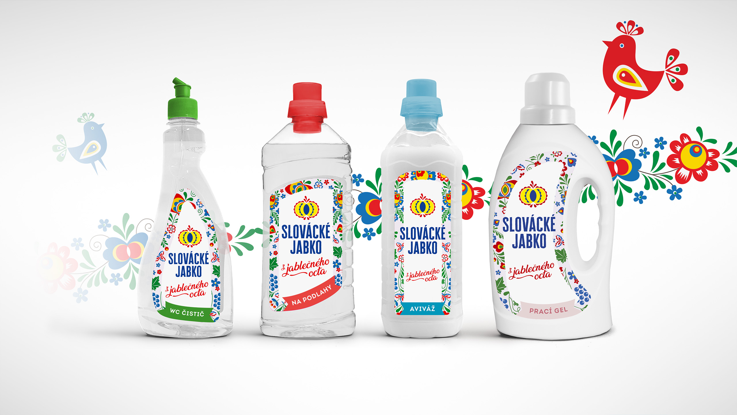


A wide range of cleaning products had to be modernized, refreshed and redesigned. The common denominator in this case was the Moravian motive and, as the name suggests, the apple from the Slovácko region.


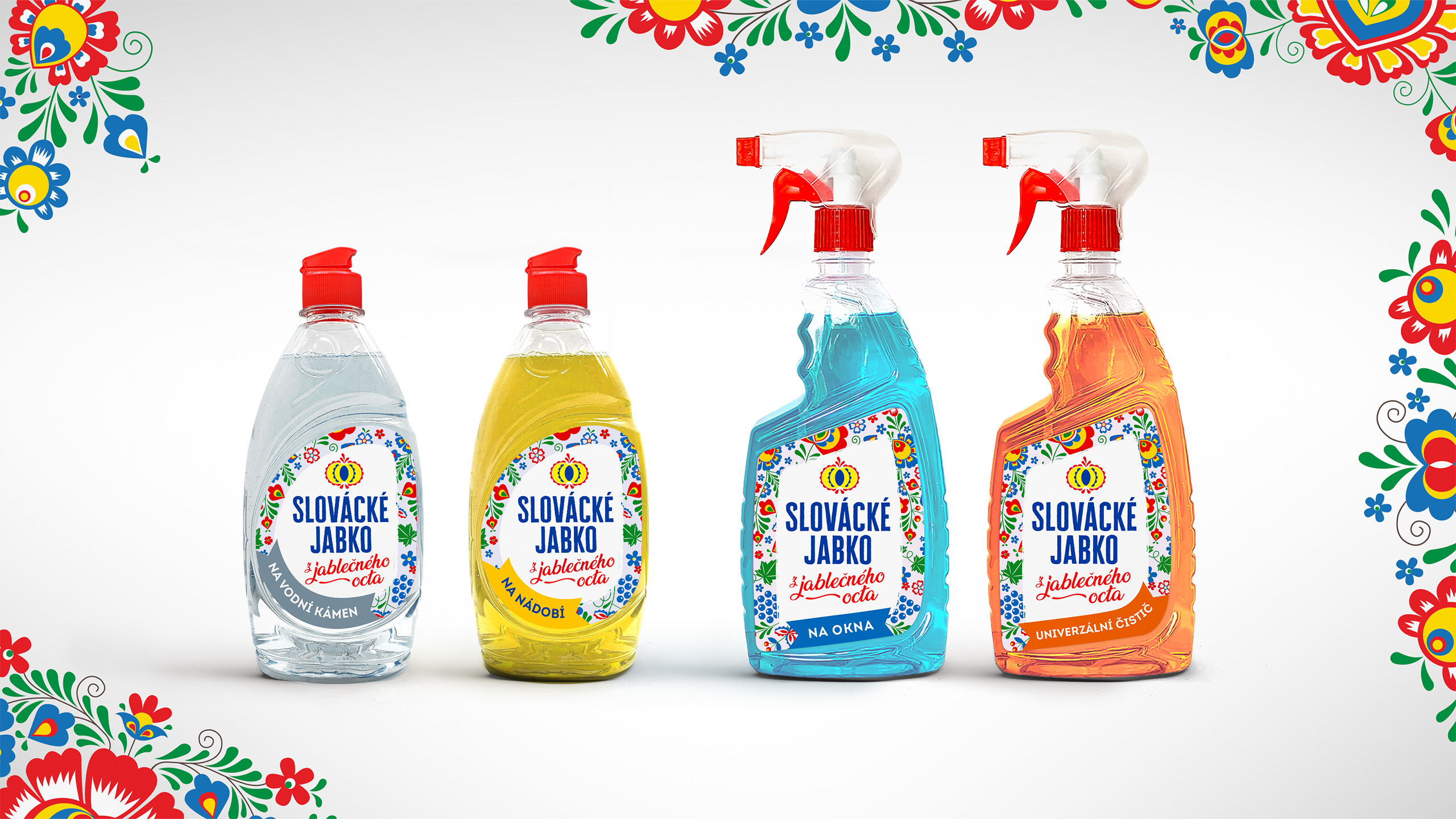
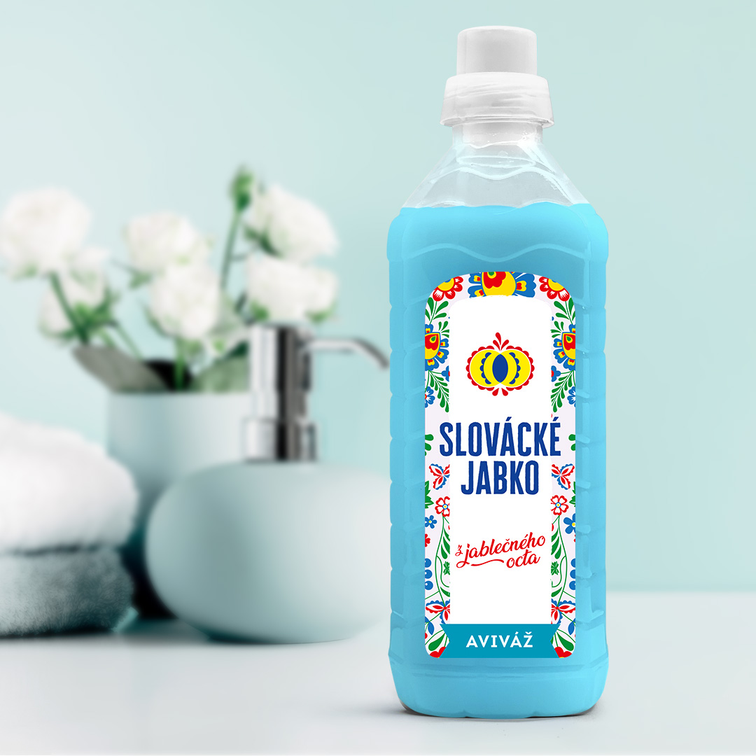


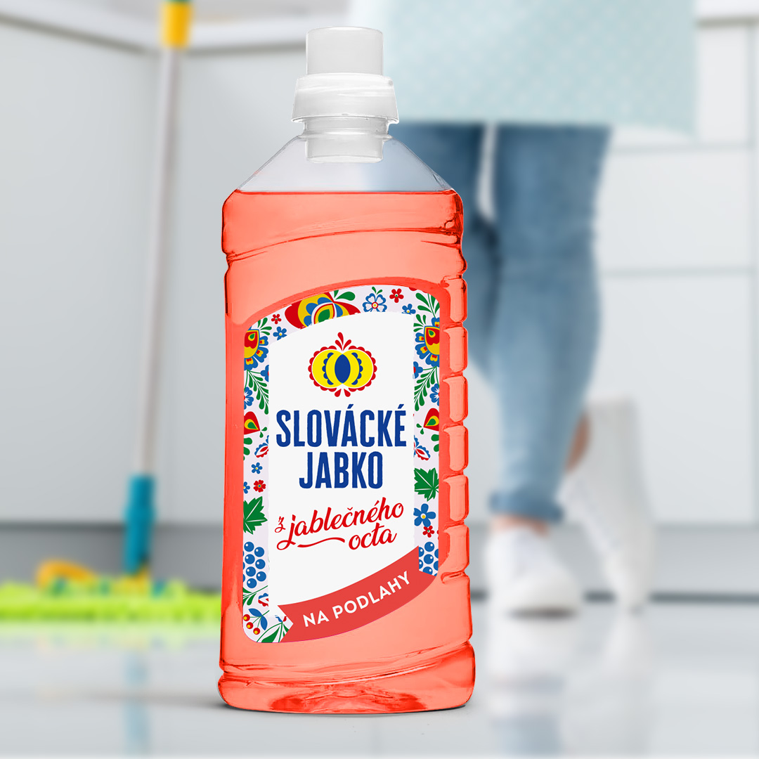
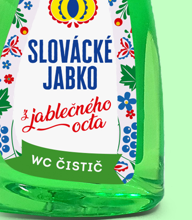
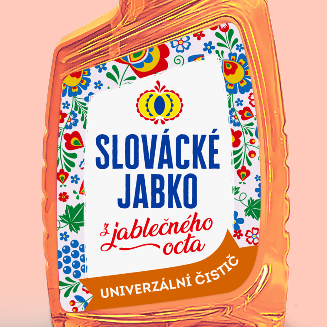
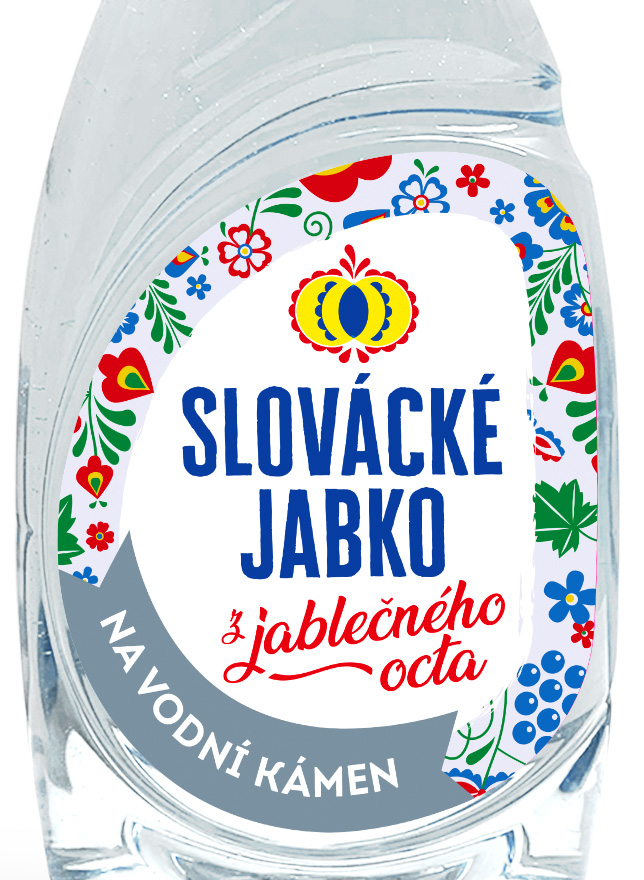
The most recognizable element of the entire package is most definitely the typical and traditional motives from the Slovácko region. The complex ornaments, bright colors, and flower shapes are fundamental to the visual identity of the product.
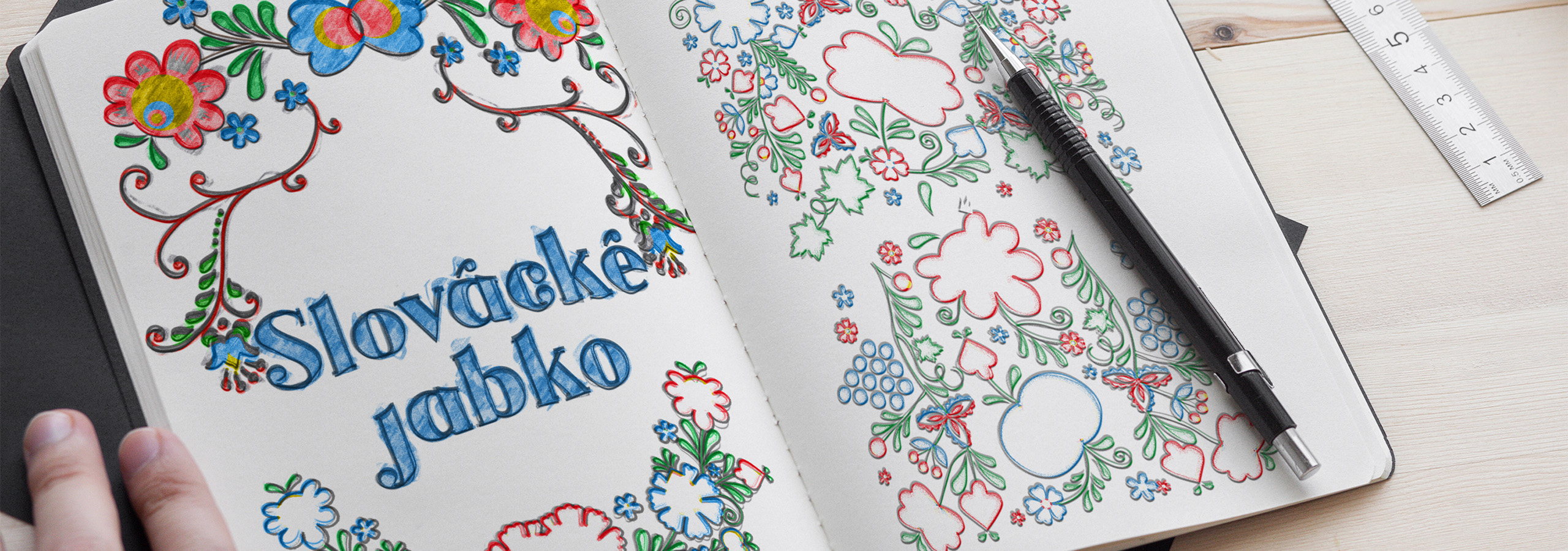

The graphic side of the product was obvious from the beginning. But it was the details and exact product line differences that made it a challenge. Keep the essence and distinguish properly between the individual products.
The traditional drawings of the Slovácko region are bright, colorful, and fairly complex (and also easily distinguishable). So we let them speak for themselves, and we mainly focused on the technical execution and on the smaller graphic elements within the design.


We will get back to you as soon as possible.