X
share


X
share
view
next


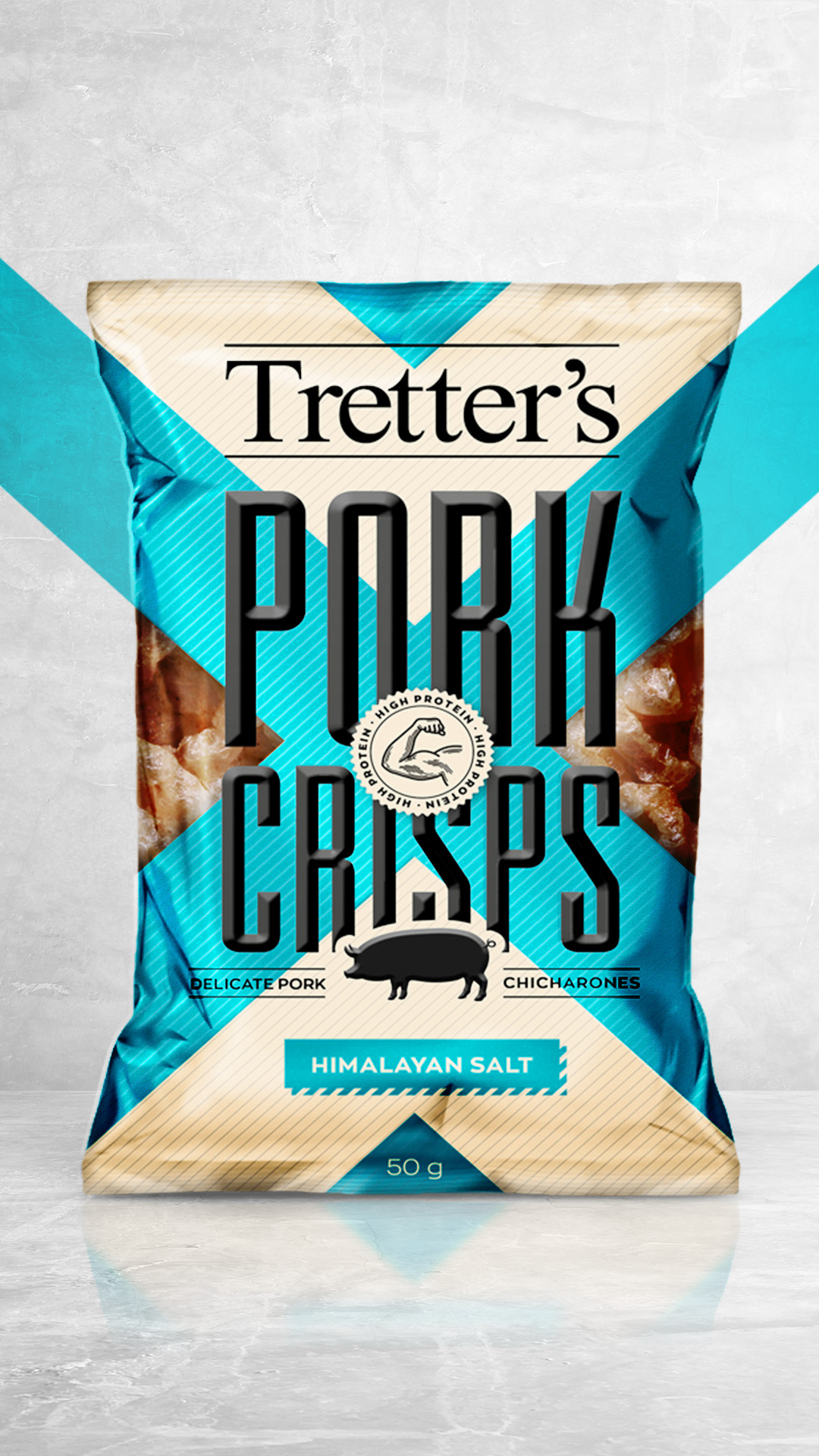
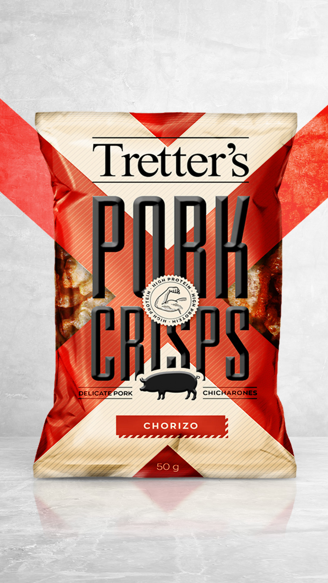


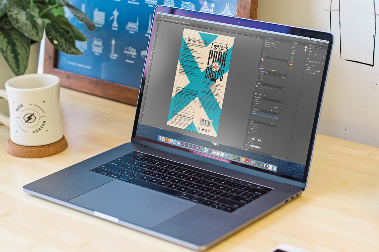
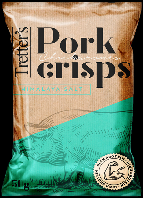
One of our many collaborations with Tretter’s chips included the pork crisps which needed a “punchy” and “exciting” bag design which would catch the attention of the customer even in an overcrowded supermarket shelf.


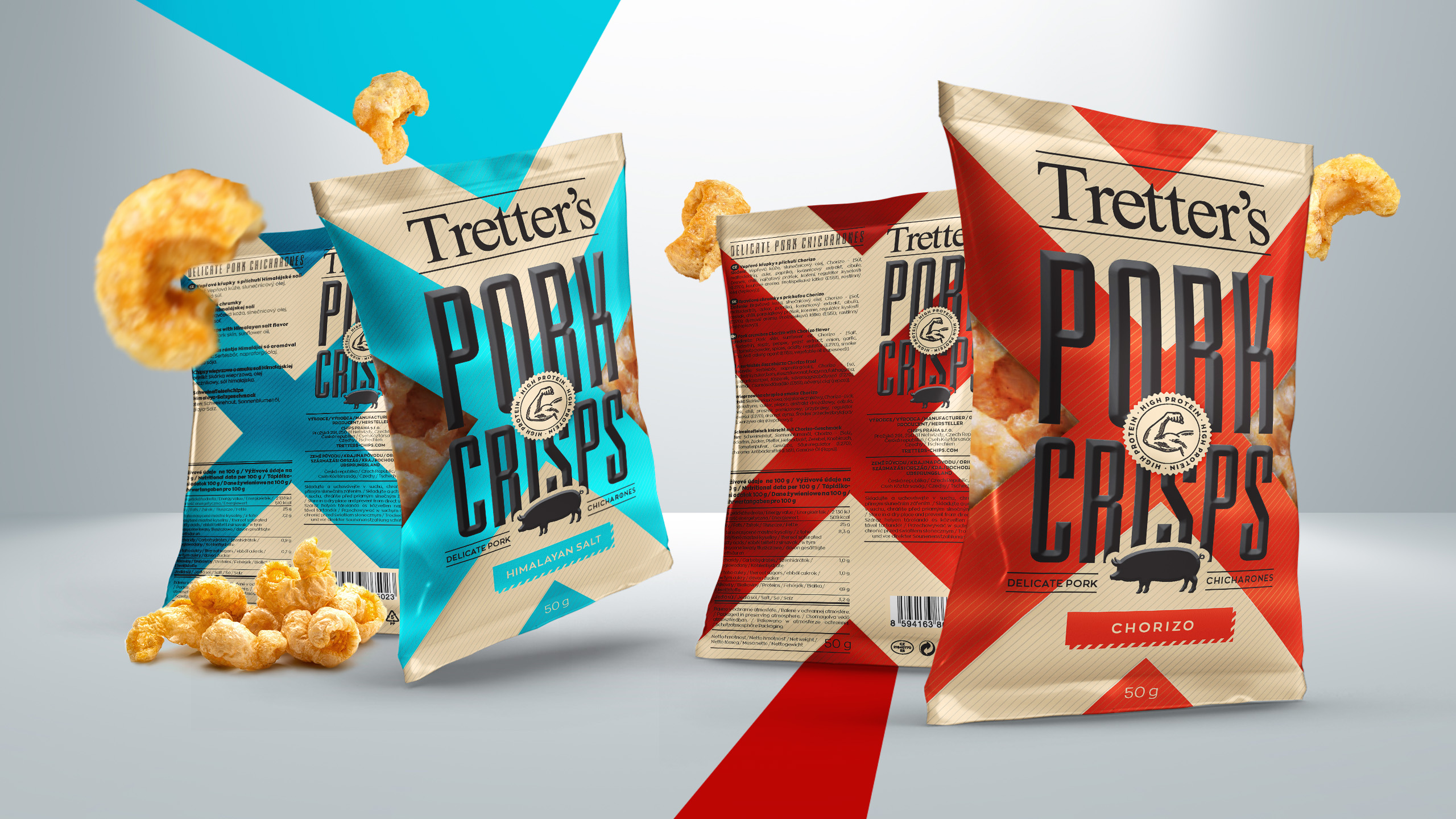
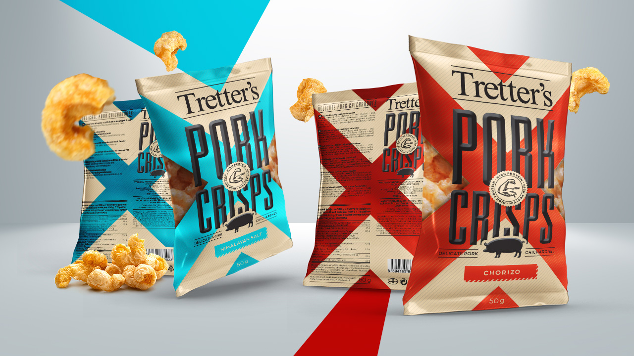
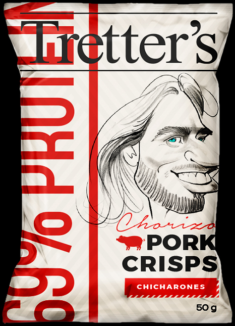
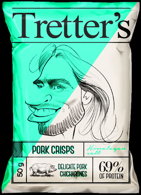
At first the visual style featured a vintage imagery (1920s to 1970s) with with bright and saturated colourful elements. for the final design tho, we switched to a comic book like theme, as it was far more eye-catching and better represented the actual product.
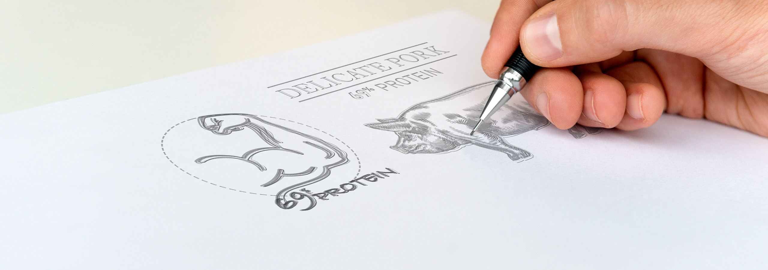
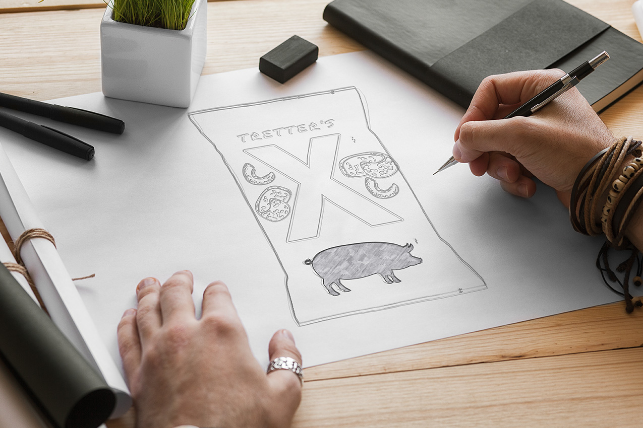
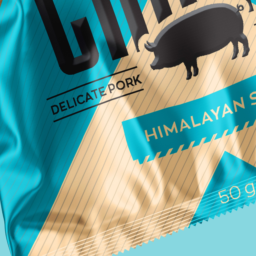
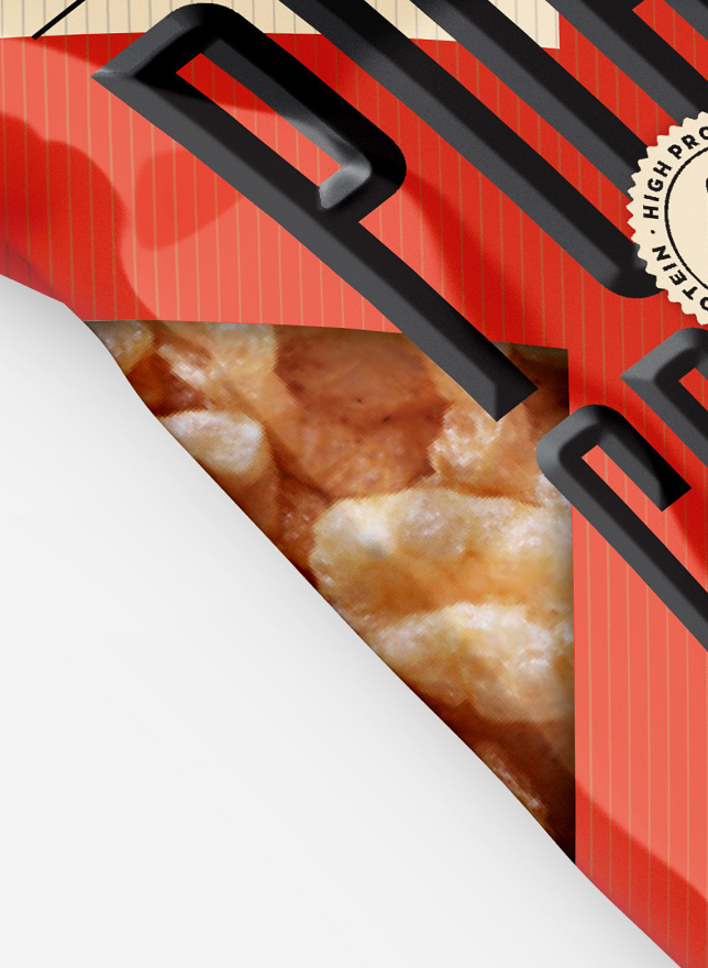
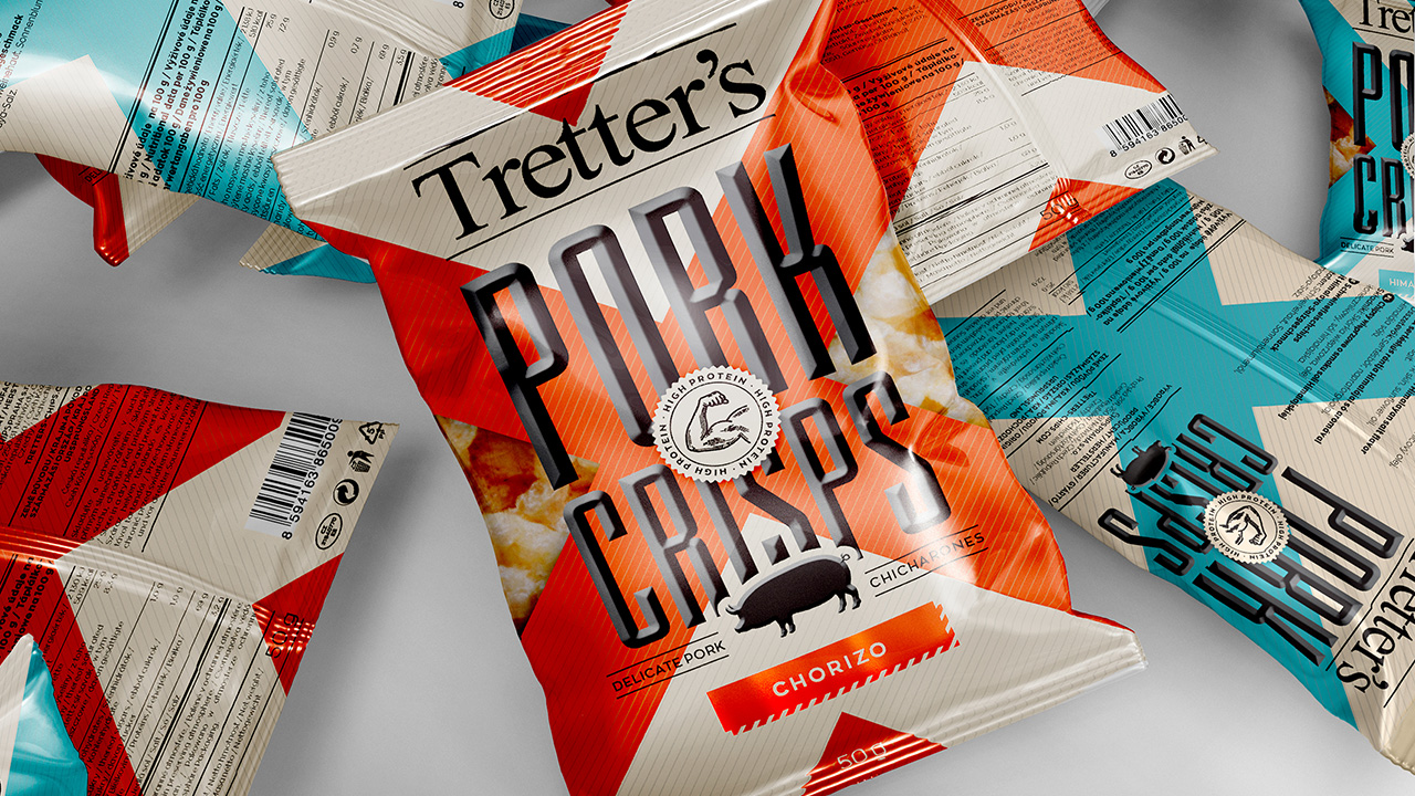
This one was a pretty big experiment for us. We started with some pork illustrations, caricatures and a variety of color and text combinations. But we finally settled on the cross (X) design with a huge product title in the center and a sneak peak of the actual product to the sides.
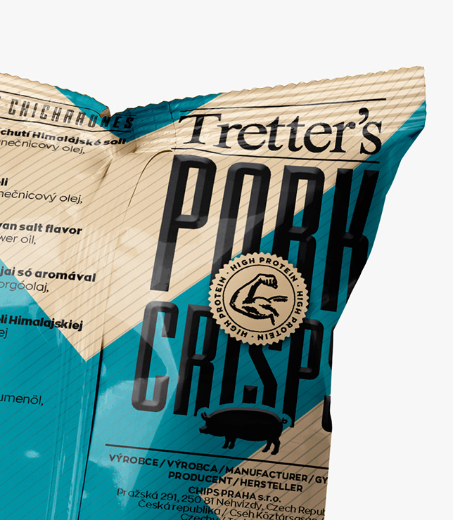
The consumer could often feel guilty when buying such snacks, so it was crucial that we display also some of the benefits. And by far the biggest one is the high protein content, which we situated right in the middle of the package.
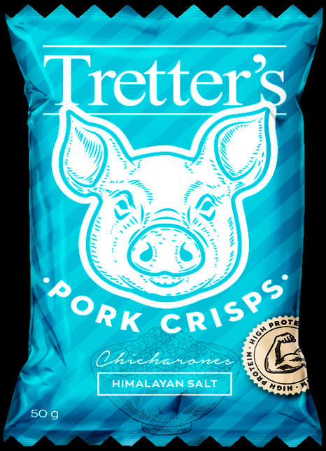
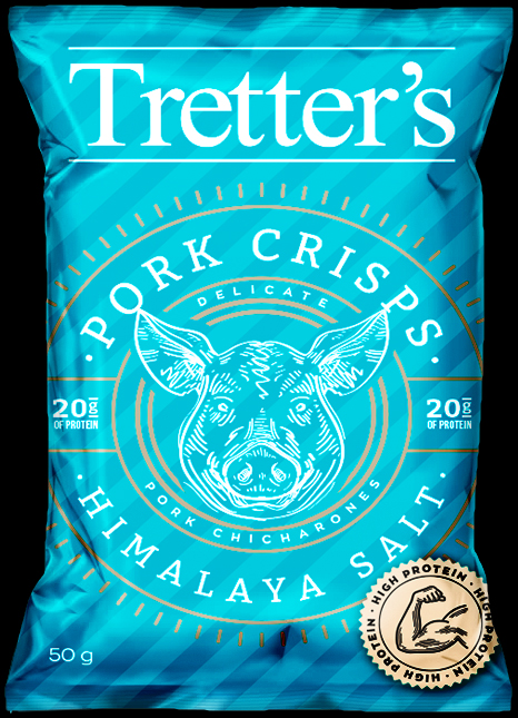
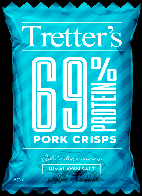
A small selection of the designs that didn’t make it on the shleves.


We will get back to you as soon as possible.