X
share
view
next

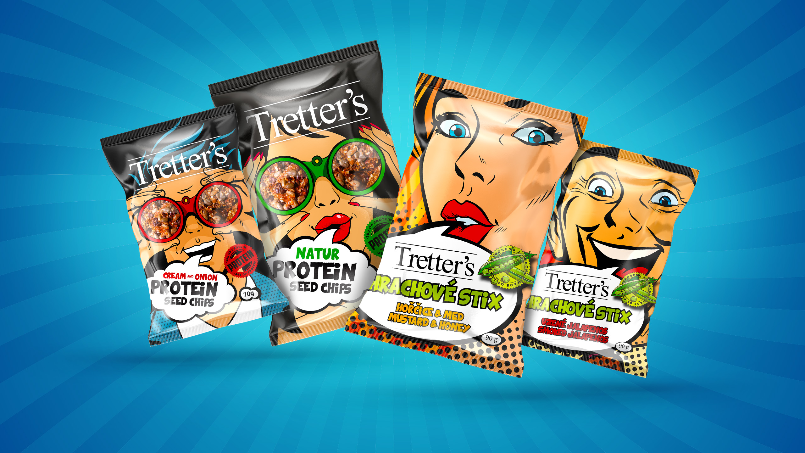

“Create a super fun and energetic packaging for our healthy snacks product lines: protein chips & pea sticks. Something really eye catching that doesn’t just scream “healthy and boring”.


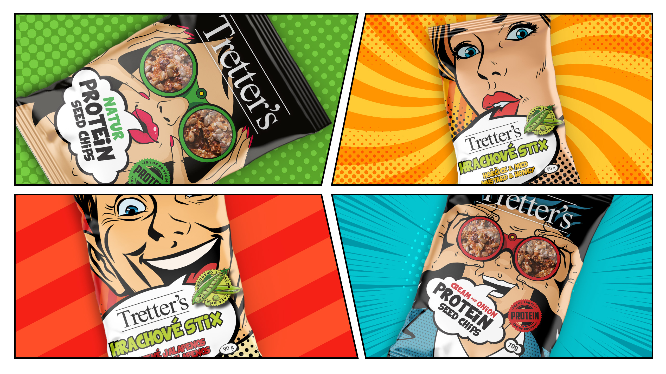
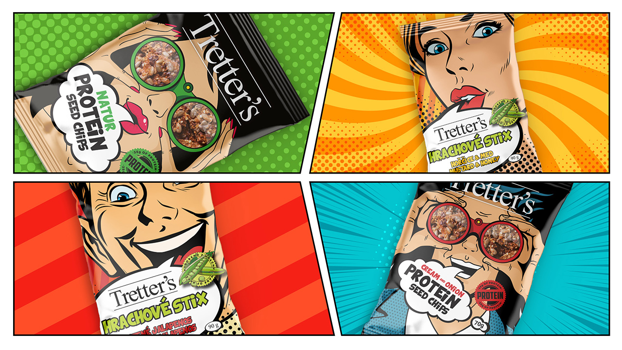
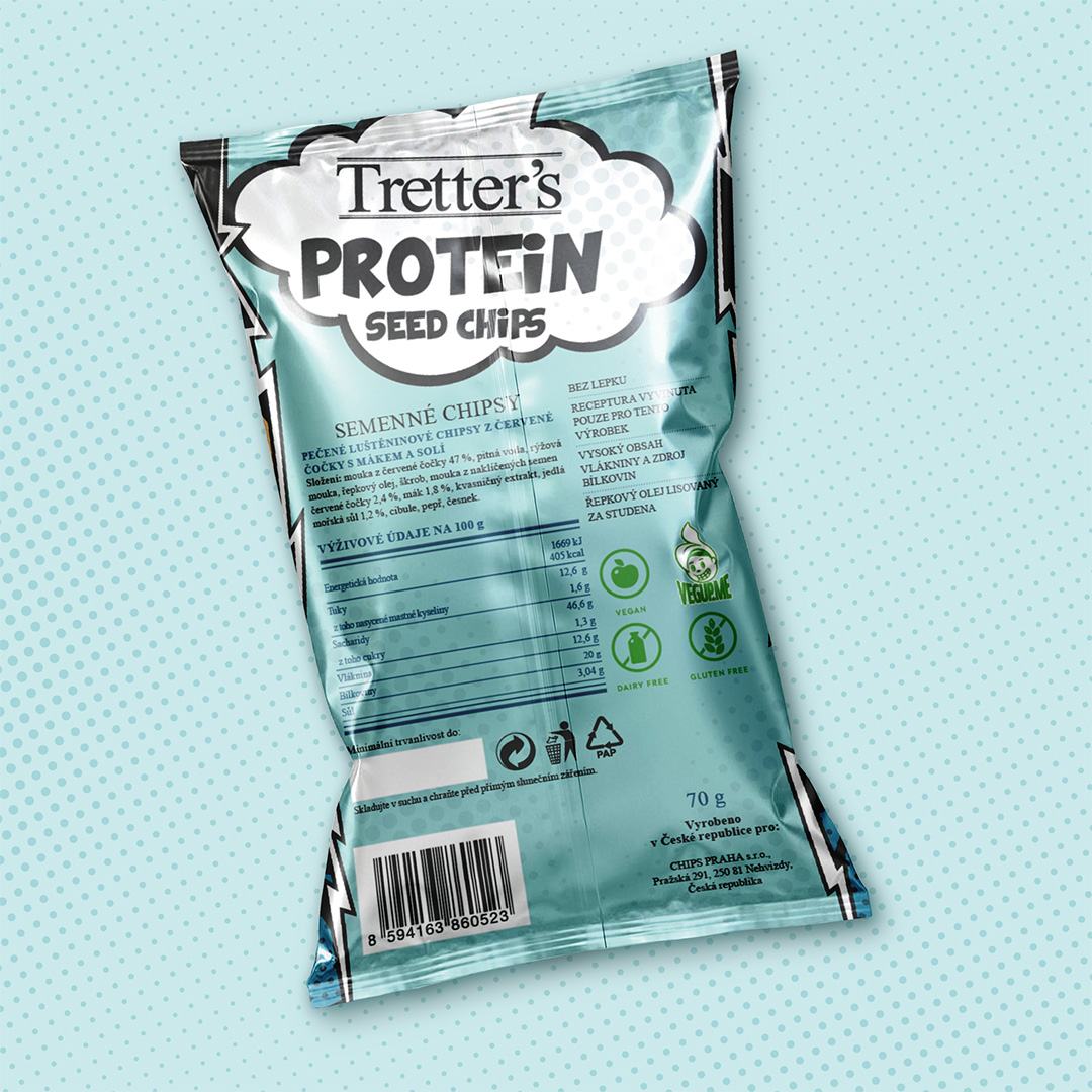
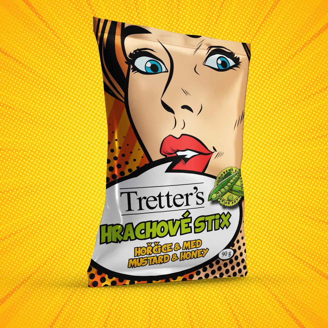
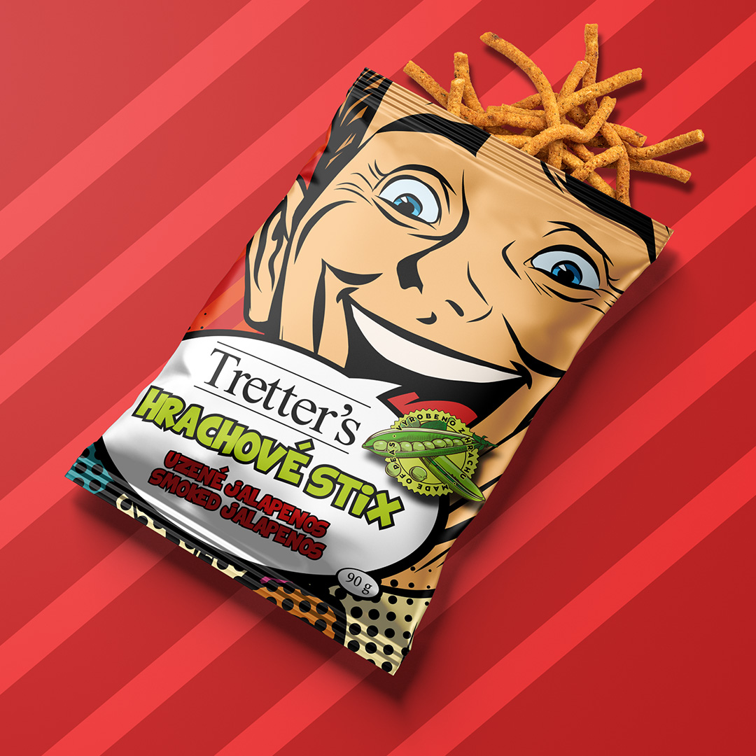
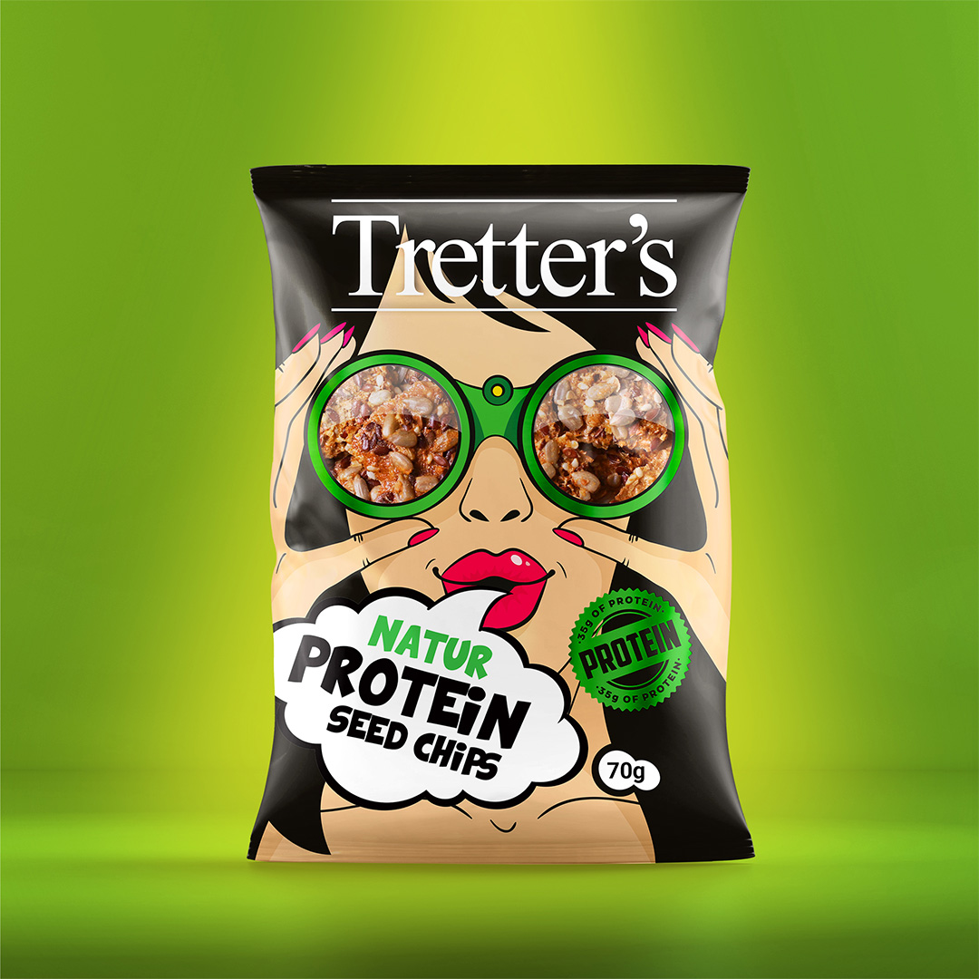
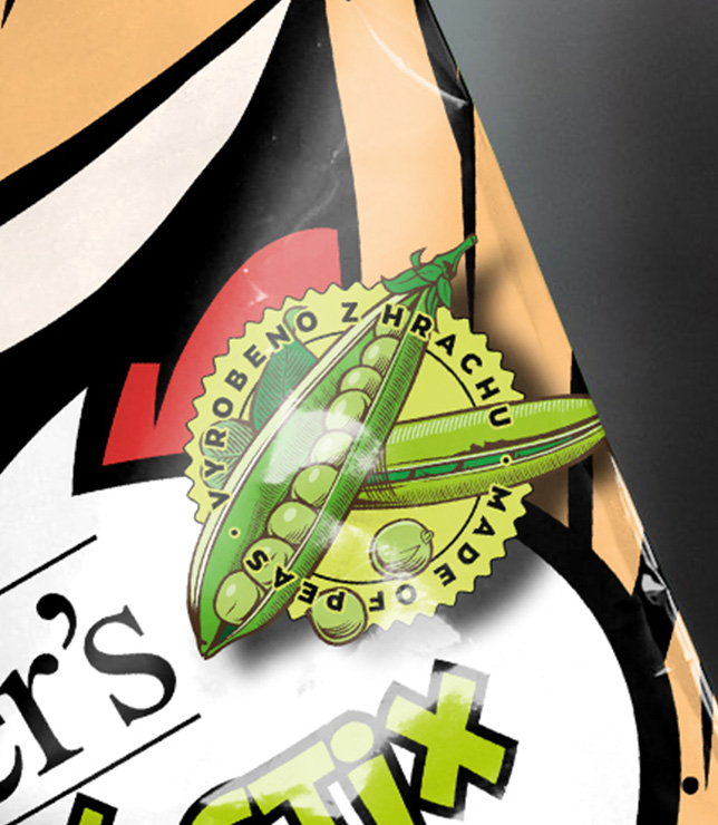
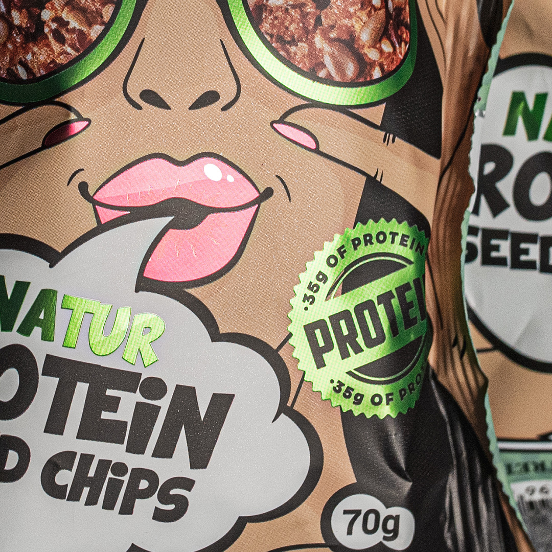
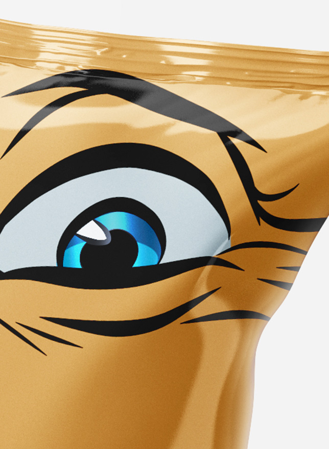
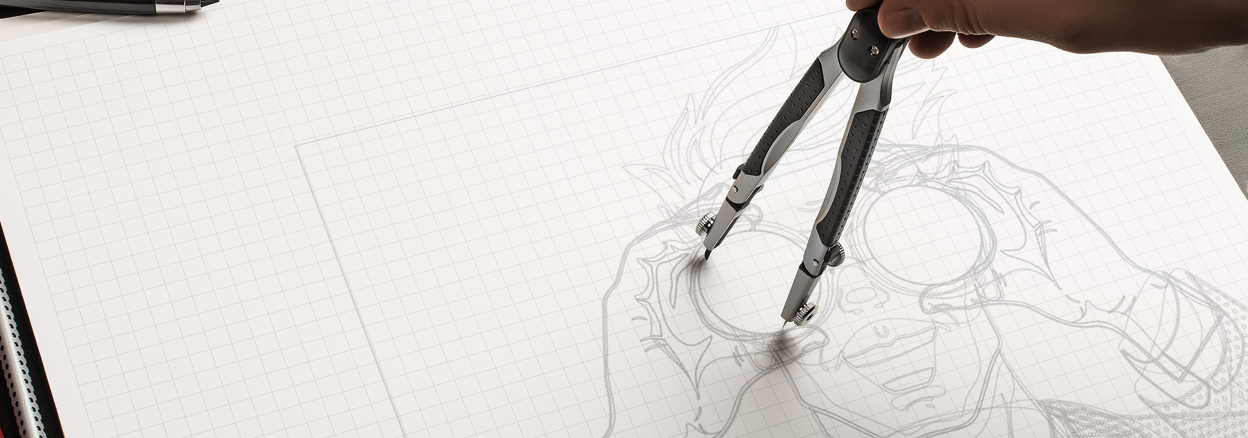
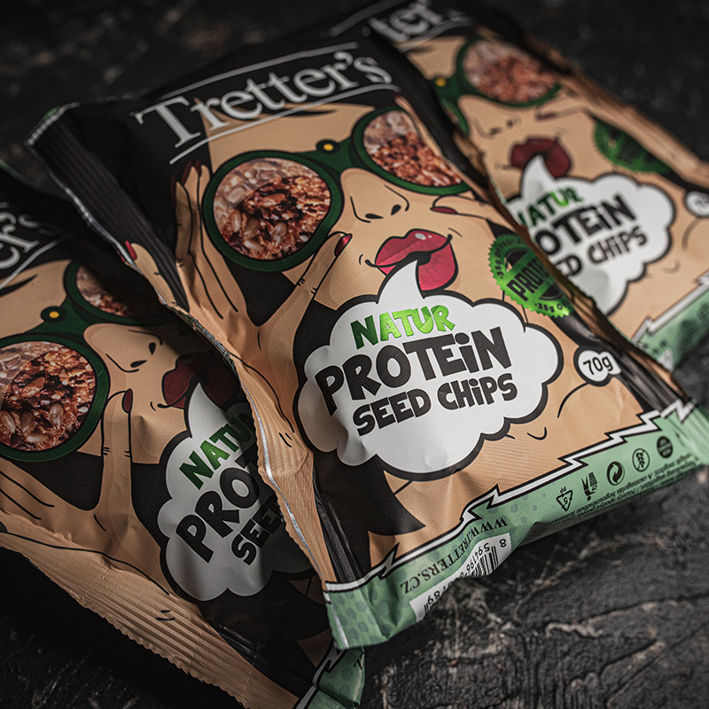
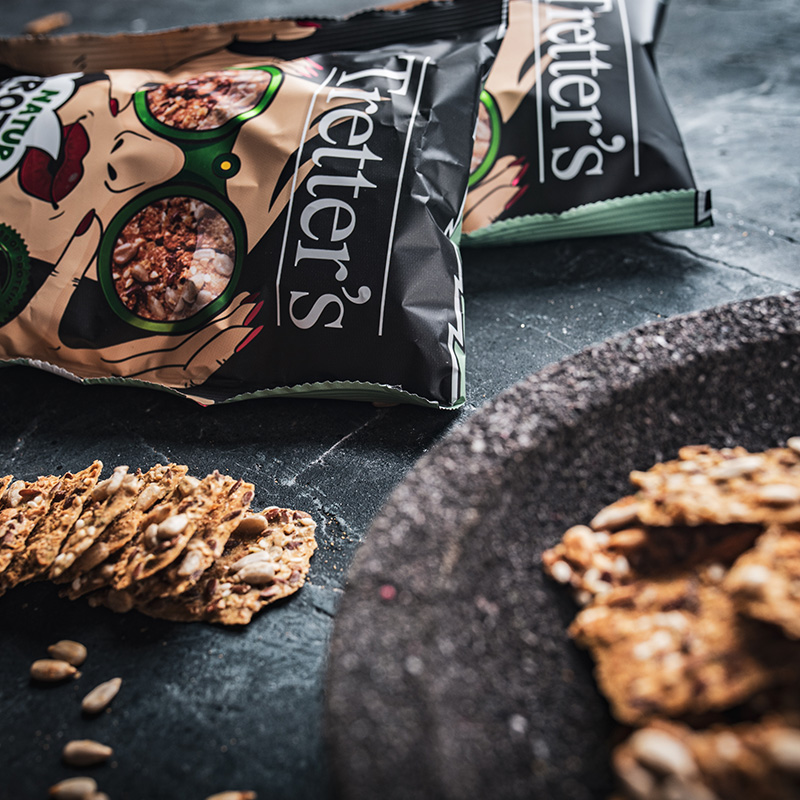
At first the visual style featured a vintage imagery (1920s to 1970s) with with bright and saturated colourful elements. for the final design tho, we switched to a comic book like theme, as it was far more eye-catching and better represented the actual product.
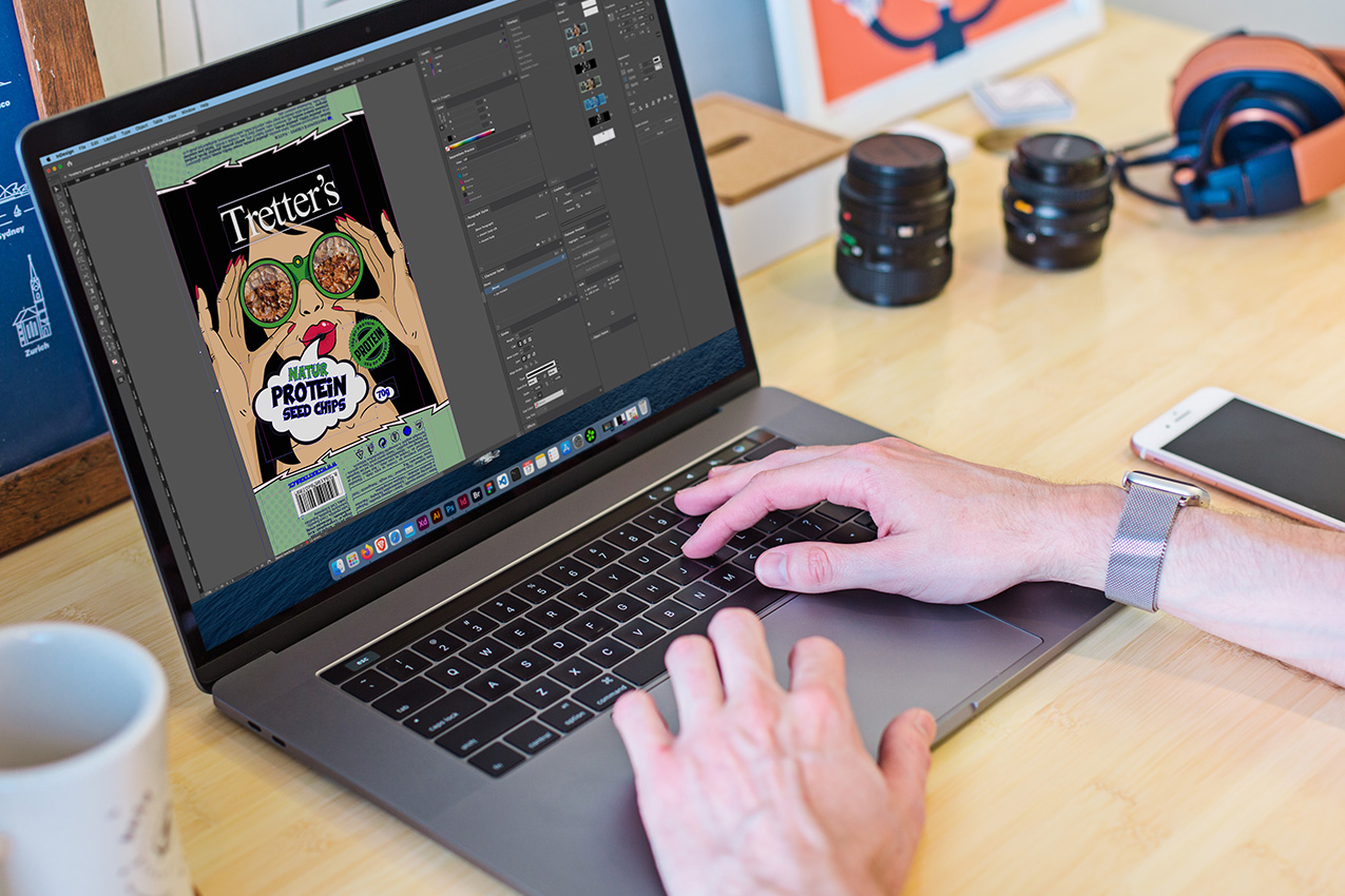
There’s a general belief that health-oriented food items are dull, bland and boring. Tretter’s Stix and Seed product lines however try to break this “rule” with bold flavours. And the visual has to capture that and communicate it clearly.
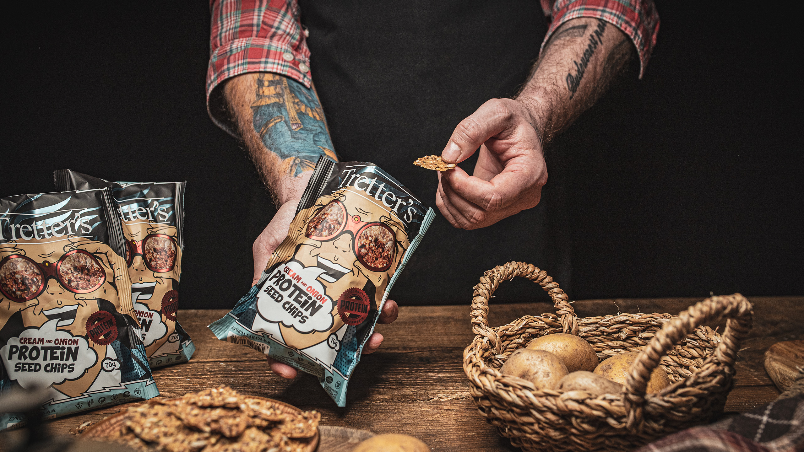
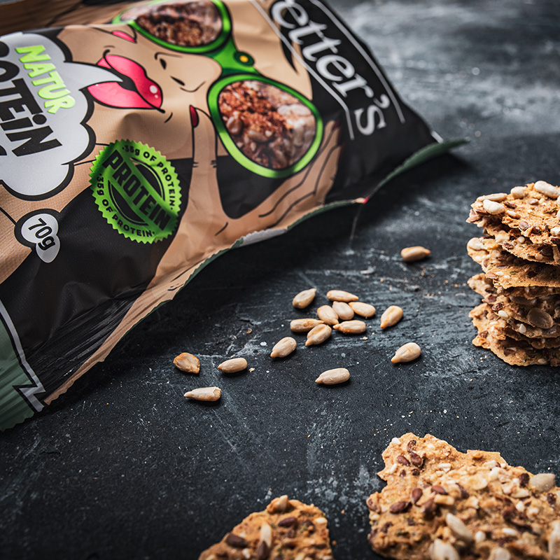
A rather big focal point of the designs were the comic book style colours, typography and overall feel in combination with the information about the “protein” and “made from peas” stickers. Now that’s fun and unique!

A small selection of the designs that didn’t make it on the shleves.



We will get back to you as soon as possible.
